When a project manager stares at a risk register full of dozens of uncertain variables—raw material costs, labor availability, interest rates, supplier lead times—the immediate question is always: which ones really matter? Not all risks deserve equal attention, and spreading mitigation efforts thinly across every uncertainty wastes time and budget. Sensitivity analysis gives teams a structured way to answer that question. It isolates each uncertain element, tweaks it across a plausible range while holding everything else steady, and measures how much the project’s key objective swings in response. One of the most intuitive and widely used ways to display the results of this analysis is the tornado diagram. It transforms a table of numbers into a visual rank-order of impact, making it immediately obvious which few variables should dominate the conversation about contingency reserves, response planning, and stakeholder communication.
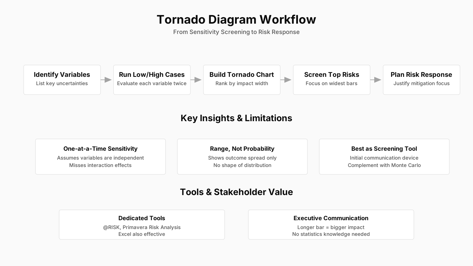
Quick Summary: Tornado Diagram & Risk Sensitivity Analysis
| Key Concept | Summary |
|---|---|
| Sensitivity Analysis | Sensitivity analysis quantifies how independent variation of each uncertain project input, across its credible range, drives change in a critical success metric such as net present value or completion date. |
| Risk Prioritization | The technique ranks variables by the scale of their potential distortion on objectives, enabling teams to allocate mitigation resources to the few factors that genuinely steer outcomes. |
| Quantitative Risk Analysis | It serves as a pivotal step within the Perform Quantitative Risk Analysis process, translating qualitative risk registers into prioritized, data-informed inputs for response formulation. |
| Framework Versatility | Applicable across PMBOK, PRINCE2, and Agile delivery models, the method sharpens backlog grooming and reveals which assumptions are most volatile in adaptive programs. |
| Method Limitations | Because single-variable analysis ignores correlation among inputs, results should be interpreted as a directional ranking rather than a precise forecast of combined effects. |
| Tornado Diagram Construction | For each variable, the project model is run at its low and high bound while all others stay at baseline; the resulting range of metric outcomes defines the horizontal bar length. |
| Visual Ranking | Bars are ordered from largest outcome spread at the top to smallest at the bottom, creating an immediate funnel visualization of which variables dominate sensitivity. |
| Probability Distinction | Bar length signals destructive potential rather than likelihood of occurrence, so the diagram gains full value when paired with probability information from Monte Carlo simulation. |
| Range Definition | Realistic ranges are essential; facilitated workshops with subject matter experts establish credible 80- or 90-percent confidence intervals that ground the analysis in practical estimates. |
| Stakeholder Communication | A tornado diagram transforms numerical sensitivity data into a visual hierarchy, directing contingency and communication focus to risks with the greatest potential impact. |
Understanding Risk Sensitivity Analysis in Project Management
Before diving into the diagram itself, it helps to unpack what sensitivity analysis actually does inside a risk management framework. In quantitative risk analysis, the goal is to move beyond simple high-medium-low ratings and assign numerical probabilities and impacts to risks, then combine them to see the overall effect on project objectives. A quantitative risk analysis technique like sensitivity analysis cuts through the noise by asking a very precise question: If we could be wrong about only one assumption at a time, how much damage would that specific error cause? The approach examines the extent to which the uncertainty of each project element affects the objective being examined when all other uncertain elements are held at their baseline values. Imagine a construction project where the total budget is sensitive to steel prices, concrete curing time, and labor productivity. Sensitivity analysis would vary the steel price from the low end of its realistic range to the high end, lock the other two assumptions at their most likely point, and recalculate the final cost. Repeating this for each variable reveals which ones push the total budget around the most.
This kind of analysis fits squarely into the Perform Quantitative Risk Analysis process in the PMBOK Guide. It comes after you have identified risks and performed qualitative prioritization, and before you commit resources to detailed response plans. Practically, it acts as a bridge. The qualitative register might flag thirty risks as “high priority,” which is too many to treat with equal rigor. Sensitivity analysis refines that list into a much shorter set of variables that genuinely control the project’s fate. In PRINCE2 environments, while the methodology does not prescribe specific quantitative tools, the Risk theme encourages the use of such analysis whenever it adds value to decision-making. In Agile programs, particularly scaled frameworks, sensitivity analysis can inform backlog grooming by revealing which non-functional requirements or architectural assumptions carry the most dangerous volatility. That versatility is part of why the technique has endured across so many delivery approaches.
What makes sensitivity analysis especially practical is that it does not require monstrous computing power or complex statistical modeling. A good single-variable sensitivity pass can be done with a spreadsheet and some thoughtful range definitions. That accessibility has a downside, though. It means practitioners sometimes apply it mechanically without fully understanding the assumptions baked into it, which can lead to overconfident decisions. The method deliberately ignores interactions between variables. In reality, a spike in steel prices often correlates with higher shipping costs or labor market tightening, effects that a simple one-at-a-time analysis misses. That limitation does not invalidate the approach; it just means the output of a sensitivity analysis is a directional ranking, not a prediction. Teams that treat it as a precise forecast rather than a prioritization tool are setting themselves up for surprises.
Key Insights on Risk Sensitivity
- Single-variable impact assessment
- Sensitivity analysis isolates the effect of a single project variable by testing its full realistic range while holding all other assumptions constant, revealing its direct influence on project objectives.
- Quantitative risk analysis technique
- Embedded in PMBOK's Perform Quantitative Risk Analysis process, this technique converts long qualitative risk lists into a shortlist of variables that fundamentally shape project outcomes.
- Adaptable across delivery frameworks
- PRINCE2 recommends sensitivity analysis when it adds clear decision value, while scaled Agile frameworks leverage it to surface volatile non-functional requirements and architectural assumptions during backlog grooming.
- Accessible but mechanically misapplied
- Though it demands only a spreadsheet and well-defined ranges, its apparent simplicity invites mechanical application without understanding the critical assumptions underpinning the analysis.
- Directional ranking not prediction
- Because the one-at-a-time method ignores interactions among correlated variables, teams should use the results as a prioritization ranking, not as a precise outcome forecast.
The Mechanics of a Tornado Diagram
A tornado diagram takes the output of a sensitivity analysis and turns it into a visually comparative chart that ranks variables by their impact. The name comes from the shape: the largest impact sits at the top with a wide horizontal bar, and as impacts shrink, the bars taper down to a funnel, much like an inverted tornado. Understanding the tornado diagram construction process is important because the way you build it directly shapes how stakeholders interpret the risks. For each uncertain variable, you need a low estimate and a high estimate that define a plausible range around a baseline. While the baseline stays fixed, you run the model with that variable set to its low value and record the resulting objective value, be it net present value, total cost, schedule finish date, or some composite score. Then you do the same for the high value. The difference between those two outcomes becomes the bar’s length. Sorting the variables from the widest range to the narrowest produces the classic funnel image.
Imagine a pharmaceutical R&D project where the key objective is the time-to-market in months. Variables might include clinical trial duration, regulatory review time, and manufacturing scale-up delay. The baseline might be 36 months. For clinical trial duration, the low estimate is 18 months and the high is 30 months. Holding the other variables at baseline, the project might finish at 30 months under the low scenario and 42 months under the high scenario, giving a swing of 12 months. Regulatory review might swing from 2 to 8 months, causing a net effect of only 6 months. Manufacturing scale-up might cause a shift from 34 to 39 months, a difference of 5 months. The tornado diagram would show clinical trial duration at the top with a wide bar spanning 12 months, followed by regulatory review, then manufacturing. A project sponsor glancing at this chart instantly knows that shaving even a small amount of uncertainty off the clinical trial phase yields outsized benefits compared to investing heavily in expediting regulatory interactions.
What often gets overlooked is that the tornado diagram does not show the probability of any particular outcome. The bar length represents the sensitivity, not the likelihood. A variable could have an enormous potential swing but be tightly controlled and unlikely to deviate far from the baseline. Conversely, a variable with a modest bar might be extremely volatile and happen frequently. That is why the tornado diagram works best when paired with a qualitative heat map or a probabilistic schedule like a Monte Carlo simulation. When you see a long bar, you are seeing destructive potential assuming the extremes occur. The art of interpretation lies in combining that with your knowledge of how likely those extremes really are.
Building the diagram correctly also demands discipline in defining ranges. If the low and high values are wishful thinking—overly narrow because the estimator does not want to look pessimistic—the diagram will understate the real risks. If they are absurdly wide to cover every conceivable black swan, the diagram loses resolution and everything starts to look equally threatening. Getting that balance right usually requires facilitated workshops with subject matter experts who can challenge each other’s assumptions. The facilitator must ensure that the range reflects a realistic 80 percent or 90 percent confidence band, not a theoretical worst-case that nobody believes. The resulting tornado diagram then earns credibility because it is grounded in a consensus about what could reasonably happen, not what could happen in a science fiction scenario.
Interpreting the Visual Output for Decision-Making
Once the bars are drawn, the conversation shifts from “what are the risks” to “where do we invest our limited attention.” The tornado diagram functions as a prioritization lens. The top one or two variables typically account for a disproportionate share of the total potential variability in the project objective. In many projects, it is not uncommon to see the top two or three bars consume over 70 percent of the combined swing, while a long tail of minor bars adds marginal noise. This pattern—sometimes called the Pareto effect of risk sensitivity—means the project team can safely narrow its deep-dive planning to a tiny handful of drivers without missing much. The visual compression of the remaining smaller bars into a thin taper also has a calming effect on anxious stakeholders who previously felt overwhelmed by a risk register filled with alarm bells. They can see that many risks, while real, are simply not in the same league as the heavy hitters.
Another subtle insight buried in the tornado diagram is the direction of impact. Some bars extend further to the left of the baseline, meaning the low value of that variable hurts the objective, while others extend further to the right, meaning the high value causes damage. For a cost objective, a material price increase obviously shifts the bar to the right. But for a schedule objective, a compressed regulatory approval might shift the bar to the left, indicating that an unusually fast approval is actually beneficial. Recognizing these asymmetries helps tailors risk responses. If a bar skews heavily in one direction, you may need a contingency plan for that specific tail, not a generic dampening of volatility.
Oddly enough, the tornado diagram also works as a communication tool for people who distrust numbers. Because it is essentially a bar chart with a memorable shape, it sidesteps the statistical jargon that can alienate busy executives. A steering committee member can look at the wide bar labeled “regulatory approval duration” and intuitively grasp that this is where the project lives or dies. The diagram then becomes a touchstone for ongoing risk monitoring. Every month, as the project progresses and some uncertainties narrow, the team can update the ranges and redraw the tornado. A variable that once dominated the top might shrink if early prototyping proves the design is robust, while a previously minor variable might creep upward as new information surfaces. This dynamic re-anchoring keeps risk conversations current and prevents the team from fighting the last war.
Why Tornado Diagrams Are Essential for Project Risk Management
Beyond the technical appeal, tornado diagrams earn their place in the practitioner’s toolkit because they solve a persistent human problem: decision paralysis in the face of complexity. A visual prioritization of risks converts an abstract list of threats into a clear hierarchy that the brain can process instantly. When a risk manager presents a sensitivity analysis report as a dense table of numbers, decision-makers often glaze over or fixate on the row with the most alarming absolute number, even if that number has little influence on the objective. The tornado diagram, by contrast, forces the eye to the top bar and implicitly says “start here.” This psychological nudge is not trivial. It aligns the entire project team’s mental model around the same few critical variables, dramatically improving the quality of resource allocation and mitigation design.
The diagram also supports a structured approach to contingency management. In traditional practice, contingency reserves are often set as a percentage of the total budget, applied uniformly. A tornado-driven sensitivity analysis reveals that not all project components need the same buffer. If the analysis shows that design complexity is the dominant source of cost overrun while permitting delays are a minor nuisance, the contingency can be skewed toward engineering efforts and away from legal retainers. This technique of risk-adjusted budgeting makes the financial case for targeted investments far more compelling. A finance director who might balk at a generic 15 percent contingency line item will often accept a 10 percent reserve if the tornado diagram shows that the only genuine threat is component testing, and even then, the plausible overrun is bounded.
Project managers who use tornado diagrams consistently report another subtle benefit. The process of building and debating the ranges forces functional groups to confront their own assumptions. The design team might claim a prototype iteration takes three weeks, while the procurement team insists it takes six. Constructing the tornado requires reconciling those estimates into a defensible range, which surfaces hidden disagreements about the project’s fundamentals. Those conversations are often more valuable than the diagram itself. They reveal misalignments in how different parts of the organization perceive the same risk, and they give the project manager ammunition to mediate before the conflict festers into a real schedule hit. So the diagram serves as both an analytical output and a facilitation device.
In large infrastructure programs, where hundreds of variables interact, a tornado diagram can condense months of quantitative risk modeling into a single slide. The ability to say “these three variables drive 80 percent of our budget uncertainty” gives program leadership permission to reduce meeting frequency on dozens of other topics and focus intensely on monitoring those three drivers. This kind of ruthless simplification is often what separates well-managed portfolios from those that drown in reporting noise. The tornado diagram becomes the heartbeat of the program’s risk rhythm: it is updated quarterly, presented to the board, and used to reallocate management reserves as the risk landscape evolves.
Real-World Application Scenarios for Tornado Diagrams
Consider a software development project with a fixed-price contract where the primary objective is margin. The uncertain variables might include scope creep, server utilization, third-party API downtime, and testing defect rates. By holding everything else at baseline and swinging each variable from its optimistic to pessimistic bound, the team discovers that scope creep creates a margin swing of $180,000, while server cost variability only moves the needle by $15,000. The result is clear: the project manager should invest heavily in scope management rigor, customer expectation setting, and change control procedures, while treating server costs as a monitoring item rather than a crisis waiting to happen. The tornado diagram gives that recommendation the force of evidence rather than opinion, which makes it far easier to get the client to accept a structured change management process.
In a pharmaceutical portfolio, drug development timelines face uncertainties like patient enrollment rates, regulatory review queue times, and manufacturing yield. A tornado diagram applied across several drug candidates quickly separates the compounds where enrollment is the dominant risk from those where a single manufacturing bottleneck could delay launch. Portfolio managers can then assign their best clinical trial operations specialists to the enrollment-sensitive projects and task the manufacturing excellence team with the production-critical efforts. The diagram does not make the decision for them, but it eliminates the paralysis of trying to optimize everything simultaneously. The ability to pinpoint where each type of resource yields the highest risk reduction is a strategic advantage that compounds over a multi-project lifecycle.
Even in Agile environments, where risk is often handled through iterative delivery and empirical feedback, tornado diagrams have utility. In a scaled Agile framework, a release train with six feature teams might have uncertainty around architectural feasibility, technical debt accumulation, and third-party service deprecation. A quick sensitivity sweep using a tornado diagram can inform the Release Train Engineer where to place the toughest spikes and where to allocate the most experienced team members. This is not about replacing inspect-and-adapt cycles but about making the initial program increment planning session smarter. The diagram provides a risk-informed starting point that the retrospective cycles can then refine, rather than a static command-and-control mandate.
What ties these examples together is the common pattern: the tornado diagram shines whenever there are multiple competing uncertainties and a clear quantitative objective. It does not matter much whether the objective is financial, temporal, or quality-based, as long as it can be expressed numerically. The technique crosses industry boundaries because the underlying mathematics is indifferent to the content of the variable. A delay is a delay whether it comes from a regulator, a supplier, or a software bug. The diagram simply ranks by the magnitude of impact, leaving the domain experts to inject meaning into the labels on the bars.
Core Insights: Visual Risk Prioritization
- Visual hierarchy overcomes decision paralysis
- Tornado diagrams transform abstract risk registers into an immediate visual ranking, focusing leadership attention on the variables that genuinely influence project outcomes rather than on the raw numbers that provoke emotional reactions.
- Enables risk-adjusted contingency budgeting
- By identifying the specific project elements responsible for cost volatility, tornado diagrams allow managers to distribute contingency reserves in proportion to true exposure, replacing blanket percentage allocations with targeted risk coverage.
- Forces alignment on underlying assumptions
- The process of constructing the diagram reconciles conflicting departmental estimates, unearthing hidden disagreements and equipping project managers with a structured facilitation mechanism to resolve misalignments before they evolve into schedule or budget disruptions.
Common Pitfalls and How to Avoid Them
While the tornado diagram is conceptually simple, a surprising number of practitioners misuse it, often by treating it as a standalone truth machine rather than one piece of a broader risk analysis toolkit. One of the most frequent mistakes is misapplying tornado diagrams without first verifying that the input ranges are defensible. It is not enough to pull best-case and worst-case numbers from a single subject matter expert’s intuition. If the low and high values are plucked from the air, the resulting diagram is a beautifully formatted ranking of hunches, not risks. The fix is to ground ranges in historical data, monte carlo simulation outputs, or a structured expert elicitation process that includes challenge rounds. Without that discipline, the team ends up managing the risks it imagines rather than the ones it actually faces.
Another common pitfall involves neglecting to specify the objective function properly. Sensitivity analysis works on a specific numerical objective. If the team identifies the objective as “total project cost” but some variables actually affect schedule more than cost, and schedule delays incur financial penalties, the analysis must incorporate those knock-on effects. A variable like “regulatory approval duration” might look innocuous in a pure cost model but devastating once you fold in the cost of delayed market entry. The tornado diagram should always reflect the ultimate business outcome, not an intermediate project metric. Otherwise, the visualization might rank variables in a way that contradicts the organization’s real priorities. This is where the project manager’s business acumen comes into play, translating technical project metrics into shareholder or customer value.
The one-at-a-time nature of the analysis also introduces a blind spot that can be dangerous if ignored. Variables that appear minor in isolation can combine to cause major disruptions. Suppose a construction project has two moderately sensitive variables: steel price and labor availability. Holding each at baseline while testing the other might reveal a narrow bar for each. In reality, a regional steel shortage often coincides with bidding wars for skilled labor, creating a compound effect far larger than either alone. The tornado diagram cannot show this because it deliberately shuts off interaction to isolate main effects. Practitioners should use it in conjunction with correlation-aware tools like Monte Carlo simulation that capture these combined effects. When presenting tornado diagrams to decision-makers, it is essential to state this limitation clearly, using language like “this chart assumes independence, so it may understate risks that tend to move together.” That honesty preserves credibility and prevents the classic post-mortem refrain of “but the diagram said it was small.”
Data quality is another perpetual challenge. Sensitivity analysis amplifies garbage in, garbage out. If the baseline model itself is structurally flawed—say, the cost model omits a major work package—the tornado diagram will faithfully rank the sensitivity of a wrong total. This is why experienced risk analysts always perform a base case sanity check before running sensitivity. They look at the total expected cost under baseline assumptions and ask whether it passes the laugh test. Only then do they start perturbing variables. Any variable whose range is wider than the baseline model’s total credible error should be scrutinized. A bar that suggests a $2 million swing when the whole project baseline is only $500,000 indicates either a nonsensical range or a catastrophic model error that needs fixing. Catching such anomalies early saves embarrassment and poor decisions.
Misinterpretation of the ranking itself also occurs. A shorter bar does not mean the variable is unimportant; it means it has a low marginal impact when varied alone. Some variables might have a narrow range because the organization has already invested heavily in controlling them, and that control is effective. The short bar is then a measure of successful risk management, not insignificance. If the bar for “power supply reliability” is tiny because the facility has triple redundancy and backup generators tested monthly, that is good news. Removing that investment would cause the bar to explode in length. Teams that mistake a short bar for irrelevance might be tempted to cut those controls, which would immediately create a new top risk. The diagram shows the current state of sensitivity, given existing controls, not the inherent severity of the source. This nuance is critically important when using tornado diagrams to optimize spend on risk responses: reduce spend on long bars, not on short bars that are short precisely because spend is currently high.
Integrating Tornado Diagrams with Other Project Management Processes
The tornado diagram does not exist in a vacuum, and its real power emerges when it is tightly coupled to the broader risk management lifecycle. Within the PMBOK framework, it is a direct output of the PMBOK quantitative risk analysis process and an input to both plan risk responses and control risks. After the diagram identifies the critical sensitivity variables, the risk response planning process can focus on developing specific contingency and fallback plans for those top drivers. Instead of writing a generic mitigation for “schedule delay,” the team can craft a targeted response for “prototype iteration delay” that includes expedited supplier agreements and parallel testing protocols. The specificity improves the odds that the response will actually work when needed.
The integration extends into monitoring and control. As the project progresses, the project manager can trigger a re-sensitivity analysis whenever a major milestone is reached or an assumption proves false. For example, if a long-lead material arrives on time and within cost, the bar representing that material’s sensitivity collapses, and a new tornado diagram might promote a previously lower-ranked variable into the top spot. This dynamic rebalancing keeps the risk register alive rather than letting it become a document that is filed and forgotten after the planning phase. Some advanced project management offices maintain a living sensitivity dashboard that automatically updates the tornado chart as actual data feeds into the model, giving decision-makers a near-real-time view of shifting risk concentrations.
When dealing with complex, multi-project programs, tornado diagrams can be aggregated to show portfolio-level risk drivers. The program manager might collect the top three sensitivity variables from each constituent project and create a program-level tornado that reveals common themes. If four out of six projects list “regulatory change uncertainty” as their dominant driver, the program office can elevate that risk to the enterprise level and advocate for a centralized lobbying or legal monitoring function. This vertical integration from project-level sensitivity to program-level advocacy is a powerful example of how quantitative risk analysis techniques can influence organizational strategy, not just project tactics.
In PRINCE2-controlled environments, the diagram can serve as an input to the risk budget or to the change authority’s decisions about accepting or rejecting change requests. If a proposed change touches a variable that appears in the top tier of the tornado diagram, the change authority should scrutinize it more rigorously, possibly requiring a full quantitative impact assessment before approval. Conversely, changes affecting only variables in the lower, tapering section might be fast-tracked. This risk-informed change control process prevents change boards from treating all requests with equal deliberation, reducing the administrative burden and speeding up low-risk adaptations.
Tornado Diagrams vs. Other Sensitivity Analysis Tools
While tornado diagrams are popular, they are not the only visualization available for sensitivity analysis, and understanding the sensitivity analysis tools comparison helps practitioners choose the right tool for the context. Spider charts, for example, display all variables on a circular grid with axes radiating from a center point, each axis representing a different variable. As you vary one variable, the line connecting the values forms a web that visually stretches where sensitivity is high. Spider charts are excellent for showing the relative shape of sensitivity across many variables at once, but they become cluttered quickly when the number of variables exceeds six or seven. The tornado diagram’s linear ranking is far easier to read for prioritization, while the spider chart is better for pattern recognition when you suspect that certain variables interact in a specific directional manner.
Scatter plots from Monte Carlo simulations offer another comparison. They can show the correlation between an input variable and the output objective across tens of thousands of trials, revealing non-linear relationships that a simple two-point sensitivity test would miss. A variable might have minimal impact near its baseline but cause an extreme tail effect once it passes a certain threshold. The tornado diagram’s single high-low range comparison cannot capture that inflection point. However, scatter plots are more intimidating to non-technical audiences and require careful explanation. In practice, many analysts use a layered approach: they start with the tornado diagram to communicate the big picture and then use scatter or cumulative probability curves to deep-dive into the top few drivers. This keeps the conversation accessible while still rigorous.
Decision tree analysis, another quantitative tool, evaluates sequences of decisions and chance events to compute expected monetary value. Tornado diagrams can feed into that process by identifying which chance nodes most affect the expected value, allowing the analyst to prune the tree and simplify the model. This is a classic divide-and-conquer strategy. The tornado tackles the initial filtering, isolating the heavy hitters, and then the decision tree models the detailed contingent responses for those critical junctures. It is a symbiotic relationship that many new practitioners overlook, instead seeing the tools as mutually exclusive. The best risk analysts maintain a fluent command of all these techniques and move between them as the project’s decision needs evolve.
One emerging alternative is the use of machine learning feature importance plots, which can rank variables by their predictive power in a trained model. These plots superficially resemble tornado diagrams but are derived from a fundamentally different mathematical approach that accounts for interactions and non-linearities. While not yet standard in project management, they offer a glimpse of where the field might head as projects generate richer data streams. For now, the tornado diagram remains the practical workhorse because it requires minimal data preparation and is instantly interpretable by diverse stakeholder groups.
Key Insights on Integration and Tools
- PMBOK risk lifecycle coupling
- The tornado diagram bridges quantitative risk analysis with risk response planning and risk control, allowing project teams to design precise contingency actions for the most sensitive cost and schedule drivers instead of relying on broad, generic measures.
- Dynamic re-sensitivity during monitoring
- At major milestones or when key assumptions prove invalid, project managers trigger fresh sensitivity analyses; the tornado diagram updates dynamically, transforming the risk register into a living dashboard that reflects current conditions.
- PRINCE2 change control impact
- In PRINCE2 environments, change requests that impact the top-ranked variables in the tornado diagram prompt rigorous quantitative evaluation, whereas modifications to lower-tier drivers can be expedited, thereby streamlining the change control process.
- Tool comparison and layered analysis
- Relative to spider charts and scatter plots, the tornado diagram offers superior prioritization and intuitive readability; analysts therefore typically apply it as a first-pass tool before using scatter plots to investigate nonlinear interactions among the highest-ranked drivers.
The Business Value-Oriented Perspective on Tornado Diagrams
From a business value-oriented standpoint, the tornado diagram aligns naturally with efforts to reduce waste and focus resources on what truly moves the needle. In BVOPM, value-oriented risk management treats product risks separately and encourages quantifying potential losses in specific units—dollars, days, user impact—rather than vague severity scores. A tornado diagram built using those quantified loss sizes immediately shows where the largest potential value destruction sits. If the top bar represents a risk that could erase six months of user adoption gains, the organization knows to prioritize it above a risk that threatens only a minor budget overrun. This quantification makes the business case for mitigation investment self-evident, short-circuiting the political negotiations that often surround contingency funding.
BVOPM’s emphasis on dynamic filtering and waste reduction also finds a parallel in how tornado diagrams should be used over time. Instead of a one-off analysis, the diagram can be updated each iteration or phase gate to reflect the latest risk intelligence. When a risk’s bar shrinks because the team took effective action, the resources previously allocated to monitoring it can be partially redeployed. The goal is to avoid the common waste of over-watching risks that no longer pose a credible threat. The tornado diagram becomes a visual dashboard for trimming monitoring overhead, a subtle but valuable form of process waste elimination. It also helps pinpoint areas where perfectionism—another BVOPM waste category—might be creeping in. If a bar is short and the team is still spending excessive time refining a mitigation plan, the diagram provides the objective evidence to call that out.
The cross-functional nature of BVOPM’s risk approach, which integrates product, process, and people risks, can be directly mapped onto the tornado diagram by labeling bars with their risk category. A quick glance might reveal that all the top bars are process-related risks, signaling that the product development team needs more support from operations, or that the people-related risks are all clustered at the bottom, implying the current hiring and training practices are working. Such insights are harder to glean from a traditional PMBOK risk register where risks are not tagged with a BVOPM-style categorization. The diagram thus supports the BVOPM principle of transparent, cross-functional risk visibility without adding layers of new documentation.
When a program uses BVOPM’s concept of a realization set—where each project can choose its own methodology—the tornado diagram provides a common language for comparing risk across agile and waterfall projects. A program manager can look at two tornado diagrams side by side, one from a Scrum team tracking velocity-sensitive factors and another from a construction project tracking cost-sensitive factors, and still see which overall uncertainties dominate the program’s aggregate outcome. The abstraction of “bar length as impact magnitude” transcends methodology differences, making it a rare cross-paradigm tool. This property makes the tornado diagram a durable asset in increasingly hybrid portfolios that mix predictive and adaptive project life cycles.
Turning Sensitivity Data into Actionable Risk Strategies
At its core, a sensitivity analysis is only as valuable as the decisions it prompts. The tornado diagram’s true worth lies in how it shapes actionable risk response strategies. Once the short list of critical variables is on the table, the team can move from analysis paralysis into design mode. For each top variable, they should develop at least one proactive response: a mitigation that reduces the probability, a contingency plan that limits the damage, a transfer mechanism like insurance or outsourcing, or an active acceptance that comes with a clear trigger for escalation. Because the diagram isolates the variables, the responses can be surgically precise. Instead of a blanket “add two months to the schedule” contingency, the team might decide to pre-qualify an alternative testing lab in case the primary one faces regulatory delays, targeting the exact variable that the diagram highlighted.
This precision has a knock-on effect on stakeholder confidence. When a sponsor sees a risk management plan that acknowledges the tornado diagram and explicitly ties each major response to a bar on the chart, they are far more likely to approve contingency reserves than when faced with a generic laundry list of undifferentiated risks. The diagram functions as a justification artifact. It can be appended to business case updates or stage-gate documents, providing a visual anchor that makes the risk conversation evidence-based. In an era where project funding increasingly depends on demonstrated risk intelligence, the ability to produce a tornado diagram in a board presentation signals a level of analytical maturity that sets the project apart.
The final leap, however, is weaving the tornado insights into the project’s operational rhythm. Risk review meetings should not be a walkthrough of every line in the register. Instead, the project manager can structure the agenda around the tornado diagram: the top three variables get a dedicated deep dive, while the remaining bars are covered in a rapid “no change” confirmation. This format respects executive attention spans and directs the team’s energy where it yields the highest return. Over successive cycles, as variables are retired and new ones emerge, the reshuffling of the bars tells a story about how the project’s risk profile is maturing. That narrative of maturation is itself a powerful communication tool for external auditors and governance bodies who want assurance that risk is being managed dynamically.
Ultimately, a tornado diagram is not a crystal ball. It will not tell you what will go wrong, only what could go wrong and how much it would matter. When paired with sound judgment, honest data, and a willingness to re-evaluate as facts change, it becomes one of the sharpest instruments in the project manager’s toolkit. It transforms the messy, multi-dimensional problem of project uncertainty into a clear ranking that anyone can understand, and from that clarity, action follows naturally.
Key Insights from Tornado Analysis
- Precise responses for critical variables
- Teams should respond to each top-ranking variable with a specific strategy, such as mitigation, contingency, transfer, or acceptance paired with an escalation trigger, rather than relying on broad schedule buffers.
- Diagram as a justification artifact
- The tornado diagram serves as a visual, evidence-based anchor when appended to business case updates or stage-gate documents, making contingency reserve approvals more straightforward and conveying analytical rigor.
- Tornado-driven operational review rhythm
- Structuring risk review meetings around the diagram allows the top three variables to undergo deep-dive analysis while the remaining ones are quickly confirmed as stable, providing a clear view of risk profile evolution over successive cycles.