A bar chart in project management is a graphical representation of project data where rectangular bars, arranged horizontally or vertically, depict values such as schedule durations, resource allocations, or frequencies. Most commonly, the term refers to the Gantt chart, a horizontal bar chart that maps project tasks against a timeline, but it can also denote histograms used in quality control, resource bar charts for staffing profiles, or cumulative flow diagrams with bar-like segments in Agile reporting. The defining characteristic is the visual encoding of quantitative information through the length or position of bars, making patterns, comparisons, and progress immediately perceptible.
Bar Chart Key Topics at a Glance
| Key Concept | Summary |
|---|---|
| Bar Chart Variants | While the label “bar chart” can denote a histogram, resource chart, or cumulative flow diagram, in project management practice it almost exclusively communicates a schedule-oriented view through a Gantt chart. |
| Timeline Encoding | Each bar in a project chart maps to a work package, activity, or phase, its horizontal length proportional to duration, displaying planned and elapsed intervals simultaneously against a calendar baseline. |
| Perceptual Advantage | Bar charts exploit the human visual system’s innate ability to compare lengths, enabling immediate detection of schedule congestion, resource overallocation, and idle windows that remain hidden in tabular formats. |
| Term Disambiguation | Because the generic term “bar chart” spans multiple chart types, ambiguous usage can cause misinterpretation; project documentation should explicitly state whether it refers to a Gantt chart, resource bar chart, or histogram. |
| PMBOK Guidance | The PMBOK Guide endorses the Gantt chart as the preferred bar chart format for summary-level schedule communication, prioritizing visual clarity for stakeholders over the detailed logic of a network diagram. |
| Agile Visualization Patterns | Agile teams often replace granular Gantt-style bars with cumulative flow diagrams and burndown charts, yet bar charts remain valuable for conveying release train timelines and feature-level roadmaps at the planning tier. |
| Evolutionary Ancestry | The modern Gantt chart, featuring dependency arrows and progress shading, matured through large defense and construction initiatives; the U.S. Navy’s Polaris program further propelled complementary methods such as PERT charts. |
| Hybrid Suitability | Hybrid delivery models naturally favor bar charts because they communicate quarter-level feature commitments and roadmap sequencing without demanding exhaustive upfront task decomposition. |
Definition and Core Meaning of a Bar Chart in Project Management
The phrase "bar chart" in a project, program, and portfolio environment almost always signals a schedule-oriented view where each bar represents a work package, activity, or entire phase, its length scaled to the planned or elapsed time. A bar chart in project management distills the complex interplay of dependencies and durations into a visual form that stakeholders can scan without needing to read a detailed schedule. In predictive methodologies, the bar chart is the primary communication artifact for the project schedule; it shows when each task starts, how long it lasts, and often the responsible person. The vertical axis lists the work breakdown structure elements, and the horizontal axis represents calendar units, days, weeks, or months. Bars can be filled, shaded, or color-coded to indicate status, such as completed, in progress, or delayed. A second set of bars, sometimes called "actual bars," may be superimposed to contrast planned versus actual progress, though this is more typical of tracking Gantt charts specifically.
Beyond the schedule domain, a bar chart also appears in a project's quality management toolkit. A histogram, which is a vertical bar chart displaying frequency distributions, helps teams analyse defect counts per category, testing results, or cycle time variations. Resource bar charts show the number of hours or full-time equivalents allocated per week or month, giving a quick overview of who is overloaded or underutilised. Because the human visual system is highly attuned to comparing lengths, these charts enable rapid assessment of peaks and troughs that spreadsheet columns simply cannot reveal with the same immediacy. This dual identity of the bar chart, as both a scheduling instrument and a general-purpose data visualization, can sometimes cause confusion when the context isn't clarified, which is why it's important to specify whether one refers to a "Gantt chart," a "resource bar chart," or a "histogram" in PM documentation.
Within the PMBOK framework, bar charts are explicitly referenced in the Schedule Management and Resource Management knowledge areas. The Guide to the Project Management Body of Knowledge (PMBOK Guide) describes the bar chart as the standard output for summary-level schedule presentations, where the Gantt chart is the preferred format for communicating the project schedule to stakeholders who do not require the detail found in a network diagram. PRINCE2 similarly incorporates bar charts under its product-based planning approach, using them in the project plan and stage plans to show milestones and control points. Agile practitioners, on the other hand, often replace traditional Gantt-style bar charts with cumulative flow diagrams, burndown charts, or other time-boxed visualizations, but a bar chart can still serve to depict release-level timelines or high-level roadmap features. In all these frameworks, a bar chart is recognized not as a standalone plan, but as a visual summary that must be backed by a more granular data structure, such as a work breakdown structure, a network diagram, or a product backlog.
Key Insights on Bar Chart Fundamentals
- Schedule-oriented bar representation
- Each bar represents a work package, activity, or phase, and its length corresponds directly to planned or elapsed time, creating an intuitive schedule-focused visualization.
- Dual identity of bar charts
- Because bar charts function both as scheduling tools and as generic data visualizations like histograms, project documentation should explicitly distinguish between a Gantt chart, a resource bar chart, and a histogram to avoid ambiguity.
- PMBOK standard for schedules
- The PMBOK Guide recognizes the bar chart, especially the Gantt format, as the standard deliverable for presenting summary-level schedules to stakeholders who require clarity without the complexity of network diagrams.
- Agile alternatives and uses
- While Agile teams typically favor cumulative flow diagrams or burndown charts for iteration tracking, bar charts remain effective for communicating release-level timelines and high-level roadmap features.
Historical Origins and Cross-Industry Context
The bar chart's journey into project management is inseparable from the story of the Gantt chart, though bar charts themselves predate Henry Gantt by centuries. William Playfair, an 18th-century Scottish engineer and economist, is credited with inventing the bar chart for economic data, using horizontal bars to compare imports and exports across trading partners. The history of bar charts in project management accelerated in the early 20th century when Henry Gantt, an American mechanical engineer and management consultant, adapted bar chart principles to production control in factories. His 1910s-era charts displayed planned and actual output for specific machines or departments along a time axis, a revolutionary shift from text-based work orders. The Gantt chart as we know it today, linking activities with dependency arrows and showing progress shading, evolved through the mid-20th century as large-scale defence and construction projects demanded better coordination.
Outside project management, bar charts are ubiquitous in fields where comparative magnitude and time-series analysis matter. Financial analysts use them to illustrate quarterly earnings, healthcare administrators to track patient admissions, and logistics planners to show shipping volumes. In quality management, statistical process control relies on histograms to monitor process capability, an application that trickled into PM quality planning during the total quality management movement. The military, particularly in the U.S. Navy's Polaris program, pushed the Gantt chart toward more sophisticated forms like the program evaluation and review technique (PERT) charts, which incorporated uncertainty, but bar charts remained the summary reporting tool of choice because no other format conveyed "when" and "how long" with less cognitive load. What the cross-industry adoption proves is that the bar chart is not a project management invention; it is a universal visual language that PM has absorbed and refined for the unique burden of displaying interdependencies, milestones, and execution variances.
Key Components and Types of Bar Charts in PM
Understanding what constitutes a bar chart in a project context requires dissecting its anatomy. The chart's foundation is a horizontal axis always representing time units of equal interval, while the vertical axis carries the list of elements being measured, be they tasks, resources, risk categories, or defect types. The key components of a bar chart begin with the axes and their scales, which determine the readability and accuracy of the representation. Misaligned time scales, for instance, can compress the visual distance between milestones and create a false impression of schedule slack that does not exist. Each bar then embodies a data point: for a Gantt chart, the bar's start point, length, and sometimes color convey the planned start date, duration, and status respectively. Milestones are commonly shown as zero-length diamond shapes or thin vertical markers, not as bars, to signal a significant event without consuming duration.
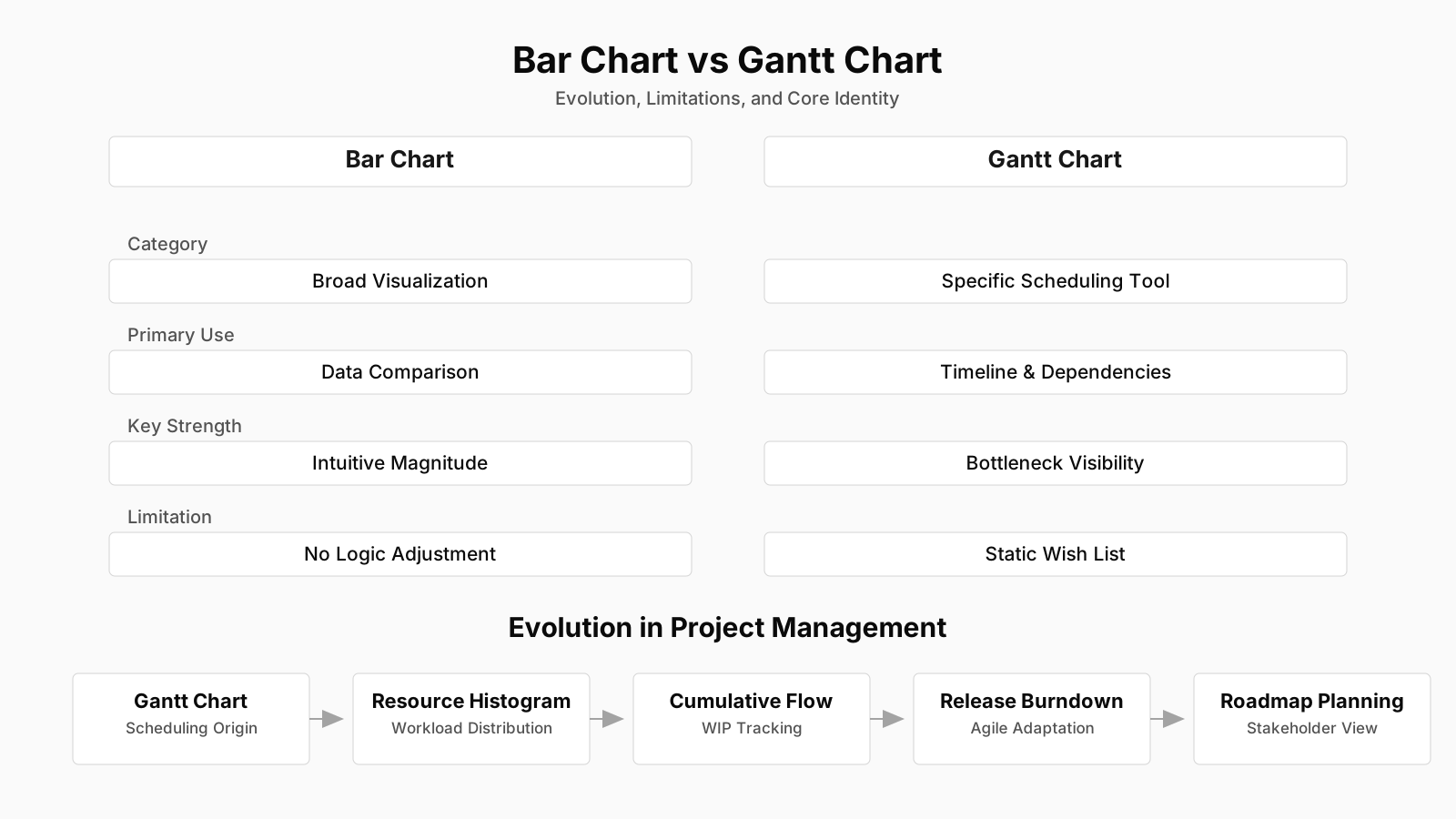
Among the types of bar charts used in project management, the horizontal schedule bar chart (Gantt) is the most prevalent. It can be presented as a summary bar chart that rolls up work packages into higher-level deliverables, or as a detailed bar chart where each lowest-level activity in the work breakdown structure gets its own bar. A tracking Gantt adds a separate bar for actual progress, allowing a visual gap analysis at a glance. Resource bar charts, often configured vertically, stack allocation bars by individual or by role, creating a resource histogram that highlights over-allocation as peaks extending beyond the capacity line. Histograms in quality management are vertical bar charts grouping measurement values into bins; their shape indicates whether a process is centred, skewed, or exhibiting bimodal patterns that might trace back to assignable causes. Cumulative flow diagrams in Agile, while not traditionally called bar charts, employ stacked bands that function like horizontal bar segments, showing the distribution of work items across different states at any given time, and they answer a different question: flow efficiency rather than static due dates.
What distinguishes a bar chart from other visual aids is its inherent limitation: a simple bar chart without dependency lines or annotations obscures the logical relationships between activities. A bar might show that developing a feature starts on Monday and takes five days, but it does not, by itself, reveal that it cannot start until the APIs are available, unless the chart includes connectors or the reader already understands the underlying sequence. This limitation is functional, not a flaw, but it means the bar chart is almost never used in isolation for planning; it is underpinned by a precedence diagramming method (PDM) network or a similar logic structure. Some project management information systems now generate "linked bar charts" that depict dependencies with arrows directly on the chart, merging bar chart simplicity with network logic.
Core Insights on Bar Charts
- Axes define chart foundation
- The horizontal axis represents evenly spaced time intervals while the vertical axis enumerates the deliverables or work items; inconsistent time scales distort perceptions of schedule buffer and urgency.
- Bars encode schedule details
- The start position of a bar indicates the planned start date, its length represents duration, and color signals status; milestones, in contrast, appear as zero-length diamond markers.
- Histograms expose allocation and variation patterns
- Resource histograms stack allocation bars by team member or role, spotlighting peaks that exceed capacity; quality histograms bin measurement data to uncover centering, skew, or bimodal distribution patterns.
- Cumulative flow diagrams visualize work item states
- Agile cumulative flow diagrams employ stacked color bands resembling horizontal bar segments to display how work items are distributed across workflow states, illuminating flow efficiency bottlenecks instead of fixed deadlines.
Bar Chart in PMBOK, PRINCE2, and Agile Frameworks
The placement of bar charts within formal methodologies reveals how different governance systems leverage the same visual tool for distinct purposes. In the PMBOK framework, a bar chart serves primarily as a schedule presentation format within the Develop Schedule process, where it translates the outputs of activity sequencing and duration estimating into a communicable view. The PMBOK Guide explicitly lists bar charts, including Gantt charts, milestone charts, and summary schedules, as schedule presentation alternatives, each suitable for different audiences. A project manager might use a milestone chart, which is essentially a bar chart with only start or finish points, for the steering committee, while the core team works from a detailed logic-linked bar chart during execution. Within the Monitoring and Controlling Process Group, a tracking Gantt with planned versus actual bars feeds into variance analysis and fuels the Work Performance Reports that flow to key stakeholders.
PRINCE2 treats bar charts as an integral part of the plan document, not as an optional visualization. A PRINCE2 project plan includes product descriptions, a product breakdown structure, and a product flow diagram, but the schedule is almost always communicated through a Gantt-style bar chart, sometimes called an activity network or a bar chart in the plan. The methodology emphasizes that the chart must show control points, stage boundaries, and tolerances, turning the graphical view into an accountability instrument. In PRINCE2's processes, the Project Manager uses the bar chart during Controlling a Stage to assess progress against the stage plan and to authorize work packages, because the chart's visual alignment with time-based tolerances makes it easier to spot early slippage than a pure textual narrative ever could.
Agile frameworks complicate the bar chart's role beautifully. Scrum does not prescribe a bar chart for sprint work; the sprint backlog is managed through burndown charts, and the product roadmap might use a simple bar-like visualization for releases, but often in a more abstract "now-next-later" column format. Kanban systems sometimes produce a histogram of cycle time distribution, which is a vertical bar chart that helps the team understand predictability. In scaled Agile frameworks like SAFe, the program board uses a kind of bar chart to represent feature delivery timelines across multiple teams, showing dependencies and milestones in a manner reminiscent of a high-level Gantt. Hybrid environments are where bar charts truly thrive, because the combination of fixed-date governance needs from the predictive world and the iterative delivery rhythms of Agile creates a natural appetite for a tool that says "this feature set is planned for the next quarter" without forcing detailed upfront task decomposition. In such contexts, the bar chart becomes a negotiation boundary object between Agile teams and traditional project sponsors.
BVOP Perspective on Bar Charts
Business Value-Oriented Project Management (BVOPM) recognizes bar charts as existing planning tools but applies a distinct lens to their construction and interpretation. Since BVOPM emphasizes relational effort points over rigid duration estimates and treats scope as a flexible five-level scale, the traditional Gantt bar chart filled with deterministic dates becomes problematic if taken as a fixed commitment. In BVOP, a bar chart might instead display timeboxes and effort bands, with bars representing value increments rather than low-level tasks. The BVOP approach to bar charts acknowledges that work breakdown structures, from which Gantt bars are derived, carry inherent inaccuracy, so the chart is used as a directional visual, not a contractual baseline. It is updated continuously as user feedback reshapes scope, with scope changes recorded not as deviations but as normal iteration of the deliverable set.
Within the BVOP framework's planning practices, a bar chart serves the "Transparent Board of Project Issues" by making resource constraints and timeline tensions visible to all roles before formal authorization. The emphasis is on flagging where the chart's neat linearity breaks down against reality, particularly when cross-functional teams report that a bar's duration no longer reflects the relational complexity of the work. BVOP does not reject bar charts; it simply treats them as conversation pieces that invite challenge, much like a physical Gantt chart on a wall in a collocated team space that anyone can annotate.
BVOP's Adaptive Bar Chart Insights
- Relational effort over duration
- BVOP bar charts map timeboxes and effort bands to relational effort points, enabling adaptive planning that reflects team capacity and complexity instead of fixed calendar dates.
- Directional visual, not baseline
- Recognizing that work breakdown structures inherently introduce inaccuracy, BVOP uses the bar chart as a living, directional view that evolves with ongoing discovery and never serves as a frozen contractual baseline.
- Value increments over tasks
- Each bar in a BVOP chart corresponds to a value increment scoped across five flexible levels, and any scope adjustments are considered a natural iteration of the deliverable set rather than a deviation.
- Conversation piece for transparency
- The chart supports the Transparent Board of Project Issues by exposing where linear timelines fail under actual work complexity and by encouraging constructive challenge from every role.
Practical Application in the Project Lifecycle
Observers of real project environments quickly learn that the bar chart is not a one-and-done artifact created at planning time and then stored away. It evolves across the lifecycle, from early ideation to project close. During initiation, a high-level bar chart might appear in the project charter appendix, showing the broad timeline for each phase, which helps the sponsor gauge feasibility without drowning in detail. How bar charts are used in project management practice becomes most visible during detailed planning, where project managers, often aided by scheduling software, decompose scope into activities, sequence them with logical relationships, and assign calendars, resources, and constraints. The resulting bar chart forms the schedule baseline. Weekly or biweekly, the project manager updates the bar chart with actual start and finish dates, recalculates the critical path, and publishes a tracking bar chart for the core team and key stakeholders.
Execution introduces the social dimension of bar charts. Walk into a construction trailer or a program war room and you will likely find a printed, often poster-sized, bar chart on the wall, marked with highlighters to show progress, weather delays, or change orders. In IT projects, the digital equivalent is a shared screen during stand-up meetings where the project manager filters the chart to show the next two weeks. The very act of marking bars as complete or delayed carries a psychological weight; even when no words are exchanged, the team member responsible for a task can see the red shading creeping past the finish date, and that visibility can prompt corrective action more effectively than an email reminder ever could. Resource bar charts are similarly used in resource management meetings to negotiate allocation conflicts; a bar that stretches beyond a person's available hours is an unassailable argument for rebalancing workload.
During monitoring and controlling, the bar chart transforms into an analytical instrument. Variance between the planned bar and the actual bar, measured in days or percent complete, feeds into earned value calculations like schedule variance. Trend analysis on multiple bar chart snapshots can reveal systemic slippage patterns, like a particular subcontractor consistently finishing two days late per activity, which then prompts root cause investigation. In portfolio management, consolidated bar charts merge project timelines from multiple initiatives to identify resource collisions or strategic gaps that no single project plan could reveal. The bar chart's practical value, at root, is not its beauty but its function as a shared reference point that aligns mental models of time across a diverse group of people with differing stakes and attention spans.
Common Challenges, Pitfalls, and Misconceptions
A great many project problems trace back not to the bar chart itself, but to how it is misinterpreted or overtrusted. The most pervasive misconception is that a bar chart represents the project plan, when in fact it only represents one slice of the plan—the timeline slice. Common misconceptions about bar charts include the belief that longer bars indicate higher priority or more valuable work, which is untrue; a critical procurement activity might be a short bar on the chart yet carries disproportionate risk. Another misunderstanding is that the gaps between bars represent plenty of buffer time, when in reality those gaps may be filled with hidden work, dependencies on external approvals, or simply scheduling software's artificial spacing due to resource leveling constraints.
Over-reliance on bar charts without maintaining the underlying logic network is a classic pitfall. When a project manager updates a Gantt chart manually by dragging bars, the dependencies and critical path can become corrupted, especially if the scheduling engine is not rerun. The chart still looks plausible, but it now encodes impossible sequences, like a task starting before its predecessor finishes, which team members discover only when they attempt to execute. Another frequent failing is the "everything is a bar" syndrome, where risk responses, quality checks, and even meetings are added as bars, cluttering the chart and obscuring the delivery-focused work. A bar chart should represent discrete work products or outcomes, not every piece of administrative busywork. Visual clutter diminishes signal, and a chart that tries to convey everything conveys nothing well.
From a stakeholder management angle, bar charts can be weaponized. A sponsor accustomed to seeing a green-shaded fully on-track chart may resist hearing about emergent risks because the visual evidence, however deceptive, is persuasive. Project managers sometimes stretch the truth by shading bars partially green based on subjective percent complete judgments, masking the fact that the remaining work contains all the toughest integration challenges. In Agile transformations, a common anti-pattern is demanding a detailed bar chart for work that, by its nature, cannot be predicted with calendar precision, leading teams to fabricate durations that satisfy the visual format but destroy psychological safety when those dates inevitably slip. Recognizing these pitfalls is not an argument against bar charts; it is an argument for using them in balance with other artifacts, like risk registers, assumption logs, and backlog health metrics, that provide the context bars alone cannot carry.
Key Insights on Gantt Misconceptions
- Timeline slice, not the plan
- A Gantt chart displays only the schedule dimension, yet it is frequently mistaken for a complete project plan, fostering misplaced confidence in the visibility it provides.
- Bar length does not signal priority
- A relatively short task such as critical procurement can carry disproportionately high risk, proving that bar length does not correlate with priority or strategic importance.
- Gaps can hide real work
- Apparent gaps between bars often mask hidden work, such as external approval cycles or resource-leveling artifacts, rather than indicating genuine slack in the schedule.
- Dragging bars corrupts dependencies
- Moving bars manually without recalculating the schedule logic can produce invalid dependency chains, including tasks that appear to start before their predecessors complete.
- Agile charts force fabricated durations
- Requiring precise Gantt bars for inherently uncertain Agile work compels teams to fabricate duration estimates, eroding psychological safety when those arbitrary deadlines are inevitably missed.
Relationship to Other Project Management Concepts
No project artifact exists in isolation, and the bar chart sits at a busy intersection of scheduling, scope, resource, and risk management tools. Its most intimate relationship is with the work breakdown structure, which provides the nouns that populate the chart's vertical axis. Without a WBS, a bar chart is just a timeline of vaguely labeled items, lacking scope accountability. A bar chart compared to a Gantt chart often raises the question of whether they are the same thing. The answer is that all Gantt charts are bar charts, but not all bar charts are Gantt charts. A Gantt chart is a specific type of bar chart that includes task names, bars along a time scale, and frequently dependency arrows, progress shading, and resource assignments, whereas a histogram or resource bar chart belongs to the bar chart family without being a Gantt. In everyday PM lexicon, "bar chart" and "Gantt chart" are used interchangeably, and this is functionally acceptable as long as the context is scheduling.
The bar chart also has a complementary, sometimes tense, relationship with the network diagram. A network diagram, whether activity-on-node or activity-on-arrow, reveals the logical flow of work and the critical path with mathematical precision, but it is difficult for non-technical stakeholders to read quickly. The bar chart is the visual translation layer that makes that logic accessible. In fact, contemporary scheduling tools maintain the network logic in the background and render the bar chart as a front-end view; if a project manager deletes a dependency line on the bar chart, the software typically removes the logical relationship from the network, demonstrating that the two are not separate documents but two perspectives on the same data model.
Resource histograms and responsibility assignment matrices like the RAM or RACI chart connect to the bar chart through the resource loading information that each bar implies. When a bar represents "design prototype," the RAM tells you who is accountable and who is consulted, but the bar chart shows when those people need to be available. This web of interconnections means that when a bar chart is updated without corresponding updates to the resource plan or the risk register, the project management plan as a whole becomes inconsistent. In mature project control environments, any bar chart publication is paired with a summary of critical path activities, near-critical path warning thresholds, and top resource risks, precisely because the chart alone is not a complete control instrument.
Evolution and Current Thinking
The bar chart's fundamental form has not changed much in a century, yet the context around it has transformed radically. Henry Gantt's original paper charts required manual redrafting, while modern cloud-based tools enable real-time collaborative editing, automatic critical path recalculation, and what-if scenario visualization that toggles bar lengths instantly. Modern bar chart tools and trends reflect a shift toward integrating the chart into digital project management ecosystems where it becomes a live dashboard element rather than a static report. Integration with building information modeling (BIM) in construction now links 3D model components directly to schedule bars, creating a four-dimensional view where the bar's progress triggers visual growth of the structure on screen, a technique known as 4D planning.
Current thinking has also softened the previously rigid boundary between the bar chart and Agile-style information radiators. Many organizations now use a layered approach: a high-level bar chart for quarterly or phase-level commitments, fed by sprint backlogs and burndown charts at the team level. This acknowledges that the bar chart's strength is in depicting stable, longer-horizon work while the team-level tools handle volatility. The debate around whether the classic Gantt chart is obsolete or essential continues, but the consensus among experienced program managers is that the tool itself is neutral; it is the philosophy of fixed-precision planning that causes trouble. A bar chart updated weekly with actuals and probabilistic ranges, rather than single-point estimates, can thrive in a hybrid world. That evolution keeps the bar chart not merely relevant but often the single artifact that bridges the language gap between traditional governance and Agile delivery, a role unlikely to diminish as long as organizations measure time in calendar units and fund initiatives on annual cycles.
Where bar charts are heading is toward greater context sensitivity. Adaptive interfaces automatically hide detail bars from executives and expand them for work package managers. Predictive algorithms overlay risk-adjusted bar shadows that show the confidence interval around a finish date, turning a once-deterministic visual into a stochastic one. For all its simplicity, the bar chart remains one of the few project management artifacts that a room full of people with divergent expertise can collectively point at and argue about productively, and that, more than any theoretical elegance, secures its place in the discipline's future.
Core Insights on Chart Evolution
- Stable form, transformed context
- Today's bar charts are embedded in cloud platforms that enable simultaneous team editing, automatic critical-path recalculations, and instant what-if toggling, eliminating the delays of hand-drafted paper revisions.
- BIM enables four-dimensional planning
- In construction, building information modeling links 3D model components directly to schedule bars, so that advancing the timeline visually constructs the digital building in a sequenced 4D simulation.
- Hybrid layering with Agile workflows
- The traditional divide between Gantt charts and Agile has softened as organizations now place high-level phase-commitment bar charts above team-level sprint backlogs and burndown charts.
- Bridge between governance and Agile
- Experienced program managers treat the chart as a neutral artifact and attribute failures to overly fixed-point plans; a weekly refreshed chart that overlays actuals with probabilistic ranges can then serve as the shared reference point linking governance and Agile delivery.