An affinity diagram is a visual tool used to organize large amounts of unstructured ideas, opinions, or data points into meaningful groups based on their natural relationships. In project management, it serves as a collaborative technique for synthesizing qualitative information gathered during brainstorming sessions, requirements workshops, retrospective meetings, and problem-solving exercises. Rather than imposing a predefined structure on raw data, the affinity diagram enables a team to surface hidden patterns and themes, making it particularly valuable when faced with ambiguity or complexity.
Affinity Diagram: Summary of Key Topics
| Key Concept | Summary |
|---|---|
| Definition | An affinity diagram is a participatory sorting method that transforms unstructured qualitative data (ideas, user feedback, or observations) into logically coherent groups, exposing underlying relationships. |
| Purpose | Used collaboratively, it synthesizes qualitative data from brainstorming, requirements elicitation, and root-cause analysis, revealing non-obvious patterns and themes that inform project decisions. |
| Origins | Developed by Japanese anthropologist Jiro Kawakita in the 1960s, the KJ Method (or affinity diagram) emerged as an ethnographic tool for grouping field observations bottom-up, deliberately avoiding predetermined frameworks. |
| Quality Roots | Adopted by Japanese quality management pioneers, it was integrated into the Seven Management and Planning Tools, supporting Total Quality Management (TQM) initiatives to drive continuous improvement through structured ideation. |
| Components | Essential components include individual data points captured on separate notes, a silent sorting phase, concise header cards that crystallize cluster themes, and a final spatial arrangement that communicates relationships at a glance. |
| Silent Grouping | Participants move notes into preliminary clusters in silence, neutralizing hierarchy and groupthink while compelling each member to engage visually, resulting in more authentic groupings. |
| Header Cards | Header cards distill each cluster into a crisp, descriptive phrase; well-crafted headers allow any stakeholder to grasp the central theme without additional explanation. |
| PMBOK | Recognized in the PMBOK Guide as one of the Seven Quality Management and Planning Tools, the affinity diagram aids the Collect Requirements, Define Scope, and Identify Risks processes by structuring ambiguous input into actionable categories. |
| Cross-Industry | The technique extends to UX research (as affinity mapping), strategic foresight, patient safety event analysis in healthcare, and curriculum feedback synthesis, demonstrating its versatility across disciplines. |
| Benefits | By making divergent viewpoints visible, the diagram uncovers hidden assumptions and sparks critical dialogue, exposing interdependencies among perspectives and fostering shared understanding. |
What Is an Affinity Diagram in Project Management?
A common affinity diagram definition in project management describes it as a method for sorting a high volume of verbal or textual data into categories that share an intuitive connection. The term itself captures the core idea: items that share some "affinity" or likeness are placed together. Unlike statistical clustering tools, the affinity diagram relies entirely on the collective judgment and tacit knowledge of the team members. You usually start with a broad prompt, such as "What are the obstacles to meeting our release deadline?" and ask participants to generate a flurry of notes, each carrying a single piece of data. The resulting chaos is then tamed by silently grouping the notes, iteration after iteration, until coherent clusters emerge. From those clusters, the team derives category headers that distill the essence of each grouping.
This technique doesn't just organize information; it exposes assumptions and forces conversations that might otherwise remain buried. People often discover that what one department calls a "resource shortage" another perceives as a "process bottleneck," and those two perspectives end up landing in the same cluster, revealing the interconnectedness of the problem. It's a sensemaking activity, not merely a sorting exercise.
Within the project environment, affinity diagrams are treated as a group creativity tool. They appear at the fuzzy front end of requirement elicitation, risk identification, and root cause analysis, where the project team needs to make sense of raw, often contradictory, stakeholder input. The tool is intentionally low-tech: sticky notes on a whiteboard still work as well as any digital facsimile, though collaborative software has expanded its reach to distributed teams. The diagram itself, once complete, becomes a deliverable that can be photographed, documented, and turned into a formal input for the next planning step.
Key Insights on Affinity Diagrams
- Definition and core purpose
- An affinity diagram organizes large volumes of unstructured verbal or textual data into intuitive categories that emerge from natural connections, turning scattered observations into structured, actionable insights.
- Relies on collective judgment
- Unlike statistical clustering tools, this technique relies entirely on the team's collective judgment and tacit knowledge to interpret raw input, ensuring that the resulting clusters reflect genuine, context-rich understanding.
- Iterative silent grouping process
- Participants generate single-idea notes in response to a broad prompt and then silently sort them through multiple rounds, allowing natural groupings to coalesce without the influence of verbal dominance or premature debate.
- Exposes hidden assumptions
- The hands-on grouping activity surfaces deeply held assumptions and reveals how different departmental perspectives intersect, sparking critical conversations that might otherwise remain unexplored.
- Practical project deliverable
- Commonly used as a low-tech creativity tool for requirements elicitation and root cause analysis, the completed affinity diagram becomes a formal input that guides subsequent planning and decision-making.
Origins and Cross-Industry Roots of the Affinity Diagram
The origin of the affinity diagram traces back to the work of Japanese anthropologist Jiro Kawakita in the 1960s. Kawakita developed what he called the KJ Method, an ethnographic technique for organizing field observations by grouping them on cards. His goal was to avoid imposing Western categorical frameworks on non-Western social data and instead let patterns arise from the data itself. The method was intensely manual and demanded deep immersion in the observations, sometimes over many days.
From anthropology, the KJ Method migrated into Japanese industry through quality management pioneers like Kaoru Ishikawa. By the 1970s and 1980s, it became one of the celebrated Seven Management and Planning Tools used in Total Quality Management circles. Manufacturing and engineering teams repurposed it to sort customer complaints, defect reports, and process improvement suggestions. The tool then spread into Western project management largely through the influence of the PMI community and quality management standards, where it found a natural home in the requirements and quality knowledge areas.
Outside project management, the technique appears in user experience research, where it's called affinity mapping, and in strategic planning sessions to cluster trends and stakeholder inputs. Healthcare teams use it to analyze patient safety incident reports; educators employ it to group student feedback. The cross-industry use underscores the tool's versatility: whenever you're drowning in qualitative snippets and need a structure that the data itself suggests, an affinity diagram is a credible choice.
Key Components and Characteristics of the Affinity Diagram Technique
At its heart, the affinity diagram technique rests on a few simple components that, when combined, produce something greater than the sum of the parts. The first component is the raw data item. Each item is a discrete, self-contained statement captured on a single note. A note might read "testing environment unstable" or "client keeps changing requirements." The rule of one idea per note is rigorously enforced. Having multiple concepts on one note makes grouping impossible because the item would want to belong in two different clusters.
Second is the silent grouping process. Once the notes are randomly arranged on a work surface, team members, without talking, begin moving them into tentative groupings. The silence is not a gimmick; it prevents dominant voices from steering the outcome and forces everyone to process the data visually. A common pattern unfolds: after a few minutes of quiet reordering, the team steps back, and a facilitator invites discussion. Some items get moved, clusters split or merge, and a new round of silent sorting begins. This iterative cycle continues until a stable arrangement emerges.
Third are the header cards, sometimes called "category titles." Once clusters settle, the team crafts a succinct phrase that captures the essence of each group. This is often the most intellectually demanding part of the entire exercise. A weak header like "Miscellaneous Issues" signals that the cluster hasn't really cohered. Strong headers, such as "Environment Stability Constraints" or "Stakeholder Expectation Volatility," immediately communicate the theme to anyone reviewing the final diagram.
Finally, the visual layout itself is a component. The finished affinity diagram shows clusters of notes, each with its header card, usually arranged so that related clusters sit near each other on the wall or screen. This spatial arrangement can itself reveal higher-level themes. Some facilitators even draw lines between clusters to show relationships, a practice that nudges the affinity diagram toward an interrelationship diagraph, though that's a separate tool.
Affinity diagrams exist in one form, but in practice you'll see variations. Some teams use color-coded notes to distinguish data sources. Others restrict item generation to a silent brainwriting step before grouping, while still others allow spoken brainstorming. The critical constant is that the grouping criteria emerge from the data, not from a preordained taxonomy.
Core Insights on Affinity Diagrams
- One idea per note
- Strictly enforcing a single concept per note ensures that every data point can be placed unambiguously, preventing the conceptual overlap that would otherwise derail clustering.
- Silent grouping process
- Conducting the sorting in silence prevents dominant voices from steering the outcome and compels the team to build consensus visually, iterating through cycles of quiet reorganization before verbal discussion begins.
- Header cards define clusters
- As clusters stabilize, the team distills each group’s essence into a sharp header phrase; a weak label like ‘Miscellaneous Issues’ immediately reveals that the grouping lacks genuine coherence.
- Spatial layout reveals themes
- By placing related clusters adjacent to one another, the final spatial layout often uncovers higher-order themes and strategic patterns that transcend the individual groupings.
- Criteria emerge from data
- Regardless of the specific ideation method used, the defining strength of the process is its strict reliance on bottom-up criteria derived from the data itself, rather than a predetermined set of categories.
Affinity Diagram in PMBOK and Other Project Methodologies
Within the PMBOK framework, the affinity diagram PMBOK designation places it squarely among the tools for the Plan Quality Management and Manage Quality processes, as one of the Seven Quality Management and Planning Tools. In the sixth and seventh editions, it's referenced as a technique for organizing data into groups for further analysis. But its reach extends beyond the quality domain. During the Collect Requirements process, an affinity diagram helps a business analyst or project manager sort dozens of stakeholder requests, wishes, and constraints. In the Define Scope process, the categorized requirements feed into the scope statement. It can also appear in risk identification workshops, where raw risks get clustered into risk categories, and during lessons learned sessions to group observations into thematic findings.
PRINCE2 doesn't mandate specific tools in the same way PMBOK does, but its principle of managing by stages and focus on products creates space for affinity diagrams in any facilitation workshop where qualitative data must be structured. A PRINCE2 project manager running a risk workshop or a lessons review could deploy the tool without it ever being named in the manual. The tool fits the "Start Up" and "Initiating a Project" processes when the project brief is being shaped from a messy pool of executive expectations and user needs.
Agile environments, particularly Scrum and Kanban, have wholeheartedly embraced affinity diagramming, though they rarely call it by that name. Retrospectives often start with a "gather data" phase where team members write observations on stickies and then silently group them into themes like "Things that went well," "Things that didn't go well," and "Puzzles." That's an affinity diagram in its purest form. During backlog refinement, product owners sometimes use affinity grouping to sort a heap of user stories into logical epics or themes. In large-scale agile frameworks, the technique helps multiple teams agree on a common decomposition of a massive feature set. Hybrid environments blend the formal documentation of predictive methods with the collaborative spirit of agile, so an affinity diagram might be a bridge: a workshop output that becomes the structured input for a traditional requirements traceability matrix.
From the BVOP perspective, affinity diagrams align naturally with that methodology's emphasis on waste reduction and early stakeholder input. BVOPM would likely encourage the use of affinity diagrams during retrospectives to categorize what it calls "process damage," such as overwork instances or rejected acceptable work, and during initial scope discussions where stakeholder concerns are aired on a transparent board of project issues. Grouping these concerns without a prebaked structure allows the team to spot patterns of waste that might otherwise be dismissed as isolated complaints, which is central to BVOPM's philosophy of surfacing hidden organizational harm.
Practical Application of Affinity Diagrams in Project Work
In everyday project practice, affinity diagram application in project management is most frequent when a team hits a wall of confusion. Picture a situation: a software project is suffering delayed releases, and the project manager calls a root-cause analysis session. Seven people, from developers to the support lead, show up. Instead of launching into a blame game, the facilitator hands out a stack of sticky notes and poses a single question: "What factors are causing the delays?" Everyone writes silently for ten minutes. The wall gets plastered with notes. Then the group, without talking, starts moving them around. After twenty minutes, four clusters emerge: "Test environment instability," "Unclear acceptance criteria," "Mid-sprint interruptions from stakeholders," and "Dependency on external vendor API." The headers get written, and suddenly the team isn't arguing about individual complaints anymore; they're analyzing four thematic areas. The session moves from emotional venting to structured problem-solving in under two hours.
This scenario repeats across industries. In construction, an affinity diagram might group site-safety observations. In pharmaceutical projects, it organizes regulatory submission feedback. The facilitator's role is paramount: they enforce the one-idea-per-note rule, keep silence during the grouping rounds, and encourage participants to move notes they disagree with rather than debating verbally. The most experienced facilitators know when to call for a break to let the unconscious mind work on the groupings.
The diagram typically appears early in a project lifecycle, but its utility doesn't end there. During execution, teams use it in retrospectives or mid-project health checks. At project closure, it offers a rapid way to sort final lessons learned into categories that might inform the program level. Program managers, in turn, use affinity diagrams across multiple project postmortems to spot systemic issues that span the program. Portfolio managers rarely apply the tool directly, but the outputs can inform portfolio-level risk or value categorization exercises.
Key Insights on Practical Affinity Diagram Use
- Root-cause analysis catalyst
- Affinity diagrams are often deployed to make sense of complex challenges, such as when a root-cause analysis of delayed software releases transforms scattered individual complaints into structured, actionable themes.
- Silent grouping mechanics
- The method’s silent, tactile approach to brainstorming and clustering ideas prevents groupthink and reveals latent patterns, ensuring that themes emerge purely from the data before they receive descriptive headers.
- Broad cross-industry adoption
- Their versatility extends well beyond software: construction teams use them to categorize site-safety observations into clear hazard patterns, and pharmaceutical teams apply them to organize regulatory feedback, accelerating submission cycles.
- Facilitator's pivotal role
- The facilitator upholds the one-idea-per-note standard, preserves the necessary silence during clustering, and resolves conflicts by inviting participants to move contentious notes rather than argue; strategic breaks are introduced to let the unconscious mind surface subtle connections.
- Lifecycle-wide and program-level use
- Beyond initial discovery, teams rely on affinity diagrams during execution for retrospectives and health checks, at project closure to organize lessons learned, and across entire programs to detect systemic patterns that span multiple initiatives.
Common Challenges, Pitfalls, and Misconceptions
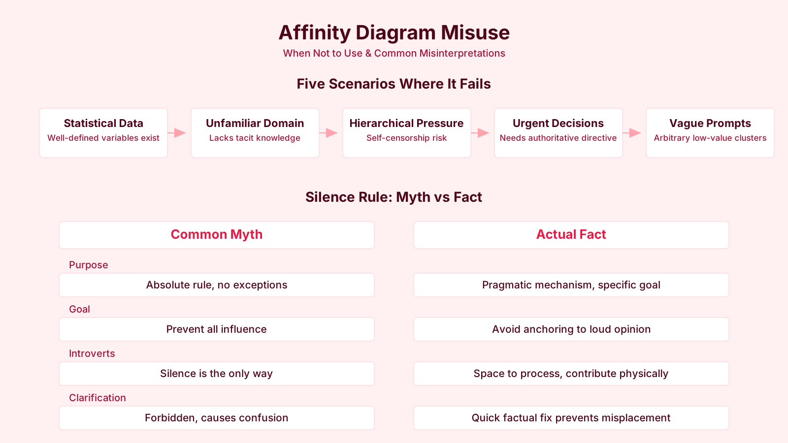
Despite its apparent simplicity, the affinity diagram harbors several challenges of using affinity diagrams that can undercut its effectiveness. One of the most pervasive is the illusion that the groupings are statistically valid. An affinity diagram is a qualitative synthesis tool, not a quantitative method. The clusters reflect the subjective judgment of the people in the room at that moment. A different group, or the same group on a different day, could produce a different arrangement. Treating the outcome as an objective truth can mislead decision-making, especially if the team skips validation with a broader stakeholder set.
Another pitfall is the "orphan note" problem. Items that don't comfortably fit any cluster often get forced into one, or worse, ignored altogether. Skilled facilitators insist that every note must find a home, even if it means creating a small cluster of related outliers. If too many items remain solitary, it might mean the original question was too broad or too vague. Facilitation inexperience further compounds the issue. Without a firm hand, verbal personalities can dominate the grouping phase by pointing at notes and suggesting categories, completely subverting the silent-sort principle.
Time pressure is a constant headache. A proper affinity exercise with a decent volume of data can take half a day, and strained project schedules rarely permit that luxury. The temptation to rush, skip the iterative refinement, and settle for sloppy headers leads to a diagram that satisfies the need for closure but lacks analytical depth. I've seen teams pump out a tidy wall of clusters in forty-five minutes that collapsed under any scrutiny because nobody paused to really think about why certain notes belonged together.
Misconceptions abound. Some managers believe an affinity diagram is just another word for brainstorming, but brainstorming generates the data; the affinity diagram organizes the data already generated. Others confuse it with a mind map, but a mind map radiates from a central concept with explicit hierarchical links, while an affinity diagram has no center and no predetermined links. And then there's the belief that digital tools automatically improve the process. While online whiteboards support distributed teams, they can strip away the tactile, spatial intelligence that comes from physically handling and rearranging paper notes. The haptic feedback of moving a note, of seeing it spatially, of standing back and scanning the wall, doesn't always translate to a sixteen-inch laptop screen.
Affinity Diagram vs Related Concepts and Tools
Understanding what distinguishes an affinity diagram from other grouping tools prevents its misapplication. The most frequent confusion arises between affinity diagrams and mind maps. A mind map, as popularized by Tony Buzan, is a radial, tree-like structure that breaks a central topic into branches and sub-branches. It's a deliberate, logical decomposition where the hierarchy is created by the mapper. An affinity diagram generates a flat network of clusters without a predetermined hierarchy, and the categories emerge bottom-up. If you already know the structure, a mind map is a better communication device; if you are trying to discover the structure hidden in mess, reach for an affinity diagram.
Ishikawa diagrams, or cause-and-effect diagrams, share a visual wall-of-notes aesthetic when done collaboratively, but they follow a rigid spine-and-bones format with categories pre-labeled (often the 6Ms: Machine, Method, Material, Measurement, Mother Nature, Manpower). The affinity diagram, by contrast, arrives at categories inductively. Sometimes after an affinity exercise, the team realizes that "Environment Stability Constraints" maps loosely onto "Mother Nature" and "Machine," but the path to that insight was organic, not forced.
The nominal group technique and Delphi technique are both structured methods for idea generation and prioritization, not for grouping. In nominal group technique, participants vote on ideas after silent generation and round-robin sharing, but there is no clustering step. In Delphi, experts give opinions anonymously across rounds until convergence, again without physically grouping the statements. An affinity diagram can be a follow-on to either of those methods, taking the top-voted ideas or converged statements and sorting them into themes.
The interrelationship diagraph is a cousin tool that explores cause-and-effect relationships between clustered items. Once an affinity diagram has organized scattered notes into themes, an interrelationship diagraph might analyze how the "Test Environment Instability" cluster affects the "Unclear Acceptance Criteria" cluster. The two tools often sit side-by-side in the quality management toolkit, but the affinity diagram always comes first: you need categories before you can map interactions between them.
In agile stories, user story mapping uses a form of affinity grouping to place stories into user activities, but story mapping deliberately arranges items along a backbone of user workflow steps, which is a predefined axis. The affinity diagram has no axis; it's a pure emergent classification. So they're different in intent, even if the sticky-note mechanics look identical.
Key Distinctions From Related Tools
- Mind maps impose predetermined hierarchies
- A mind map deliberately organizes a central topic into structured branches, excelling at communicating known relationships, while an affinity diagram uncovers emergent patterns inductively from raw, unstructured data.
- Ishikawa diagrams force predefined categories
- Cause-and-effect diagrams rely on a fixed spine-and-bones layout and preset labels like the 6Ms, channeling analysis along predetermined causal paths, whereas affinity diagrams allow themes to surface directly from the data without any imposed framework.
- NGT and Delphi do not group ideas
- The nominal group technique and Delphi method generate and prioritize expert input but include no clustering step; an affinity diagram naturally complements them by synthesizing their results into coherent thematic clusters.
- Interrelationship diagraph works after affinity
- The interrelationship diagraph charts cause-and-effect linkages among existing clusters, requiring a completed affinity diagram first to define the themes that it then connects systematically.
Evolution and Current Thinking on Affinity Diagrams
The evolution of affinity diagram methodology in project management reflects broader shifts toward visual collaboration and remote work. In the 1990s and early 2000s, the technique was almost exclusively an in-person workshop exercise, a staple of quality circles and Joint Application Development sessions. The rise of Agile in the mid-2000s brought it into everyday team rituals, notably retrospectives, where it lost some of its formality and gained a reputation as a "just do it" practice that didn't require specialized facilitators. That democratization was healthy but also led to sloppy implementations.
The past decade has seen digital tools transform the space. Miro, MURAL, Lucidspark, and Microsoft Whiteboard all offer infinite canvases where distributed teams can generate and group virtual sticky notes. These platforms introduce advantages: instant documentation, versioning, asynchronous contribution, and the ability to manipulate vast quantities of notes without running out of wall space. Yet a current debate simmers among experienced facilitators about whether digital affinity diagrams produce the same depth of insight. The argument isn't purely nostalgic. Physical space, peripheral vision, and the ability to physically walk around a wall of notes create a different cognitive engagement. Some research in cognitive psychology suggests that spatial memory aids recall and pattern recognition in ways that 2D screens do not replicate.
Current best practice leans toward hybrid approaches. A co-located core team might work with physical notes while remote participants join via a camera pointed at the wall, adding their input through a digital twin that a co-facilitator transcribes. Another evolution is the integration of affinity diagrams into design thinking sprints, where they serve as a transition between the empathize and define phases. Here, the tool is meticulously codified within a five-day structure, a stark contrast to its flexible origins.
There's also a growing recognition that the silent grouping phase, while powerful, needs adaptation for neurodiverse participants or those from cultures where silence can be interpreted as disengagement or assertion of hierarchy. Facilitators are experimenting with structured whispering rounds, or giving explicit permission to speak only to ask clarifying questions about a note's meaning, not about its placement. These adaptations reflect a maturing understanding that the technique, like any tool, must be calibrated to the humans in the room rather than dogmatically applied.
Another thread of evolution is the blending of affinity diagramming with artificial intelligence. Some digital whiteboard tools now offer "suggested clusters" based on natural language processing of the note text. The AI can propose groupings that the team can accept, reject, or refine. This can accelerate the early sorting rounds but introduces the risk of the algorithm imposing biased associations. The critical thinking step remains the team's responsibility, and practitioners who conflate speed with quality might accept machine-generated clusters that miss subtle, context-dependent relationships that only a human would catch.
Ultimately, the affinity diagram endures not because it's a novel concept, but because it solves a genuinely hard problem: converting a noisy, qualitative mess into the first draft of order. It doesn't require statistical software, it doesn't need a certified specialist, and it can be run in a warehouse cafeteria or a virtual whiteboard. Its core demand is that a group of people commit to the silent, iterative, sometimes frustrating work of collectively building sense, which is, at bottom, a microcosm of project management itself.