A burndown chart is a graphical tool used primarily in Agile project management to display the amount of work remaining in a sprint, release, or other time-boxed iteration against the time available to complete it. The vertical axis typically represents the outstanding work, measured in story points, hours, or task count, while the horizontal axis shows the passage of time, usually days. A downward-sloping line tracks actual progress, often compared to an ideal trajectory that represents a perfectly linear rate of completion. The chart offers a quick, visual snapshot of whether a team is on pace to finish the planned scope by the end date, making it one of the most common information radiators in Scrum and other iterative frameworks.
Burndown Chart Summary: Key Insights at a Glance
| Key Concept | Summary |
|---|---|
| Definition | A burndown chart is a visual management artifact in Agile that plots outstanding work against the remaining time in a time-boxed iteration, enabling real-time assessment of whether the team will deliver the committed scope. |
| Chart Axes | The vertical axis quantifies remaining effort (story points, hours, or tasks), while the horizontal axis tracks elapsed time in days, showing the team's consumption rate at a glance. |
| Progress Lines | An actual progress line slopes downward as work finishes; it is benchmarked against an ideal trajectory that assumes a constant, linear burn rate, highlighting deviations well before the iteration ends. |
| Core Purpose | The chart provides an instant visual verdict on whether the team's current pace will complete the planned scope by the deadline, functioning as a primary information radiator for daily standups and stakeholder alignment. |
| Main Strength | Its simplicity replaces granular task-level status with an intuitive trend line, making progress immediately legible to both technical teams and non-technical stakeholders. |
| Agile Origins | Burndown charts emerged alongside Scrum in the early 1990s, when Ken Schwaber and Jeff Sutherland introduced lightweight, transparent tools to replace cumbersome traditional status reports. |
| Historical Roots | The underlying pattern of visualizing work depletion over time originates in industrial engineering and manufacturing, drawing on cumulative flow diagrams long used for inventory control and throughput analysis. |
| PMBOK Recognition | PMBOK 6th Edition references burndown charts as a data analysis technique for schedule control, while the 7th Edition endorses any visual artifact that fosters transparency, inspection, and self-managing team dynamics. |
What Is a Burndown Chart?
A burndown chart definition centers on its role as a work-remaining versus time-remaining visualization. In purely technical terms, it is a time-series chart where the y-axis captures the total estimated effort of uncompleted tasks and the x-axis marks each day of the iteration. The downward slope of the actual work line gradually approaches zero as tasks are finished. The conceptual foundation is simple: if a team starts with one hundred story points on day one and has five days left, the chart makes it obvious whether the remaining points are trending toward zero by the final day. This clarity is the chart's main strength; it strips away the complexity of task-level status reports and replaces them with a trend line that anyone can interpret at a glance.
Within the broader discipline of project monitoring and controlling, the burndown chart belongs to a family of variance-at-a-glance techniques. Unlike a Gantt chart that emphasizes sequencing and dependencies, the burndown chart is a pure progress pulse. It answers one question: "Based on our current rate, will we finish on time?" The answer is never perfectly clean, because the line seldom follows the ideal path, but the deviation itself becomes the conversation starter. The chart does not explain why work is lagging; it simply signals that something needs attention. That singular focus is both its power and, as practitioners often discover, its limitation.
Key Insights on Burndown Charts
- Time-series progress visualization
- A burndown chart tracks the remaining effort across the sprint, revealing whether the actual completion trajectory aligns with the ideal path that ends at zero by the deadline.
- At-a-glance completion predictor
- By condensing granular task status into a single descending line, the chart provides an immediate yes-or-no answer on deadline risk, allowing stakeholders and team members to make rapid pacing adjustments without wading through lengthy status reports.
- Signals deviations, not causes
- A gap between the actual and ideal lines serves as a trigger to investigate, yet the chart intentionally exposes only the deviation, compelling the team to root out the underlying drag, whether it stems from underestimation, blockers, or scope creep.
Origins and Evolution of Burndown Charts
The origin of burndown charts in Agile can be traced to the early days of Scrum in the 1990s, when Ken Schwaber and Jeff Sutherland sought lightweight tools to replace cumbersome status reports. Although time-series work tracking existed long before in industrial engineering and manufacturing, the specific pairing of remaining effort with an ideal line emerged organically from the need for highly visible sprint progress indicators. In the first descriptions of Scrum, the burndown chart appeared as a hand-drawn graph on a whiteboard, updated daily by the team. That low-tech origin matters because it reflects a philosophy of simplicity and transparency over precision.
Outside of software, the underlying concept of tracking work depletion over time has roots in production control and inventory management, where cumulative flow lines have been used for decades. The kanban systems at Toyota, for instance, monitored work-in-progress levels visually, though not with a burndown line. What makes the burndown chart distinct is its explicit focus on remaining work as a diminishing quantity, directly linked to a time-boxed commitment. That time-box emphasis separates it from the more open-ended cumulative flow diagram, which doesn't presuppose a deadline. Over time, the burndown concept migrated from sprint-level use to release-level and even portfolio-level planning, adapting as Agile scaled beyond single teams.
Key Components of a Burndown Chart
Understanding the key components of a burndown chart is essential for interpreting what the visual is actually communicating. At minimum, a chart will display two plotted series: the actual work remaining and the ideal work remaining. The x-axis marks time, often in days, starting from the first day of the iteration and ending on the last. The y-axis measures the chosen work unit—story points, ideal hours, or task count. Story points are the most common in Scrum because they abstract away from individual variability in hourly estimates, focusing instead on relative complexity. However, some teams prefer hours when they need finer granularity, especially for short sprints where daily fluctuations matter.
The ideal line is a straight diagonal from the top-left corner to the bottom-right, representing what progress would look like if the team completed exactly the same amount of work each day. Reality never matches that line; the actual line wiggles, sometimes plateauing, sometimes dropping steeply, depending on integration challenges, scope changes, or discoveries during development. The gap between the actual line and the ideal line is the visual manifestation of variance. A common enhancement is adding a trend line based on a linear regression of recent actual data, which extrapolates forward to predict a realistic completion date. This predicted end date, when it drifts past the iteration boundary, becomes a hard-to-ignore warning sign.
Key Insights on Burndown Charts
- Actual and ideal lines
- The chart overlays a straight line of ideal progress against the actual remaining effort, making it immediately visible that real sprint trajectories rarely match a uniform daily pace.
- Axis scale choices
- The horizontal axis spans the sprint days, while the vertical axis measures the selected work unit, typically story points for relative sizing or hours for finer granularity in short iterations.
- Predictive trend warning
- A trend line derived from recent actual data uses linear regression to project a realistic completion date, giving the team a clear, early signal when the forecasted finish extends beyond the sprint boundary.
Types of Burndown Charts
There are several types of burndown charts in Agile that serve different planning horizons. The sprint burndown chart is the most widely recognized, tracking a single sprint's scope of up to four weeks. The release burndown chart operates at a higher level, tracking the progress of one or more teams toward a product release that may span several sprints. Each sprint completion reduces the remaining story points for the release, and the chart shows whether the release scope is being consumed at a sustainable pace. Release burndowns often introduce a complication: scope can change between sprints, so the line may move upward when new stories are added, producing a less smooth visual but a more honest one.
An epic burndown chart tracks the work of a large user story or feature that spans multiple sprints. It behaves like a mini release burndown, but its scope is more contained. Product burndown charts extend the concept to the entire product backlog trajectory, showing how quickly the backlog is being reduced over months or quarters. These longer-horizon charts often look more like a sawtooth pattern as work gets added and removed through continuous backlog refinement. Each type confronts the same fundamental tension: the burndown line can only accurately reflect completion pace if the denominator—the total work—remains stable. In environments where scope discovery is constant, the chart's slope may mislead unless scope changes are visibly annotated.
Burndown Charts in Project Management Frameworks
The burndown chart in PMBOK is not explicitly named as a formal tool in the PMBOK Guide's standard processes, but it aligns naturally with the Monitor and Control Project Work process and the Control Schedule process, particularly when an Agile or hybrid approach is used. PMBOK 6th Edition references burndown charts under the category of data analysis techniques for schedule control, and the 7th Edition, with its principles-based approach, supports any visual artifact that aids transparency and team self-management. The burndown chart functions as an information radiator that replaces more traditional schedule variance metrics like Schedule Performance Index (SPI) in predictive environments.
PRINCE2 Agile explicitly accommodates burndown charts as part of its guidance on tailoring the method for Agile delivery. Within a PRINCE2 project, the Team Manager may use a sprint burndown to provide the Project Manager with evidence of progress against the stage plan. The chart becomes a lightweight alternative to detailed checkpoint reports, preserving the principle of management by exception. When the burndown line deviates beyond agreed tolerances, it triggers an escalation, tying the Agile artifact back into the PRINCE2 governance structure. Hybrid environments often blend the burndown chart with milestone tracking on a Gantt chart, using the former for team-level detail and the latter for stakeholder summaries.
Cross-Framework Burndown Chart Insights
- PMBOK alignment and support
- Although the PMBOK Guide does not formally name burndown charts, the 6th Edition treats them as a data analysis technique for schedule control, and the 7th Edition endorses them as visual artifacts that foster transparency and self-management.
- PRINCE2 Agile integration
- In PRINCE2 Agile, Team Managers are permitted to use sprint burndowns as lightweight evidence of progress against the stage plan; deviations beyond agreed tolerances trigger escalation consistent with the management by exception principle.
- Hybrid chart combinations
- Hybrid environments combine burndown charts with Gantt milestone tracking, leveraging burndowns for granular team progress and Gantt charts for consolidated stakeholder reporting.
How Burndown Charts Are Used in Practice
In daily Scrum meetings, the practical application of a burndown chart revolves around answering whether the team is on track to meet the sprint goal. The Scrum Master or a team member updates the chart before or during the stand-up, and the visual immediately anchors the discussion. Instead of individuals reciting task-level status in a vacuum, the chart provides context: if the line has flattened for two days, the conversation shifts to identifying impediments rather than listing done tasks. Many teams project the chart on a screen or keep it prominently displayed in the team area, reinforcing shared ownership of the sprint outcome.
Beyond the daily pulse, the burndown chart informs sprint planning indirectly by revealing the team's historical velocity and its pattern of work completion. If past sprints consistently show a steep drop in the final days, a pattern of "student syndrome" emerges, where work gets deferred. Recognizing such patterns allows the team to adjust its sprint commitment or to investigate the root causes of late surge behavior. Product owners may also review release burndowns to manage stakeholder expectations about upcoming delivery dates, using the trajectory to negotiate scope trade-offs rather than pushing for fixed scope and fixed dates simultaneously.
Interpreting a Burndown Chart Accurately
Reading a burndown chart requires looking beyond the ideal line to understand what the shape of the actual line reveals about interpreting a burndown chart in sprints. A line that initially drops faster than expected can mean overestimation, low complexity at the start, or the team front-loading simpler stories. Conversely, a line that remains flat for the first few days suggests dependencies, blocked tasks, or an underestimation of setup complexity before delivering value. A common healthy pattern shows moderate progress early, a slight mid-sprint slowdown as integration issues surface, and then acceleration toward the end, resulting in a gentle S-curve rather than a straight line.
When the actual line sits consistently above the ideal line, re-planning conversations are inevitable. If the gap is small and the trend is converging, the team may finish close to the final day. If the gap is widening, finishing on time becomes improbable without scope reduction. Scope changes add another interpretive layer. Adding tasks mid-sprint causes the line to jump upward, which can obscure the underlying completion rate if not marked clearly. Some teams annotate the chart with scope change events, drawing vertical lines and noting the reason, which transforms the chart from a simple progress meter into a narrative of the sprint's challenges and decisions.
Key Takeaways on Burndown Analysis
- Actual line shape reveals causes
- A steep early drop often signals overestimation or a surplus of simple tasks, whereas a prolonged flat start points to dependency bottlenecks and intricate setup work.
- Ideal line gaps trigger re-planning
- When the actual line stays above the ideal but steadily converges, a timely finish remains feasible; a consistently widening gap, however, makes on-time completion unlikely without reducing scope.
- Scope changes need clear annotation
- Annotating mid-sprint task additions with vertical markers and concise reasons transforms the burndown chart into a narrative that captures sprint disruptions and the team’s adaptive decisions.
Common Challenges and Pitfalls with Burndown Charts
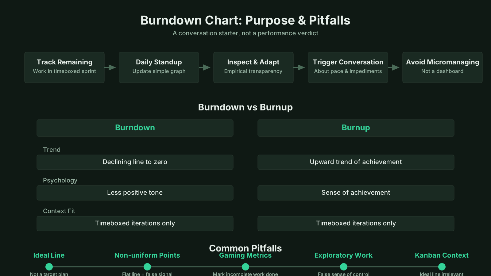
One of the most common pitfalls of using burndown charts is the assumption that the chart directly measures productivity or team performance. A burndown chart shows rate of story point burn, not value delivered, quality achieved, or even work effort per person. A team can close many low-point stories quickly while neglecting a critical high-point, high-risk item, producing a satisfying downward slope that masks the fact that the most important work remains untouched. This distortion arises because story points reflect relative size, not priority, so the chart must always be read alongside the sprint backlog's priority ordering.
Another frequent trap is treating the ideal line as a rigid performance target rather than a reference point. This misinterpretation can lead to management pressure that causes teams to game their estimates—inflating story points so the line looks better, or breaking tasks into artificially small pieces to get more frequent downward ticks. Such behaviors strip the chart of its diagnostic value. Additionally, when a burndown chart is used across multiple teams with different estimation baselines, comparing the slopes directly is meaningless, creating illusions of performance variance that doesn't exist. The tool works best within a single team context where estimation norms are stable.
Burndown Chart vs Burnup Chart and Other Tracking Tools
The distinction between a burndown chart and a burnup chart lies in what each tracks. A burnup chart displays completed work as an upward line, with total scope represented as a flat line that can be raised if scope increases. This makes scope change visibly explicit: when new stories are added, the total scope line jumps upward, and stakeholders can see completion progressing toward a moving target. The burndown chart, by contrast, typically collapses scope changes into the remaining-work line, making the chart harder to interpret without annotation. Burnup charts provide a clearer separation between "how much we have done" and "how much is left overall," which many product owners find more transparent for long-horizon planning.
When compared to earned value management (EVM) metrics, the burndown chart serves a similar purpose but with far less computational overhead. EVM requires detailed baselines and cost data to produce indices like SPI and CPI. A burndown chart, on the other hand, needs only a total work estimate and daily updates of remaining work. This makes it far more accessible to Agile teams that avoid heavy upfront planning. However, EVM offers more rigorous variance thresholds and forecasting formulas, which some large programs require for governance. In hybrid settings, project managers may use burndown charts for team-level tracking while reporting EVM-derived data to the program management office.
Tracking Tool Comparison Essentials
- Burnup charts show scope changes
- Burnup charts depict completed work as an upward-trending line alongside a total scope line that rises when new work is added, making scope expansions immediately visible and revealing progress against an evolving target.
- Burndown charts obscure scope shifts
- Burndown charts integrate scope changes into a single remaining-work line, complicating trend interpretation unless new work is annotated separately, while burnup charts maintain separate tracks for completed work and total scope, preserving visibility into scope evolution.
- EVM provides rigor, demands data
- Earned value management enforces strict variance thresholds and predictive formulas such as SPI and CPI that are indispensable for governing large programs, yet its dependence on detailed baselines and cost data often leads Agile teams to favor burndown charts for their simplicity and real-time feedback.
Current Thinking and Debates Around Burndown Charts
In recent years, some experienced Agile practitioners have questioned whether the burndown chart remains the most useful tracking tool, arguing that modern views on burndown charts in scrum recognize its limitations in complex knowledge work. The critique hinges on a subtle but important point: burndown charts emphasize output at the expense of outcomes. Finishing all planned stories by the sprint end does not guarantee that the increment achieved the sprint goal or that it solves a real user need. This has led many teams to supplement or replace burndown charts with cumulative flow diagrams, cycle time scatterplots, and probabilistic forecasting, focusing on flow efficiency and predictability rather than a binary on-track judgment.
Another debate centers on the psychological effect of displaying a burndown chart publicly. For some teams, the sight of the line lagging above the ideal line triggers urgency and collaboration; for others, it induces anxiety and demotivation, particularly if the chart is viewed by stakeholders who lack the context to interpret it charitably. Acknowledging this human factor, some coaches recommend using the chart as a team-owned diagnostic tool rather than a management report. When used internally, the team can have honest discussions about why the slope changed without fear of external judgment. This reflects a broader evolution in how Agile metrics are framed—less about performance proof and more about shared situational awareness.
As Agile scales, the burndown chart is being adapted rather than discarded. Scaled Agile frameworks like SAFe include iteration burndowns at the team level and program burndowns at the release train level, with careful guidance on integrating scope changes. The future likely holds more automation, with tools that compute burndown lines from real-time task board updates rather than requiring manual input, and more sophisticated overlays that highlight the probability of on-time completion based on historical velocity ranges. Yet the core idea remains unchanged: a simple line moving toward zero, forcing a daily acknowledgment of where the team stands versus where it thought it would be. That daily reckoning, more than any mathematical precision, is what gives the burndown chart its enduring value in an industry that frequently overcomplicates simple truths.