A cumulative flow diagram is defined as a visual project management tool that displays the number of work items in each state of a defined workflow over a continuous time period. It takes the form of a stacked area chart in which colored bands represent states such as backlog, analysis, development, testing, and done. The diagram makes it possible to see at a glance how many items are waiting, how many are active, and how many have been completed at any point on the timeline.
Although the term appears most frequently in Agile and Kanban contexts, the underlying logic applies to any project environment where work moves through identifiable stages. The chart does not measure effort or story points directly; it counts work items and uses that count as the basis for understanding flow. This distinction matters because a diagram that shows stable item counts can conceal uneven effort per item, which is one of the limitations discussed later.
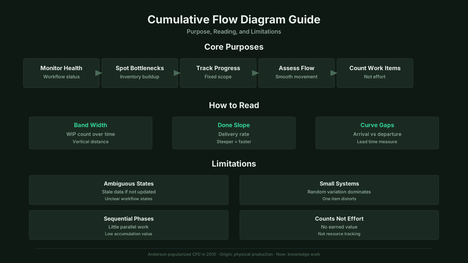
Cumulative Flow Diagram: Summary of Key Topics
| Key Concept | Summary |
|---|---|
| Core Definition | A cumulative flow diagram is a stacked area chart that tracks the number of work items in each workflow state over time, offering an immediate visual read on queue depth and flow balance. |
| Practical Applicability | While the term is most common in Agile and Kanban, the underlying logic applies to any project environment where work moves through distinct, observable stages. |
| Historical Origins | The technique has its foundations in queueing theory and lean manufacturing, where monitoring arrival and departure rates was essential for controlling inventory and exposing production bottlenecks. |
| Cross-Industry Transfer | Comparable cumulative flow visuals helped manufacturing supervisors track raw materials, work in process, and finished goods; this concept later migrated to knowledge work through pull systems and Kanban methods. |
| Management Interpretation | It enables project managers, Scrum masters, and delivery leads to quickly assess whether work is moving smoothly or accumulating in a particular state. |
| Constraint Identification | For example, when the testing band begins to widen faster than the development band, the team can identify test capacity as the emerging constraint well before it surfaces in discussion. |
| Key Limitation | Stable work item counts can hide significant variation in effort per item, which is a central limitation when this metric is used without supporting context. |
| Time Axis Granularity | The horizontal axis typically represents calendar time, spanning days to months depending on the project timeline and the level of detail required. |
What Is a Cumulative Flow Diagram?
Before using the tool in delivery management, practitioners often ask what is a cumulative flow diagram and how it differs from other progress charts. The cumulative flow diagram definition in project management is tied to flow-based delivery: it is a stacked area chart showing how many work items sit in each state of a workflow at each point in time. The horizontal axis represents time, while the vertical axis represents the cumulative number of work items that have entered the workflow up to that point.
In project management, the diagram functions as a monitoring instrument rather than a planning document. It enables a project manager, Scrum master, or delivery lead to observe whether work is flowing smoothly or accumulating in a particular state. When a band widens unexpectedly, it usually means that items are entering that state faster than they are leaving it. That simple visual cue can prompt a deeper investigation into blocked work, unresolved dependencies, or capacity constraints.
Origins and Cross-Industry Context
The cumulative flow diagram has roots in queueing theory and lean manufacturing, where understanding arrival and departure rates over time was essential for managing inventory and production bottlenecks. In manufacturing, similar cumulative flow representations helped supervisors see how raw materials, work in process, and finished goods moved through a production line. The core idea was transferred to knowledge work as teams began applying pull systems and Kanban methods to software development and service operations.
Outside project management, cumulative flow thinking appears in supply chain management, healthcare patient flow analysis, and IT service delivery. In those fields, the chart helps identify where demand outpaces capacity and where delays accumulate. This cross-industry credibility reinforces its value in project settings, but it also means that the tool must be adapted to the specific unit of delivery, whether that unit is a user story, a change request, a patient admission, or a production order.
For a project team, the practical translation is straightforward. Imagine a small software project where a board has four columns: ready, building, testing, and done. The cumulative flow diagram stacks the totals for these columns over a sprint or several sprints. If the testing band starts growing faster than the building band, the team can see that test capacity may have become the constraint, even before anyone verbalizes the problem.
Key Insights on CFD Fundamentals
- Flow-based progress visualization
- A cumulative flow diagram uses a stacked area format to show how many work items are in each workflow state at any given time, providing a flow-based view of progress rather than a simple task count.
- Time and item axes
- The horizontal axis tracks time progression, while the vertical axis indicates the cumulative number of work items that have entered the workflow up to that point, giving teams a clear sense of how volume builds over time.
- Monitoring, not planning tool
- As a monitoring instrument rather than a planning tool, the diagram helps delivery leads detect whether work is moving smoothly or accumulating in a particular state, prompting focused investigation into blockers or capacity constraints.
- Roots in manufacturing
- The technique originated in queueing theory and lean manufacturing, where it was used to track materials through production lines, and it was later adapted to knowledge work through Kanban and pull systems across delivery teams.
Key Components of a Cumulative Flow Diagram
The key components of a cumulative flow diagram include the time axis, the item count axis, and the colored bands that correspond to each workflow state. Each of these components carries specific information, and misreading any one of them can lead to wrong conclusions about delivery health. The bands are stacked from left to right across the timeline, with the lowest band often representing the first state and the highest band representing the final state or overall scope.
The horizontal axis normally shows calendar time, which can range from days to months depending on the project duration and the granularity required. The vertical axis shows cumulative item counts, not remaining effort. This is a critical distinction because teams sometimes expect the diagram to look like a burndown chart. A burndown chart starts high and goes down; a cumulative flow diagram generally climbs upward because completed work accumulates over time.
Workflow State Bands
Each colored band in a cumulative flow diagram represents one workflow state or queue. The thickness of a band at any given date indicates the number of items currently in that state. A thin band may mean that the state is mostly empty, while a thick band shows that work has accumulated there. The boundaries between bands show the points where items transition from one state to the next.
The top edge of a band records the cumulative arrivals to that state, while the bottom edge records the cumulative departures. The vertical distance between the top and bottom edges is the work in progress for that state. The overall top edge of the chart represents the cumulative scope that has entered the workflow, and the top edge of the done band represents cumulative completions. The gap between total scope and completed items reveals the amount of unfinished work still inside the system.
Time Axis and Item Count Axis
The choice of time units on the horizontal axis depends on the cadence of the project. Teams running daily standups often review a chart with daily granularity. Teams managing longer release trains may use weekly or even monthly intervals. The vertical axis is driven by the number of work items, which means that all items are treated as equivalent units. That is a simplification, and teams working with very different item sizes should be cautious when interpreting the chart as a pure measure of progress.
Another component frequently added in digital tools is a horizontal guideline representing a work in progress limit. When a band crosses that guideline, the team has exceeded its agreed capacity for that state. In manual settings, the same concept is simply a reference line drawn on the chart. This component makes the diagram actionable by connecting visual evidence to an explicit policy decision.
Interpreting a Cumulative Flow Diagram
A structured approach to how to read a cumulative flow diagram starts with examining the width of the colored bands rather than the jagged edges of any single line. The overall top line and done line are useful for understanding trend, but the real diagnostic information lives in the gaps between lines. A widening gap means accumulating work, a narrowing gap means clearing work, and a stable gap suggests the state is in balance.
When the done band grows steadily, the project is completing work. When the testing band grows while the done band remains flat, the system is producing work faster than it can validate it. This pattern often points to a quality bottleneck, unclear acceptance criteria, or insufficient testing capacity. The diagram does not tell the team why the bottleneck exists, but it narrows the search.
Band Width and Work in Progress
The width of each band is a direct proxy for work in progress in that state. If the development band is much wider than the testing band, the team may be optimizing local development throughput at the expense of end-to-end delivery. A project manager or delivery lead can use this observation to ask whether developers should shift effort toward testing or whether the testing state needs additional capacity.
Persistent widening of several bands at the same time often indicates that items are entering the workflow faster than they are leaving it. That can happen when a team pulls in too much work, when requirements change midstream, or when external dependencies delay handoffs. The diagram makes the aggregate effect visible even when individual blockers are hidden in team discussions.
Slopes, Throughput, and Cycle Time
The slope of the done band measures throughput, which is the number of items completed per unit of time. A flat done band shows no completions. A steep done band shows a period of high delivery. By comparing the slopes of different bands, a team can see where work is slowing down. The horizontal distance between the top and bottom edges of a band at a given item count approximates the average cycle time through that state for that item position.
This relationship is based on Little's Law, which links work in progress, throughput, and cycle time. A higher work in progress level with the same throughput means longer cycle time. A lower work in progress level can shorten cycle time without increasing throughput, simply because items spend less time waiting. The cumulative flow diagram provides the visual evidence for these trade-offs, making it a practical tool for delivery conversations.
Essential Insights on Interpreting CFDs
- Focus on band widths
- Reading a cumulative flow diagram begins with the width of each colored band, because the gaps between lines hold the diagnostic information, not the jagged edges of any single line.
- Gap dynamics reveal balance
- A widening gap reveals queued work is growing, a narrowing gap shows the team is clearing work faster than new work arrives, and a stable gap indicates that arrival and completion rates are in balance.
- Testing bottleneck pattern
- When the testing band expands while the done band remains flat, the system is producing work faster than it can be validated, and this pattern typically signals a quality bottleneck, unclear acceptance criteria, or insufficient testing capacity.
- Dev and testing imbalance
- A development band that is much wider than the testing band suggests local development throughput is being optimized at the expense of end-to-end delivery, prompting questions about shifting effort toward testing or adding testing capacity.
- WIP reduction shortens cycle time
- Reducing work in progress shortens cycle time without requiring higher throughput, because items spend less time waiting in queues between handoffs.
Cumulative Flow Diagram in Agile and Kanban
The cumulative flow diagram in Agile delivery functions as more than a status report; it exposes the health of the delivery system itself. In Kanban, the chart is a standard part of the management review ritual. Teams use it during service delivery reviews and operations reviews to discuss flow, bottlenecks, and improvement opportunities. It also appears in Scrum environments where teams have adopted Kanban practices within sprints, sometimes called Scrumban.
In an Agile setting, the diagram aligns with the principle of making work visible. A physical board shows the current state, but a cumulative flow diagram shows history. The combination is powerful because current board snapshots can hide chronic problems. A board may look clean today while the cumulative flow diagram reveals that the testing queue has been growing for the past three weeks.
Agile teams also use the chart to inspect their adaptation. If a team commits to reducing work in progress, the diagram should show narrower bands in the following iteration. If a team changes its definition of workflow states, the diagram should be reset or reconfigured to avoid mixing old and new data. Without that adjustment, the historical view can become misleading.
Cumulative Flow Diagram in PMBOK, PRINCE2, and BVOP
The placement of a cumulative flow diagram in PMBOK contexts is best understood as a supporting visualization rather than a formally prescribed management artifact. The PMBOK Guide emphasizes work performance data and control, while the cumulative flow diagram supplies the flow-based evidence needed for monitoring and controlling in adaptive work. It fits naturally within the monitor and control project work process when teams use Kanban or hybrid delivery.
PMBOK does not list the cumulative flow diagram among traditional earned value management tools, and project managers should not treat it as a replacement for schedule variance or cost performance index. Instead, the diagram complements those traditional measures by showing where work is stuck. In a hybrid environment, a project manager might use earned value for baseline variance and a cumulative flow diagram for flow health, with each tool answering a different question.
PRINCE2 and PRINCE2 Agile
PRINCE2 does not define a cumulative flow diagram as a management product, and its process model remains focused on stages, tolerances, and management by exception. In PRINCE2 Agile environments, however, the delivery teams may use Kanban-based controls within the agreed tolerances. A cumulative flow diagram can then serve as a progress report format for the project board or as a control document at stage boundaries.
The diagram is not part of PRINCE2's minimum requirements, but it can support the manage product delivery process by giving a team manager a clear picture of how products are moving through quality and approval states. When the board asks for evidence that a stage is under control, a stable cumulative flow diagram is useful supplementary information, though it does not replace the formal highlight report or checkpoint report.
BVOP Perspective on Cumulative Flow Diagrams
The Business Value-Oriented Project Management methodology does not mandate a specific chart type, but its focus on waste reduction and value delivery aligns with the diagnostic purpose of a cumulative flow diagram. BVOP categorizes waste such as overwork, perfectionism, and rejected acceptable work, and these conditions often manifest as persistent widening bands in review, testing, or rework states. A cumulative flow diagram can be used to detect the visual signature of that process damage.
BVOP also tracks business value points and considers whether declining value delivery should trigger reconsideration of a project. In that context, a cumulative flow diagram showing a flat done band over several periods can serve as one piece of evidence that value is not reaching the stakeholder. The chart itself is neutral; its interpretation depends on the framework's principles and the team's agreed policies.
CFD Roles Across Major Methodologies
- PMBOK supporting visualization
- Within PMBOK, the cumulative flow diagram is most effective as a flow-based evidence tool in the Monitor and Control Project Work process, particularly for Kanban or hybrid delivery teams.
- Not an EVM replacement
- PMBOK positions the cumulative flow diagram as complementary to earned value metrics such as schedule variance and cost performance index; it answers flow health questions rather than replacing baseline variance analysis.
- PRINCE2 optional support
- PRINCE2 does not mandate the cumulative flow diagram as a management product, but it supports the Managing Product Delivery process by visualizing how products progress through quality and approval states.
- Supplementary reporting evidence
- During a PRINCE2 stage assessment, a stable cumulative flow diagram gives the board supplementary evidence of delivery flow while the formal Highlight Report and Checkpoint Report remain the authoritative sources.
- BVOP waste detection
- BVOP aligns directly with the cumulative flow diagram's diagnostic value because persistently widening bands in review, testing, or rework states reveal waste categories such as overwork, perfectionism, and rejected acceptable work.
Purpose and Importance of a Cumulative Flow Diagram
The purpose of a cumulative flow diagram is to make invisible work, uneven flow, and accumulating queues visible before they undermine delivery forecasts. It creates a shared understanding of system behavior, which is harder to achieve through status reports that show only completed work or remaining effort. When a team can see the shape of its delivery history, discussions about delays become less personal and more evidence-based.
Project managers use the diagram to identify trends that may require preventive action. A gradual widening of the in-progress band over several weeks may not trigger an alarm on any single day, but the cumulative view makes the trend hard to ignore. The chart also helps in forecasting, because stable throughput and cycle time patterns support more reliable completion projections than subjective estimates alone.
The importance of the diagram grows in projects with many small work items and frequent releases. In those environments, traditional milestone tracking is too coarse to reveal flow problems. A cumulative flow diagram provides continuous feedback about whether the delivery machine is functioning as intended. That feedback loop is especially valuable when teams are expected to respond quickly to changing priorities.
Cumulative Flow Diagram vs Burndown and Burnup Charts
A frequent comparison is the cumulative flow diagram vs burndown chart distinction, because both are used to track progress but they reveal fundamentally different information. A burndown chart plots remaining work against time and shows whether the team is on track to finish a selected scope by a deadline. A cumulative flow diagram plots cumulative work in each state and shows whether the flow is healthy irrespective of a fixed deadline.
A burnup chart is closer to a cumulative flow diagram because it shows cumulative completed work and total scope over time. However, a burnup chart typically uses two lines: total scope and completed work. A cumulative flow diagram uses multiple bands for all intermediate states. This additional granularity is the main advantage of the cumulative flow diagram, because a burnup cannot show where incomplete work is stuck.
Other related tools include lead and cycle time scatterplots, control charts, and aging work in progress charts. A lead time scatterplot shows the distribution of item durations, while a control chart identifies outliers. An aging chart shows how long items have been in progress. The cumulative flow diagram complements these tools by showing the systemic pattern over time, but it does not replace the need for item-level investigation when a specific delay requires root-cause analysis.
Flow Chart Comparison Key Insights
- Burndown tracks deadline progress
- By plotting remaining work against time, a burndown chart indicates whether the selected scope is on track for completion by the fixed deadline.
- CFD reveals flow bottleneck states
- A cumulative flow diagram uses multiple bands to represent every intermediate state, revealing where incomplete work accumulates and highlighting bottleneck stages that a burnup chart cannot isolate.
- CFD complements item-level tools
- The cumulative flow diagram reveals systemic patterns across the workflow over time, but it complements rather than replaces scatterplots and control charts when investigating the root cause of a specific delay.
Practical Applications Across the Project Lifecycle
Realistic cumulative flow diagram examples from project teams show how the chart is used during execution, monitoring, and retrospectives rather than during upfront planning. In the early stages of a project, the diagram may not have enough data to be useful. Once the team has moved a meaningful number of items through at least two states, the visual patterns begin to support operational decisions.
During project execution, a Scrum master or delivery lead may review the diagram daily or weekly to spot emerging bottlenecks. If the testing band widens while development stays stable, the team can immediately discuss whether testers need help or whether acceptance criteria are causing rework. In a Kanban system, the same observation might trigger a temporary work in progress limit adjustment or a request for additional capacity.
At the end of an iteration or release, the cumulative flow diagram supports retrospective analysis. The team can compare the diagram from the current period with previous periods to evaluate whether flow improved. If a policy change was supposed to reduce queue buildup and the bands remain thick, that is evidence that the change did not achieve its intended effect. The diagram can also inform stakeholder communications by providing a visual story about delivery stability without overwhelming nontechnical audiences with detailed metrics.
In portfolio management, the diagram is less common but valuable when evaluating the health of continuous delivery pipelines. Portfolio managers may aggregate flow data across teams to identify systemic constraints affecting multiple projects. The visual nature of the chart makes it easier to share across governance bodies than tables of raw data. Even so, aggregation should be done carefully because different teams may define workflow states differently.
Common Challenges and Limitations of Cumulative Flow Diagrams
Several limitations of cumulative flow diagrams arise when teams view them as universally accurate measurement instruments instead of as models of a workflow. One common challenge is inconsistent state definitions. If one team member moves an item to testing only after code is complete, while another moves it earlier for review, the chart will not reflect a meaningful flow. The team must agree on explicit definitions before relying on the diagram.
Another limitation is the equal weighting of work items. A large epic counts the same as a small bug fix. In mixed-backlog environments, the cumulative count can obscure significant differences in effort and value. Teams sometimes mitigate this by splitting work into roughly similar-sized items or by using separate charts for different classes of service. Without that discipline, the chart may show flat completion while the team is actually delivering several large, high-value items.
A common misconception is that a cumulative flow diagram can replace a project schedule. It cannot show whether a fixed deadline will be met with certainty, and it does not account for dependencies outside the visualized workflow. Another misconception is that a perfect, parallel band structure is always the goal. Some variation is normal, and a completely flat line may indicate that no work is being started or completed at all. The chart should be interpreted in context rather than against an idealized template.
Teams also encounter the trap of changing the workflow states mid project without resetting the diagram. This creates historical discontinuities that make trend analysis unreliable. The chart should be reconfigured only between iterations or releases, and the reasons for the change should be documented. Finally, automated tools can generate cumulative flow diagrams that look authoritative even when the underlying data is incomplete. Project managers should verify that the data source captures all work items and that excluded items do not distort the view.
Key Insights on CFD Limitations
- Define workflow states explicitly
- Teams need explicit, shared definitions for every workflow state, since inconsistent interpretations of when work enters or leaves a stage will distort the cumulative flow diagram and undermine its value as a decision-making tool.
- Mixed item sizes mask true progress
- When a backlog contains items of vastly different effort and value, cumulative counts treat every item as equivalent and can hide real delivery. Teams should split work into roughly similar-sized items or use separate charts for different classes of service.
- CFDs cannot ensure deadline certainty
- Cumulative flow diagrams cannot guarantee that a fixed deadline will be met and typically ignore external dependencies that influence delivery. Automated tools may present these charts as authoritative even when the underlying data is incomplete, creating false confidence.
Evolution and Current Thinking on Cumulative Flow Diagrams
Current thinking on cumulative flow diagrams reflects a shift from simple status charts toward flow metrics and probabilistic forecasting tools. Early adopters often used the diagram as a static image in team rooms. Modern project management tools generate the chart automatically from digital boards and allow users to filter by date range, class of service, or team. This has increased accessibility but also reduced the need for manual interpretation skills.
The integration of cumulative flow diagrams with Little's Law and throughput forecasting has strengthened their analytical value. Teams can estimate completion dates by applying observed throughput rates to remaining work, treating the diagram as the basis for Monte Carlo simulations. This approach recognizes uncertainty rather than pretending that a single date will be correct. The diagram supplies the historical flow data that makes such forecasts possible.
There is ongoing debate about how much emphasis to place on the cumulative flow diagram versus other flow metrics. Some practitioners argue that lead time distribution charts and aging work in progress charts are more actionable for day-to-day decisions. Others maintain that the cumulative flow diagram remains the best single view for systemic problems. The most balanced view is that the cumulative flow diagram works best as part of a broader flow metric suite, not as a standalone answer.
In hybrid project management, the diagram has found a place alongside traditional status reporting. Project managers may include a cumulative flow image in governance packs while still presenting milestone and budget data. This hybrid use reflects a broader trend toward visual management in projects that are not fully agile. The diagram's simplicity is both its strength and its risk: it communicates quickly, but it requires an informed reader to avoid drawing the wrong conclusion from a single visual glimpse.