A control chart in project management is a statistical tool used to monitor process performance over time and distinguish between normal, expected variation and variation caused by exceptional or assignable circumstances. The control chart definition in project management focuses on stability rather than conformity to requirements, which is a subtle but important distinction. It is one of the seven basic quality tools recognized in the PMBOK framework and appears primarily during the Control Quality process. In practice, the chart plots successive measurements of a project process or deliverable characteristic against statistically derived control limits, helping project teams decide whether a process is stable enough to predict future outcomes.
Control Chart Key Topics at a Glance
| Key Concept | Summary |
|---|---|
| Control Chart Overview | A statistical tool that tracks process performance over time to separate inherent variability from exceptional events requiring intervention. |
| Structural Components | Successive measurements are plotted against a central reference line and statistically derived upper and lower control limits, typically set three standard deviations from the mean. |
| Primary Purpose | The core objective is to assess whether the process generating deliverables is stable and predictable, rather than to evaluate whether any individual output satisfies a specification. |
| Special Cause Signals | A single point outside the control limits or a nonrandom sequence of points indicates the probable presence of special cause variation and warrants immediate investigation. |
| Common Applications | Project managers use control charts to monitor defect rates, cycle times, cost variances, schedule variances, and other repeatable process metrics, enabling early detection of performance shifts. |
| Interpreting Variation | Points fluctuating within the control limits in a bounded but unstructured pattern generally represent routine noise, suggesting that a fundamental process overhaul is unnecessary. |
| Role of the Center Line | Although project managers may prefer the center line to reflect a contractual target or desired service level, the control chart objectively depicts the process's actual performance. |
| Common Cause Variation | Routine variation stems from the cumulative effect of numerous small, persistent factors such as minor differences in team capability, tool responsiveness, or task complexity. |
What Is a Control Chart in Project Management?
The term control chart in project management refers specifically to a graphical representation of process data collected over time, set against a center line and statistically calculated upper and lower control limits. Its purpose is not to evaluate whether a single deliverable meets a specification, but to reveal whether the underlying process that produces deliverables is behaving in a predictable way. A stable process produces points that cluster around the center line within the control limits in a pattern that reflects only common cause variation. A signal such as a point outside the limits or an unusual sequence of points suggests that special cause variation has entered the process and warrants investigation.
Control charts have their roots in statistical process control, a discipline developed for manufacturing but now applied widely in project quality management. Project managers use them to track defect rates, cycle times, cost variances, schedule variances, and other process metrics that can be measured repeatedly. The chart itself is simple in appearance, but its interpretation requires an understanding of variation. Without that understanding, teams often mistake normal fluctuations for problems or miss genuine signals that the process has changed.
Imagine a project team tracking how long it takes to resolve defects after testing. Most days cluster around fifteen hours, with occasional twenty-hour spikes. A control chart shows whether those spikes fall outside the range expected from historical data. If a point sits outside the control limits, the team investigates what happened that day. If points bounce inside the limits in an unpredictable but bounded way, the variation is probably routine noise and does not require a process overhaul. That distinction is the core value of the tool.
Control Chart Key Insights
- Control chart definition
- A control chart plots process data over time against a central line and statistically derived upper and lower control limits, making variation visible and distinguishing routine noise from meaningful shifts.
- Purpose is predictability
- Its primary value is revealing whether the underlying process is stable and predictable over time, rather than judging whether an individual output meets a specification.
- Common cause variation pattern
- In a stable process, data points cluster randomly around the center line and remain within the control limits, indicating that only routine common cause variation is present.
- Special cause variation signals
- Data points falling outside the control limits or forming non-random patterns signal that special cause variation has entered the process and warrants immediate investigation.
- Application and interpretation
- In practice, project managers track metrics such as defect rates and cycle times, but accurate interpretation depends on understanding process variation to avoid reacting to false alarms while still detecting genuine signals.
Key Components of a Control Chart
The key components of a control chart include a center line, upper and lower control limits, sequential data points, and the time scale on which those points are plotted. The center line typically represents the mean or median of the process data. The upper control limit, often abbreviated UCL, and lower control limit, often abbreviated LCL, are calculated from process data rather than customer requirements or contractual thresholds. In traditional control charts, these limits are commonly set at three standard deviations from the center line, which establishes a range where roughly 99.7 percent of points should fall if the process is stable and normally distributed.
Center Line and Control Limits
The center line is derived from historical process performance, not from a target value. This is a frequent source of confusion. A project manager might want the center line to represent a contractual obligation or a desired service level, but the control chart shows what the process is actually doing. The upper and lower control limits define the natural variation of the process. They are not fixed by the customer, and they differ from specification limits, which define acceptable output boundaries. A process can be statistically stable yet incapable, meaning all points fall within control limits but many exceed specification limits.
Data Points and Patterns
Each data point on a control chart represents an individual measurement or a sample statistic such as a mean or range. The sequence of points matters as much as their position. A single point outside the control limits is the most obvious signal, but patterns within the limits can also indicate instability. Runs of points on one side of the center line, gradual trends toward the limits, and cyclic patterns may all suggest a process shift. Many practitioners use additional run rules to detect these subtler signals. However, adding too many rules increases the rate of false alarms, so chart interpretation requires judgment.
Common Cause and Special Cause Variation
Common cause variation is the ordinary, inherent variation present in any process. It comes from the cumulative effect of many small factors, such as minor differences in team skill, tool responsiveness, or task complexity. Special cause variation is the result of an identifiable, unusual event, such as a team member leaving mid-iteration, a server outage, or a sudden change in requirements. A control chart helps separate these two types of variation. Treating common cause variation as if it were special cause leads to overadjustment, which can actually increase process variability over time. Treating special cause variation as if it were common cause lets real problems go unaddressed.
Origins and Cross-Industry Context
The origins of the control chart trace back to Walter Shewhart, who developed the technique at Bell Laboratories in the 1920s. Shewhart was working on improving telephone equipment manufacturing and recognized that managing quality required more than inspecting finished products. His insight was that variation in production could be measured, modeled, and used to signal when a process had changed. W. Edwards Deming later promoted Shewhart’s ideas in Japan and elsewhere, embedding them in broader quality management philosophies.
Control charts are prominent outside project management in manufacturing, healthcare, software engineering, and service operations. Hospitals use them to monitor infection rates and patient wait times. Manufacturers use them to track dimensional tolerances and defect counts. Software teams use them to visualize cycle time and throughput. This cross-industry credibility helps explain why the tool appears so frequently in project quality management. The basic statistical logic remains the same across industries, even though the metrics and data collection methods vary significantly.
Core Takeaways on Control Charts
- Shewhart's Bell Labs origin
- Walter Shewhart introduced the control chart at Bell Laboratories in the 1920s to bring statistical rigor to telephone equipment manufacturing and reduce process variability.
- Variation as a signal
- Shewhart's central insight was that variation in production data could be measured and modeled to distinguish routine fluctuations from meaningful process changes, enabling intervention before defective output accumulated.
- Deming's global promotion
- W. Edwards Deming later championed Shewhart's methods in Japan and around the world, making control charts a foundational element of modern quality management and continuous improvement.
- Cross-industry adoption patterns
- Control charts have become standard practice in manufacturing, healthcare, software engineering, and service operations because they apply the same statistical logic to widely different metrics such as part tolerances, infection rates, and cycle time.
Control Chart in PMBOK and PRINCE2
Control chart PMBOK placement is within the Control Quality process, which belongs to the Monitoring and Controlling Process Group and the Project Quality Management Knowledge Area. The PMBOK Guide recognizes the control chart as one of the seven basic quality tools, alongside tools such as the cause-and-effect diagram, histogram, Pareto chart, and scatter diagram. In Control Quality, the project team uses control charts to assess the stability of processes associated with deliverables and to identify variation that may require corrective action. The chart is not a stand-alone quality report; it is used with quality metrics, work performance data, and approved change requests.
Role in Control Quality
Within Control Quality, a control chart helps the team understand whether measured results are within expected variability. For example, a project manager tracking defect density per release can plot the data, calculate control limits from prior releases, and see whether the current release represents a meaningful shift. If a point falls outside the control limits, the team investigates the cause. The findings may lead to a change request, a defect repair, or an update to process documentation. The control chart therefore contributes to quality control measurements and, when necessary, to recommended preventive or corrective actions.
PRINCE2 Perspective
PRINCE2 does not mandate the use of control charts, but the methodology’s quality theme and management stage boundaries support their use. A PRINCE2 project can define quality criteria, tolerances, and quality methods in the quality management approach. Control charts can then provide objective evidence that a process remains within agreed tolerances. This is especially relevant when a project produces repeated deliverables, such as regular reports, releases, or service requests. In that sense, the control chart supports PRINCE2’s emphasis on management by exception, because it helps project boards and project managers identify deviations that genuinely require escalation.
Control Chart in Agile and Hybrid Environments
The control chart in Agile environments often takes a slightly different form than the traditional Shewhart chart. Many Agile tools display a control chart for cycle time, lead time, or throughput, with a rolling average and bands around that average. Agile teams use these charts to understand flow rather than to enforce manufacturing-style quality gates. A Kanban team might watch a control chart of cycle time to see whether recent work items are taking unusually long. A sudden upward trend may indicate a blocked dependency, a new technical risk, or a capacity issue that demands a focused conversation.
In Scrum, control charts can support the Sprint Retrospective by providing empirical data on how the team’s work patterns are changing. The team may track defect discovery rate, build failure frequency, or time from code complete to tested. Instead of reacting to a single bad day, the chart helps the team see whether performance is stable or shifting. Hybrid projects often combine this flow-oriented use with more traditional stage gate controls. A hybrid team may use a control chart during iteration cycles for process health, while also relying on predictive quality checks at major phase milestones. That dual approach works when the team is clear about which metrics are for learning and which are for formal acceptance.
Core Takeaways on Agile Control Charts
- Agile chart adaptations
- In Agile settings, control charts track cycle time, lead time, or throughput using rolling averages and adaptive bands, replacing the static quality limits typical of manufacturing processes.
- Flow-focused interpretation
- These charts help Agile teams interpret workflow health: a sharp increase in cycle time often points to blocked dependencies, emerging technical risks, or capacity constraints that require immediate team attention.
- Scrum retrospective support
- During Sprint Retrospectives, Scrum teams rely on control charts to analyze defect discovery rates, build failure frequency, and the time from code complete to tested, which reveals whether performance is stable, improving, or deteriorating over successive sprints.
- Hybrid control integration
- In hybrid projects, flow-oriented control charts monitor iteration-level process health, while traditional stage-gate controls provide predictive quality assessments at major phase milestones, together offering a comprehensive view of delivery risk.
Purpose and Importance of a Control Chart
The purpose of a control chart is to provide a rational basis for action when process data changes. Without such a tool, project managers often react to every fluctuation as if it were significant. This reaction can create more instability than it resolves. The control chart makes the distinction between noise and signal explicit, so the team can investigate only the meaningful deviations. That discipline reduces wasted effort and prevents unnecessary interventions in an otherwise stable process.
Control charts also support predictability. A stable process, even one with relatively wide control limits, is predictable within those limits. The team can forecast future performance with more confidence because the variation is understood. When special cause variation appears, the chart provides an early warning that the past may no longer predict the future. This is particularly valuable in long-running projects, where small process drifts can accumulate into significant schedule or cost problems over time. The tool turns quality monitoring into an evidence-based conversation rather than a subjective argument about whether performance is acceptable.
How a Control Chart Is Used in Practice
Using a control chart in project management typically involves selecting a meaningful process metric, collecting data in time order, calculating the center line and control limits from a baseline period, and then continuing to plot new data as it arrives. The chart becomes a living dashboard rather than a one-time report. Common metrics include defect density, rework hours, schedule variance, cost variance, response time to stakeholder requests, and build failure frequency. The choice of metric depends on the project context and what the team most needs to stabilize or improve.
For example, a software project manager may track the number of critical defects found per testing cycle over several sprints. After enough baseline data exists, the manager can establish control limits and identify any cycle that falls outside them. A higher than expected defect count might point to new code complexity, a change in team composition, or an ineffective test environment. A lower than expected count might be good news, but it could also indicate incomplete testing. The control chart does not answer those questions by itself, but it tells the team when asking them is worthwhile.
Control charts are also used during the execution and monitoring phases of projects, rather than initiation or closing. The project manager, quality manager, or process owner is usually responsible for maintaining the chart. In Agile teams, the role may rotate or be shared. Real-time dashboards have made it easier to maintain control charts without heavy statistical work, but the interpretive skill remains central. A chart that no one understands will not improve decisions, no matter how automated the data collection may be.
Practical Control Chart Essentials
- Living process dashboard
- A control chart functions as a live operational dashboard, continuously plotting new data points against limits derived from a stable baseline rather than serving as a one-time static report.
- Context-driven metric selection
- Teams select metrics such as defect density, rework hours, schedule variance, or build failure frequency according to the specific aspects of project performance they need to stabilize or improve.
- Baseline data sets limits
- Once the team has collected sufficient baseline data, they establish control limits that identify unusual cycles, for example a software manager detecting an unexpected surge in critical defects across consecutive testing cycles.
- Chart prompts investigation
- An out-of-control point does not reveal its own root cause, but it directs the team to examine contributing factors such as code complexity and incomplete test coverage, and real-time dashboards still require skilled interpretation.
BVOP Perspective on Control Charts
The BVOP perspective on control charts connects the tool to the monitoring of process health and value delivery. In Business Value-Oriented Project Management, control charts can track Business Value Points over time, where persistent decline may serve as an early signal that a project or process is becoming economically questionable. They can also help visualize signs of process damage, which BVOPM describes as invisible organizational harm that accumulates through overwork, perfectionism, and rejected acceptable work. A control chart showing rising rework or prolonged cycle time does not prove these problems exist, but it can prompt the deeper investigation BVOPM encourages.
Common Challenges, Pitfalls, and Misconceptions
Several control chart misconceptions cause teams to misuse the tool. One common mistake is confusing control limits with specification limits. Control limits come from process data and describe what the process is doing, while specification limits come from customer or contractual requirements and describe what is acceptable. A process can be inside its control limits and still fail specifications, or outside a control limit while still meeting the specification. The two boundaries answer different questions.
Another challenge is insufficient baseline data. Control limits calculated from very few data points are unstable and often produce misleading signals. Teams may also collect data inaccurately or inconsistently, especially when the project environment changes frequently. In those cases, the chart may reflect data collection problems rather than true process variation. Some project managers assume that any point outside the control limits means a defect occurred or the project is failing. That assumption is incorrect. It means a process signal has occurred, and the team should look for a cause before drawing conclusions.
Overreaction to normal variation is another common pitfall. A project manager who sees a downward trend in two consecutive weeks might immediately change the process, yet such short-run patterns often occur by chance. Tampering with a stable process can increase variation and reduce predictability. Control charts should also not be applied to every metric available. Not every measurement is important enough to justify the data collection and interpretation effort. Selecting metrics that tie directly to project objectives keeps the chart relevant and prevents information overload.
Essential Insights on Chart Misconceptions
- Control limits differ from specification limits
- Control limits reflect actual process behavior derived from the data, whereas specification limits represent the range of acceptable performance defined by customer or contractual requirements.
- Small samples produce unstable limits
- Control limits calculated from a small number of data points are statistically unstable, which increases the risk of false signals and misguided interpretations.
- Poor data collection distorts charts
- When data collection is inaccurate or inconsistent, especially in fast-changing environments, the chart may display data quality issues instead of genuine process variation.
- Out-of-control points are not defects
- A point outside the control limits signals a process shift or unusual variation, but it does not by itself confirm that a defect occurred or that the project is failing.
- Short-run patterns often occur by chance
- A downward trend spanning only two consecutive weeks is often no more than random variation, so adjusting the process on the basis of such short-run patterns is frequently an overreaction.
Relationship to Other Project Management Concepts
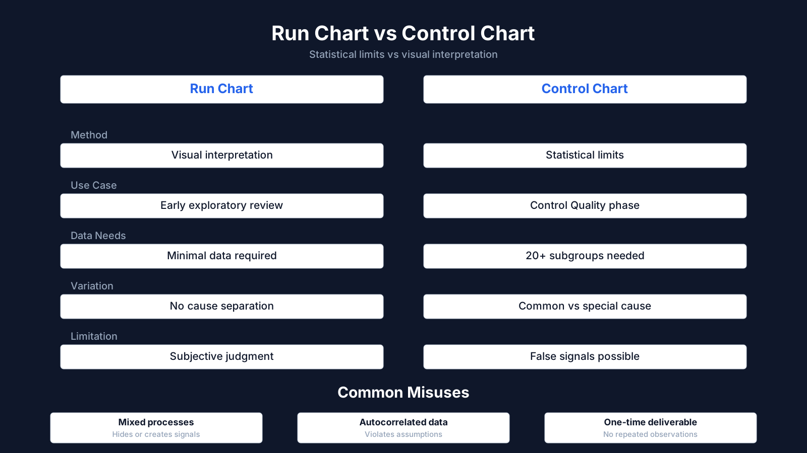
The control chart vs run chart distinction is a foundational point in quality management. A run chart plots data over time and shows trends, but it does not include statistically calculated control limits. A control chart adds those limits, making it possible to distinguish special cause variation from ordinary variation. In practice, many project teams start with a run chart because it is easier to create. Moving to a control chart adds analytical power but also requires more statistical discipline.
Control charts relate closely to other quality tools. A histogram shows the distribution of data but does not preserve the time order. A Pareto chart ranks categories of defects by frequency and helps identify where to focus improvement. A scatter diagram examines relationships between two variables. The control chart uniquely combines time order with variation limits, which is why it is valuable for monitoring process stability. It also connects to earned value management when used to track schedule or cost performance indices over time. If the cost performance index shows a steady downward drift, a control chart can help determine whether the drift is a real trend or ordinary fluctuation. That link between quality and project performance data makes the control chart a bridge between process quality and overall project control.
Evolution and Current Thinking
The modern control chart has evolved beyond its industrial origins into a flexible monitoring tool supported by automated dashboards, real-time data feeds, and analytics platforms. Many project management tools now generate control charts without manual calculation, which lowers the barrier to entry. At the same time, this convenience can create a false sense of statistical understanding. Software can produce a chart, but it cannot decide what the limits mean in a specific project context. That judgment remains a human responsibility.
Current thinking also reflects a more nuanced view of variation. Traditional control charts assume a relatively stable process and independent data points, assumptions that do not always hold in project environments. Project work often involves changing teams, shifting priorities, and irregular data collection. Some practitioners argue that control charts should be used selectively in projects, focusing on repeatable processes rather than one-time activities. Others advocate for control charts based on percentiles or non-parametric methods when data are not normally distributed. Agile teams often prefer cycle time scatterplots and cumulative flow diagrams, which provide related insights without the same statistical assumptions. These different schools of thought do not make the control chart obsolete. They refine when and how it should be used, reinforcing the core idea that understanding variation is essential for managing work effectively.
Key Insights on Control Chart Evolution
- Digital tools lower the barrier
- Control charts have shifted from manual, calculation-heavy tools to automated outputs embedded in real-time project dashboards, which lowers the technical barrier but also changes how teams engage with the underlying data.
- Automation creates false confidence
- Because software can generate charts without manual calculation, teams may mistake the presence of a chart for valid statistical insight, even though the tool cannot determine whether control limits are meaningful in a particular project context.
- Traditional assumptions often fail
- Standard control charts presume process stability and independent observations, but project environments with evolving teams, shifting priorities, and irregular data collection routinely violate these assumptions, weakening the charts' diagnostic value.
- Adapted methods and alternatives emerge
- Contemporary practice reserves control charts for repeatable workflows, uses percentile or non-parametric methods when data are non-normal, and increasingly turns to agile visual tools such as cycle time scatterplots and cumulative flow diagrams.