A cause-and-effect diagram is defined as a structured visual tool that enables project teams to systematically identify, organize, and display potential causes contributing to a specific problem, outcome, or event. Often referred to as a fishbone diagram or an Ishikawa diagram, its primary function within project management is to move conversations away from surface-level symptoms and toward a comprehensive exploration of root causes that may be lurking behind quality defects, schedule slippages, cost overruns, or process failures. By laying out cause categories along branches that feed into a central spine, the diagram creates a shared mental model that helps diverse stakeholders participate in problem-solving without jumping prematurely to conclusions.
Cause-and-Effect Diagram: Key Takeaways
| Key Concept | Summary |
|---|---|
| Definition | A cause-and-effect diagram is a visual framework that systematically maps potential root causes of a defined problem, helping teams trace contributing factors in a structured, collaborative way. |
| Alternative Names | Widely recognized as a fishbone diagram for its skeletal layout, or an Ishikawa diagram in tribute to its originator, this tool is a cornerstone of quality and process improvement. |
| Purpose | The primary goal is to shift analysis beyond immediate symptoms, driving a comprehensive investigation into the root causes behind defects, schedule slips, or performance failures. |
| Origin | Kaoru Ishikawa introduced the method in the 1960s at the University of Tokyo, empowering shop-floor workers to graphically map quality issues and democratize root-cause analysis. |
| Categories | Early applications adopted the classic 6Ms: Machines, Methods, Materials, Manpower, Measurement, and Mother Nature (Environment), providing a ready-made structure to launch causal brainstorming. |
| Structure | The standard layout features a horizontal arrow, its head pointing to the right, representing the problem. Radiating branches list potential causes; every item must be a cause, never a symptom, to keep the focus on underlying factors. |
| Systemic Thinking | Effective application demands systemic inquiry: teams iteratively ask "why" to drill into each causal branch, revealing interdependencies and deeper layers of influence that surface-level fixes often miss. |
| Software Adaptation | In software projects, the categories often shift to People, Process, and Technology, allowing teams to investigate areas such as team dynamics, code review practices, and CI/CD pipeline stability. |
Origins and Development of the Cause-and-Effect Diagram
The cause-and-effect diagram origin lies squarely in the world of post-war Japanese manufacturing quality control. Kaoru Ishikawa, a pioneer at the University of Tokyo, introduced the tool in the 1960s as a way for shop-floor workers to map out the factors that could influence a particular quality issue. Ishikawa wanted a method that did not require advanced statistical training yet still brought rigor and structure to group problem-solving. The diagram quickly became a staple of the total quality management movement and was later embedded into global quality standards, such as those championed by the American Society for Quality. Its early applications focused heavily on production lines, where root causes of defects were analyzed through a small set of standardized categories, famously the 6Ms: Machines, Methods, Materials, Manpower, Measurement, and Mother Nature (environment). Over time, the approach crossed into healthcare, service industries, software engineering, and, naturally, project management. In each domain the logic remained the same but the category labels were adapted to fit the context. Airline safety investigators, for instance, might use categories like Personnel, Procedures, Equipment, and Environment. What matters is not the exact labels but the discipline of forcing causes into buckets that prevent a team from fixating on the first, most obvious factor.
Within project management, this borrowing from industrial engineering makes perfect sense. Projects, after all, are temporary organizations that produce unique deliverables under constraints. When a deliverable consistently fails testing, or when a milestone is missed repeatedly, the instinct is often to blame the person nearest to the problem. The cause-and-effect diagram pushes back against that instinct by requiring the team to consider systemic influences: perhaps the handoff process is undefined, the testing environment does not mirror production, or the acceptance criteria were ambiguous. This cross-industry pedigree gives the tool a credibility that goes beyond mere brainstorming; it is rooted in decades of tangible performance improvement work.
Key Insights on Diagram Origins
- Ishikawa's 1960s manufacturing innovation
- Kaoru Ishikawa designed the cause-and-effect diagram at the University of Tokyo in the 1960s to equip shop-floor workers with a structured, accessible method for diagnosing quality issues without relying on advanced statistical training.
- The 6Ms standardized categories
- Early production-floor teams adopted the 6Ms framework of Machines, Methods, Materials, Manpower, Measurement, and Mother Nature as a standard taxonomy to bring consistency and completeness to root cause analysis.
- Cross-industry expansion and credibility
- The tool spread from manufacturing into healthcare, service industries, software engineering, project management, and airline safety, gaining enduring credibility through decades of tangible performance improvements and by steering teams toward systemic influences rather than fixating on surface-level causes.
Core Components and Structural Elements
At its most basic, the structure of a fishbone diagram consists of a horizontal arrow pointing to the right, representing the problem or effect under investigation, often called the "head." From that arrow runs a central spine. Angled lines, or "bones," branch off this spine, each representing a major category of potential causes. Sub-branches, which can extend several levels deep, capture secondary and tertiary causes that contribute to a primary one. This architecture lets a group simultaneously see the big picture and drill into granular detail. The true power of the structure is not its appearance but the rule that every item placed on a bone must be a cause, not a symptom, and that teams should continuously ask "why" as they progress down each branch.
The classic set of cause categories used in project management often starts with the 6Ms but adapts them liberally. Common variations include People, Process, Technology, Materials, Environment, and Measurement. In software projects, for example, "People" might encompass developer skill, team morale, and communication patterns; "Process" covers code review procedures, build pipelines, and approval gates; "Technology" addresses toolchain reliability, server provisioning, and library dependencies. The diagram does not demand a fixed category set. Part of the facilitator's skill is choosing categories that match the problem domain. When a project is plagued by late deliverables, a team might create branches such as Scope Definition, Estimation Accuracy, Resource Availability, and External Dependencies. The structural constraint that matters most is that the categories are mutually exclusive enough to organize thinking while being comprehensive enough to trigger ideas a single individual would not have.
The physical act of drawing the diagram—whether on a whiteboard, a digital canvas, or a large sheet of paper—has an almost ritualistic effect. It signals that the group is engaging in a deliberate inquiry and not just complaining. Many practitioners note that the spatial arrangement itself diffuses defensiveness. When a cause about "unclear requirements" sits next to "frequent interruptions" under the Process bone, no single person is being singled out. The diagram externalizes the problem, making it something the team can analyze together rather than an accusation.
The Cause-and-Effect Diagram in Project Management Frameworks
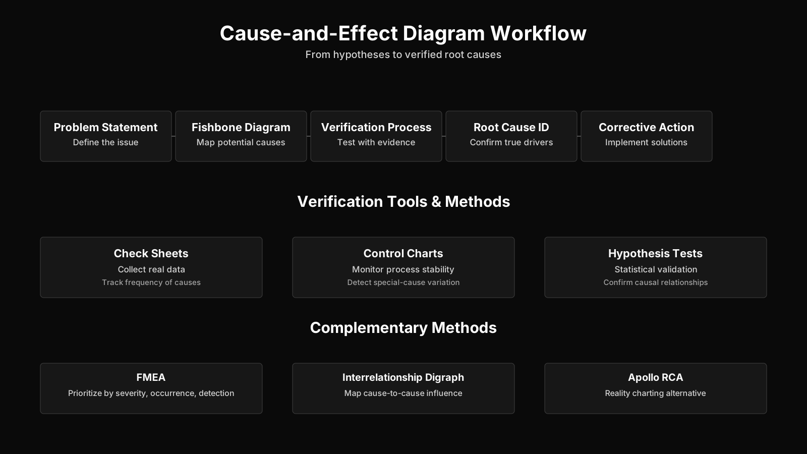
The cause-and-effect diagram in PMBOK is explicitly listed as a key tool within the Project Quality Management knowledge area. The PMBOK Guide positions it as both a planning tool—used during Plan Quality Management to think ahead about what could go wrong—and an execution tool within the Manage Quality process. It also appears under Monitor and Control Project Work when teams analyze variance causes. PMBOK does not prescribe a specific category set; instead, it emphasizes that the diagram is meant to stimulate thinking and that it should be followed by data collection to verify whether suspected causes have genuine influence. This pairing of the diagram with verification is where many real-world applications stumble, as we will see later. PRINCE2 does not reference the tool by name, but its principles of continued business justification and learning from experience invite the use of cause-and-effect logic during quality reviews and lessons-learned exercises. A PRINCE2 project manager might employ the diagram during a stage assessment when deliverable quality slides, feeding findings into the Lessons Log.
Agile environments have embraced the cause-and-effect diagram with a slight twist. Sprint retrospectives and problem-solving workshops use it to examine things like recurring defects, velocity dips, or failed experiments. Because Agile emphasizes self-organizing teams, the diagram becomes a shared discovery mechanism rather than a manager-led analysis. One pattern is to anchor the effect as "sprint goal not met" and then populate bones that include Team Practices, External Blockers, Definition of Done Clarity, and Tooling. The BVOPM perspective brings an additional refinement. Since BVOPM categorizes waste and root causes with predefined categories that include overwork, perfectionism, process damage, and rejected acceptable work, a cause-and-effect diagram used in a BVOP setting can directly map detected defects onto those standardized categories. This alignment makes it easier to quantify "process damage" as an invisible but real cost and to track how frequently certain root-cause patterns recur across projects. In essence, the diagram becomes a lens for linking tangible quality issues to the broader business value metrics that BVOPM demands.
In hybrid settings, the diagram acts as a bridge. A predictive project plan may rely on the diagram during risk identification workshops and quality audits, while iterative development cycles use it informally at the iteration level. Regardless of the delivery approach, the underlying need remains: when something goes wrong repeatedly, a system-level view is more effective than individual blame.
Frameworks and Root Cause Analysis
- PMBOK tool for quality management
- The PMBOK Guide identifies the cause-and-effect diagram as a foundational tool in Project Quality Management, supporting proactive risk identification during planning and enabling structured variance analysis during execution.
- Post-diagram verification
- PMBOK emphasizes that the diagram should stimulate thinking, after which rigorous data collection must verify the suspected causes; this verification step is precisely where many real-world implementations fall short.
- PRINCE2 and BVOPM adaptations
- PRINCE2 incorporates cause-and-effect thinking implicitly through its principle of learning from experience, while BVOPM operationalizes this by mapping each detected defect onto its predefined waste categories such as overwork and perfectionism.
Purpose and Importance in Project Management
The purpose of a cause-and-effect diagram in project management extends far beyond simply listing possible reasons for a problem. It serves as a deliberate countermeasure against two common cognitive traps: jumping to conclusions and narrowing the analysis frame prematurely. When a schedule delay first appears, a project manager may instinctively attribute it to poor estimation. A properly facilitated diagramming session will eventually capture that estimation accuracy is probably influenced by how requirements were communicated, by the availability of historical data, and by pressure to commit early. Suddenly a one-dimensional explanation becomes a network of interrelated factors, each of which might be addressable. The diagram therefore functions as a system-thinking tool inside a discipline that sometimes rewards immediate action over thoughtful diagnosis.
Its importance also manifests through group dynamics. Because the diagram is built collaboratively, it generates a shared understanding of the problem's anatomy. Stakeholders who would otherwise blame one another can see how their own actions, tooling choices, or assumptions fit into the broader causal picture. In program and portfolio settings, this can prevent repeated mistakes across multiple projects. A program manager might use a common cause-and-effect template derived from post-mortems on failed initiatives, creating an organizational memory of typical failure patterns. At the portfolio level, such aggregated diagrams can inform governance decisions about which process changes to invest in. The diagram, therefore, is not just an analytical instrument; it is a communication artifact that aligns a group around a richer, more honest story about what is happening.
Practical Application and Common Use Cases
Using cause-and-effect diagrams in project management typically occurs during structured problem-solving sessions, quality audits, risk workshops, and post-incident reviews. A project team facing recurring test failures, for instance, might set the effect as "high defect leakage into production." The facilitator then draws the spine and proposes categories such as Testing Environment, Test Data, Tester Skill, Code Complexity, and Requirements Clarity. The group populates the bones freely, suspending judgment. An engineer might add "the staging database does not have referential integrity" under Test Data, prompting a deeper "why" that reveals a lack of automated data masking tools. This cascading effect is what makes the tool practical: it turns a vague complaint into a set of specific, investigable hypotheses.
In risk identification, the diagram can be used proactively. Instead of waiting for a problem, the team sets the effect as "project fails to meet acceptance criteria" and brainstorms potential causes before work begins. Those cause branches then feed into risk registers as discrete risk items, each inheriting the causal logic that makes response planning more informed. A common real-world scenario is a vendor-delivered component that consistently arrives late. The team might use a cause-and-effect diagram with categories like Contract Terms, Vendor Capability, Requirements Volatility, and Logistics. They discover that late changes in specifications are the root trigger, leading to contract renegotiation rather than futile pressure on the vendor. The diagram doesn't solve the problem, but it redirects energy toward the actual lever.
One practical but underused variation is overlaying the diagram with data. A team might add frequency counts or severity scores next to each sub-branch to turn the qualitative map into something closer to a Pareto precursor. This helps prioritize which causal paths to attack first. It also aligns with the PMBOK's insistence on verification. Saying "poor training is a cause" is not enough; the team must check whether training records correlate with defect rates. The diagram frames what to investigate, but the investigation itself requires rigor that teams sometimes skip.
Core Insights on Practical Application
- Structured workshop settings
- Structured workshops leverage cause-and-effect diagrams to uncover systemic root causes in problem-solving sessions, quality audits, risk workshops, and post-incident reviews.
- Example: defect leakage analysis
- When analyzing high defect leakage into production, teams populate categories such as Test Data, Code Complexity, and Requirements Clarity to reveal cross-functional breakdowns that contribute to the problem.
- Cascading root cause discovery
- The diagram transforms ambiguous symptoms into testable hypotheses, as when repeated "why" questioning of a staging database issue exposes the missing automated data masking tools that allowed the fault to occur.
- Proactive risk identification
- By setting "project fails to meet acceptance criteria" as the effect before work begins, teams map cause branches directly into risk registers, converting causal relationships into discrete, traceable risk items.
- Example: vendor risk assessment
- Using categories like Contract Terms and Requirements Volatility, a vendor risk assessment often reveals that late specification changes are the true root trigger, redirecting the response toward contract renegotiation rather than unproductive vendor pressure.
Common Challenges, Pitfalls, and Misconceptions
Cause-and-effect diagram pitfalls often begin with the misconception that the tool itself delivers root cause identification. In reality, the diagram only structures potential causes; it does not validate them. A team can easily populate a fishbone with plausible-sounding factors, never collect data, and then implement fixes that address phantom causes while the real issue persists. The comfort of a filled-out diagram can create an illusion of thoroughness that undermines actual root cause analysis. Another frequent problem is stopping at the first plausible cause rather than drilling down to deeper sub-causes. When someone writes "lack of communication" under the People bone, a skilled facilitator will ask "why was communication insufficient?" until the team reaches a ground-level condition they can act upon. Without that persistence, the exercise degenerates into a list of complaints.
Oversimplifying the category set is equally risky. Adopting the generic 6Ms for every problem, regardless of context, can force causes into ill-fitting categories or leave important dimensions entirely off the diagram. Conversely, making the diagram too granular too early can overwhelm the group and stall the session. Striking the right balance requires practice and a facilitator who knows when to split a branch and when to consolidate. Another silent pitfall is the absence of the right people. If a cause-and-effect exercise is conducted only by managers, it will produce a management-centric view that may completely miss what frontline developers, testers, or operators experience daily. Many project managers have observed that the most insightful cause contributions come from the quietest team members once they see the visual space opening up.
There is also a persistent myth that cause-and-effect diagrams belong exclusively to manufacturing and are too linear for complex software projects. While it is true that software systems are tightly coupled and feedback-rich, the diagram remains useful as a starting scaffold. It does not replace systems dynamics models, but it forces a discipline of categorizing causes that can later feed more sophisticated analyses. The key is to treat the diagram as a hypothesis-generation device, not as a final causal model. When used that way, even in complex adaptive projects, it serves its purpose.
Relationship to Other Quality and Root-Cause Analysis Tools
It is common to compare a cause-and-effect diagram vs other root cause tools and see it as occupying a distinct, complementary niche. The 5 Whys technique, for example, drills vertically into a single causal chain but does not provide the panoramic view that a fishbone offers. A Pareto chart prioritizes causes by frequency or impact but does not help discover what those causes might be in the first place. Scatter diagrams and control charts assess correlation and variation but assume that the variables in question have already been identified. The cause-and-effect diagram, by contrast, is a divergent thinking tool that expands the pool of candidates. Many effective problem-solving sequences start with a fishbone to generate possibilities, use the 5 Whys to deepen the most promising branches, and then apply a Pareto analysis to decide where to invest corrective resources. In risk management, it relates to the risk breakdown structure (RBS) because both organize potential sources of failure. An RBS is hierarchical and generic; a cause-and-effect diagram is specific to a single effect and can be overlaid onto the RBS for richer risk identification.
It is also worth distinguishing the diagram from a flowchart or a process map. A process map shows how activities are supposed to flow and where handoffs occur, while a fishbone focuses on why a particular outcome deviates from the expected. They are often used together. One could map the process, identify the step where delays concentrate, and then run a cause-and-effect session to understand the factors making that step fragile. In the Failure Mode and Effects Analysis (FMEA) context, cause-and-effect thinking forms the basis for identifying failure causes before severity and occurrence ratings are assigned. In that sense, the diagram is not a standalone artifact but rather a cognitive technique that permeates many quality and risk disciplines.
Key Insights on Tool Integration
- Distinct complementary niche
- Unlike the 5 Whys or Pareto charts, which converge on root causes or priorities, the cause-and-effect diagram serves as a divergent tool that broadens the set of potential causal factors for deeper exploration.
- Sequential problem-solving workflow
- A disciplined problem-solving sequence typically begins with a fishbone diagram to surface a wide range of possible causes, continues with the 5 Whys to drill into the most promising branches, and then employs Pareto analysis to direct corrective resources toward the most impactful few factors.
- Links to risk and process tools
- The fishbone aligns with the risk breakdown structure for cataloging failure origins, stands in contrast to process maps that depict flow rather than cause-and-effect deviations, and enables FMEA by systematically identifying failure causes prior to assigning severity and occurrence ratings.
Evolution and Current Thinking in Project Management
The evolution of the cause-and-effect diagram in project management has seen a shift from rigid, factory-floor templates toward much more contextual and digital-friendly adaptations. Early methods insisted on the exact 6M labels; today’s practitioners freely create custom categories like Stakeholder Alignment, Decision Latency, or Cognitive Bias when diagnosing project delays or governance breakdowns. Virtual collaboration tools now enable distributed teams to co-create fishbone diagrams on digital whiteboards, adding stickies and nested branches in real time. This has expanded the tool's accessibility, but it also introduces the risk of superficial participation where people drag pre-written tokens without real deliberation.
A more philosophical shift has occurred around the diagram's underlying assumption of linear causality. In complex projects, causes and effects often interact in loops. A delay causes reprioritization, which causes context switching, which causes more delays. Strictly hierarchical branching structures can obscure these feedback loops. Some methodologists advocate for augmenting the fishbone with causal loop diagrams or influence maps where the dynamic relationships become visible. Still, many seasoned project managers find the fishbone's simplicity a feature, not a limitation, precisely because it resists the temptation to overmodel and instead keeps a team grounded in tangible, investigable items. The current best practice, therefore, is to treat the cause-and-effect diagram as a starting point that primes analytical thinking, always pairing it with evidence gathering and an openness to finding that the real cause lies in the interactions among branches rather than in any single bone. That honest, evidence-oriented mindset may be the most valuable evolution of all.