A Big Visible Chart is a large, prominently displayed physical or digital board that communicates critical project information, status, and metrics to all team members and stakeholders in an immediately accessible, transparent manner. It serves as an information radiator, fostering collective awareness, alignment, and swift decision-making. In the lexicon of project management, the term big visible chart conveys not just the artifact itself but the principle of radical transparency and real-time visibility into the pulse of a project.
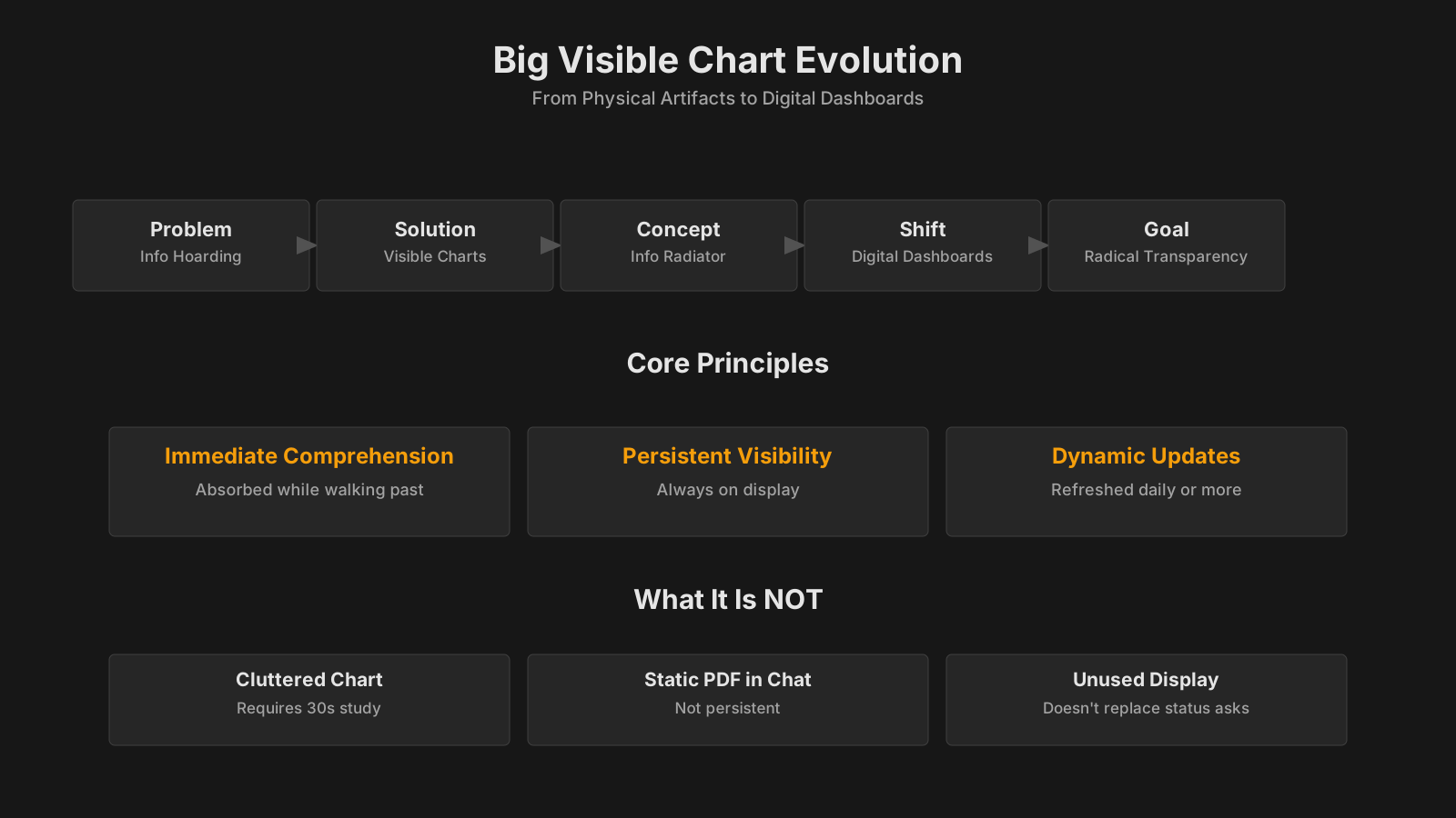
Big Visible Charts: Summary of Key Topics
| Key Concept | Summary |
|---|---|
| Definition | A Big Visible Chart is a prominent, real-time display, physical or digital, that conveys critical project status, key metrics, and work progress to all stakeholders at a glance, fostering immediate alignment and shared understanding. |
| Transparency Principle | Beyond the physical board, the principle embodies radical transparency: it makes the real-time heartbeat of the project visible to everyone, transforming abstract status into shared, actionable insight. |
| Content Types | They showcase live data such as burn-down charts, task boards, cumulative flow diagrams, risk heatmaps, or quality metrics in shared, high-traffic areas, dismantling information silos and promoting collective ownership of outcomes. |
| Accessibility | Unlike slide decks buried in email or static reports, these charts function as public interfaces: accessible to anyone passing by, conveying essential status at a single glance with no narration required. |
| Historical Roots | Their lineage traces to Lean manufacturing’s Andon boards for visual controls, and were formalized as a core practice by Extreme Programming in the late 1990s, which championed large, visible feedback loops. |
| Information Radiator | Alistair Cockburn coined the term “information radiator” to describe exactly this: a persistent, glanceable display that radiates information to anyone in its vicinity without pulling them out of their workflow. |
| Key Components | A well-designed chart centers on a single primary metric or a compact set of related indicators; it includes a time axis to reveal trends, a clear target or threshold for instant status checks, and a defined frame (physical or digital) that sets it apart from surrounding noise. |
| Project Use | In the Monitor and Control Project Work process, these visual displays enable rapid variance analysis and data-driven performance reviews. For hybrid approaches, they blend predictive and Agile metrics into a single visual control center that delivers a unified, real-time picture of project health. |
What Is a Big Visible Chart?
To fully grasp the concept of Big Visible Charts, one must understand their dual role as both a communication tool and a coordination mechanism. Big Visible Charts explained through the lens of project management refer to deliberately oversized, public-facing displays of data such as burn-down charts, task boards, cumulative flow diagrams, risk matrices, or quality metrics, designed to eliminate information silos. They are not private reports or slide decks that circulate via email; they are placed in a team's shared space, physical or virtual, where anyone can glance at them and immediately extract meaning without needing an explanation. This makes the chart an active participant in daily work, constantly reminding the team of what is being done, what remains, and where the pain points are.
A subtle but crucial distinction is that a big visible chart is never just a static poster. It must be updated frequently, often daily, to reflect the current reality. If a chart shows last week's data, it ceases to be an information radiator and becomes wallpaper. The chart’s size and placement are deliberate choices. It needs to be big enough that someone standing a few meters away can read the key indicators. And it needs to be visible in a high-traffic area, not hidden in a corner. In digital settings, this translates to a large monitor or a dedicated dashboard screen always on display in a virtual team room.
Origins and Cross-Industry Foundation
The idea of making status visible to everyone is not new and certainly not born in software development. Lean manufacturing pioneered the use of visual controls, the most famous being the Andon board, a large lighted display that signaled production status and problems in real time on the factory floor. Workers could pull a cord to stop the line, and the Andon board would instantly show where the issue occurred. That same principle of immediate, public visibility crossed over into product development and eventually into knowledge work.
In the late 1990s and early 2000s, Extreme Programming popularized the concept of the big visible chart as a core practice. Alistair Cockburn later coined the term information radiator to describe any display that a person can understand with a brief glance while walking by. The term big visible chart stuck because it was immediately descriptive. Teams would tape large sheets of paper to the wall, draw a graph by hand, and color it in every day. The act of updating the chart was itself a ritual that reinforced ownership and kept the team honest about progress.
Core Characteristics That Define a Big Visible Chart
Several properties separate a proper big visible chart from an ordinary report tacked to a wall. Firstly, it is simple to the point of being almost crude. A visitor unfamiliar with the project should be able to deduce what the chart measures within seconds. Overly complex visualizations defeat the purpose. Secondly, the metrics shown are always actionable. The best big visible charts surface information that prompts a conversation or a decision. A burn-down chart that shows a flat line for three days is an invitation to ask what is blocking the team. A risk matrix with a new red item is a signal to the project manager that a mitigation plan is overdue. Thirdly, the chart is updated by the people doing the work, not by a separate reporting function. This creates a tight feedback loop between doing the task and seeing its impact on the overall picture.
Key Insights on Big Visible Charts
- Dual role in project management
- By presenting metrics such as burn-down charts and risk matrices at an oversized scale in communal areas, these charts serve as both a communication conduit and a coordination engine, breaking down information silos that fragment team awareness.
- Shared space eliminates information silos
- Unlike confidential reports or slide decks circulated via email, these charts inhabit shared physical or digital spaces, allowing anyone to interpret the information at a glance without requiring additional explanation.
- Daily updates prevent wallpaper effect
- To remain effective information radiators, these charts must be updated daily; stale data quickly transforms them into passive wallpaper that no longer informs decisions.
- Andon board as historical precedent
- Lean manufacturing introduced visual management through the Andon board, an illuminated factory-floor display that broadcast production status and alerted teams to issues instantly.
Key Components and Types of Big Visible Charts
The effectiveness of any Big Visible Chart rests on a small set of structural components that make it work in practice. Key components of Big Visible Charts include the choice of a single focal metric or a tightly related set of metrics, a temporal axis that shows change over time, a target or threshold line, and a physical or digital boundary that frames the chart as a distinct object. Without these elements, the chart either becomes ambiguous or loses its status as a standalone information source.
The most recognizable type is the burn-down chart, which tracks remaining work against time. A burn-up chart does the opposite, showing completed work and total scope on the same graph, which makes scope changes explicit. Task boards, especially the kanban variety, are arguably the most common big visible charts in use today. A wall covered with sticky notes that move from left to right tells a story of flow, bottlenecks, and work-in-progress limits. Cumulative flow diagrams extend that story by showing the distribution of work items across different stages over time, giving a quantitative view of cycle time and throughput.
Beyond the classic Agile charts, big visible charts also include program-level roadmaps, risk matrices, impediment backlogs, and even team health radars. A risk matrix blown up to poster size and hung in the project war room forces risk discussions out of spreadsheets and into daily consciousness. Some organizations use large screens that cycle through a set of integrated charts, often called information radiators in the plural sense, to create a broadcast of the project’s vital signs. Each type has its own rhythm and audience, but all share the principle that the data is not hidden.
Big Visible Charts in Project Management Frameworks
The concept of the Big Visible Chart threads through multiple project management methodologies, though each framework gives it a slightly different name and emphasis. Big Visible Charts in PMBOK are not called out as a separate artifact, but they map directly to the information radiators tool described in the PMBOK Guide’s Manage Communications process. The guide frames information radiators as a communication method that pushes information to a broad audience without requiring them to pull it from a repository. In the Monitor and Control Project Work process, the use of visual data displays supports variance analysis and performance reviews, making it easier to identify deviations from the plan at a glance.
PRINCE2 does not prescribe big visible charts, but practitioners often adapt its reporting products into visual formats. A daily checkpoint report that normally resides in a document management system can be transformed into a large wall chart showing the current stage’s deliverables and their status. The highlight report that goes to the project board can be displayed on a screen outside the boardroom, giving stakeholders a continuous view of progress rather than a once-per-stage snapshot. The principle of tailoring in PRINCE2 allows this kind of adaptation without breaking the method’s structure.
Agile frameworks place the big visible chart at the center of daily work. In Scrum, the sprint backlog is often a visible chart, whether on a physical board with cards or on a digital screen. The sprint burndown chart is a classic information radiator that updates the team on whether they are on track to meet the sprint goal. Extreme Programming explicitly lists big visible charts as a practice and encourages teams to put up as many as are useful, as long as they remain current. Kanban, by its very nature, makes the entire workflow a big visible chart where anyone can see the state of every work item and identify queues building up. In hybrid environments, predictive elements like a work breakdown structure can be displayed as a large hierarchical chart, while Agile delivery metrics are tracked on adjacent boards, creating a unified visual control centre.
Key Insights Across Project Frameworks
- PMBOK Information Radiators Concept
- PMBOK frames Big Visible Charts as a form of information radiator, a communication mechanism that actively disseminates critical data across the project environment so that stakeholders absorb updates without needing to seek out documents or formal reports.
- PRINCE2 Report Visual Adaptation
- In the absence of a defined visual management practice, experienced PRINCE2 practitioners transform checkpoint and highlight reports into persistent wall charts or digital dashboards, giving leadership and teams continuous, at-a-glance insight into project health and progress.
- Agile and Hybrid Visual Workflows
- Extreme Programming mandates big visible charts to reinforce shared accountability, Kanban builds total workflow transparency into its core process, and hybrid delivery models fuse predictive work breakdown structures with agile boards to establish a single visual command centre for coordinated decision making.
The BVOPM Perspective on Big Visible Charts
Within Business Value-Oriented Project Management, Big Visible Charts serve a purpose that goes beyond mere transparency. BVOPM perspective on Big Visible Charts is that they are essential for making invisible process damage visible to all roles in the organization. The methodology’s transparent board of project issues is itself a big visible chart, where concerns raised by any stakeholder are publicly posted and cannot be quietly shelved. This aligns with the BVOPM principle that waste categories such as overwork, perfectionism, and rejected acceptable work must be tracked openly so that systemic improvements can be targeted.
In the monitoring and controlling dimension, BVOPM encourages teams to plot Business Value Points on a big visible chart over time. When a persistent downward trend appears, the chart acts as an early warning signal that the project may need deeper intervention, possibly even closure. This direct link between a visual artifact and a go/no-go decision is a more aggressive use of the big visible chart than typical frameworks employ. It also underscores the BVOPM view that a chart is not just for information but for triggering management decisions based on value, not just schedule or cost. The cross-functional nature of BVOPM means that such charts are designed to be understandable immediately by new joiners and stakeholders from any department, reinforcing the methodology’s emphasis on brief, universally readable planning documents.
Practical Application and Common Scenarios
The real power of a Big Visible Chart reveals itself in the daily routine of a project team rather than in theory. Big Visible Charts examples in practice range from a simple hand-drawn burndown on a flip chart in a co-located startup team to a wall-sized digital display in a corporate program management office. A development team might begin every morning standup gathered around a kanban board, physically moving sticky notes as they report what was done yesterday, what will be done today, and what is blocking them. The physical movement of the cards can make the standup more engaging and can reveal patterns of work stagnation that a digital-only board might obscure.
In a multi-team program, a large visible roadmap showing dependencies between workstreams and upcoming milestones can prevent last-minute integration surprises. When that roadmap is updated only after a weekly checkpoint, it avoids the churn of daily micro-adjustments and gives leadership a stable planning reference. A risk matrix on the wall near the project manager’s desk, with red and yellow markers, often prompts spontaneous risk conversations with stakeholders who drop by for other reasons. The chart serves as a conversational anchor that would not exist if the same data were hidden in a risk register.
At the portfolio level, a big visible chart might display the health of all projects using a simple traffic light system, along with a few key performance indicators for each. This allows portfolio governance meetings to move away from detailed status reports and focus on the exceptions that are signaling red. The physical presence of the chart in a shared boardroom, or a persistent digital equivalent, keeps the portfolio’s overall condition in the collective consciousness. In all these cases, the chart does not replace detailed reports but acts as a constant invitation to dig deeper when something looks off.
Key Insights on Big Visible Chart Use
- Daily use drives real value
- A Big Visible Chart gains its true power when teams inspect it as part of every standup and planning session, converting data into immediate action rather than treating it as a static report.
- Wide range of formats
- Implementations range from a hand-sketched burndown on a flip chart in a co-located team room to a wall-sized digital dashboard in a corporate program office, proving that high visibility adapts to any context.
- Physical boards boost engagement
- When team members physically move sticky notes during standup, the tactile process increases accountability and highlights bottlenecks that remain invisible in digital-only tools.
- Portfolio charts focus on exceptions
- Using a color-coded health board at the portfolio level enables leadership to bypass exhaustive reports and immediately focus collective attention on initiatives flagged as red, transforming governance from a status checkpoint into a rapid intervention mechanism.
Common Challenges, Pitfalls, and Misconceptions
Despite their apparent simplicity, Big Visible Charts are surprisingly easy to get wrong, and the consequences can undermine trust in the very transparency they are meant to create. Big Visible Charts pitfalls frequently begin with neglect: a chart that is not updated becomes a source of misinformation, and team members quickly learn to ignore it. The chart then degenerates into visual noise, often referred to as wallpaper, that makes the workspace feel cluttered without providing any value. The social contract of the big visible chart is that the team commits to maintaining it, and when that contract breaks, the chart’s authority evaporates.
A related pitfall is the temptation to display too many metrics on a single chart or to fill a wall with so many charts that nothing stands out. Information overload can be just as damaging as information hiding. Project managers sometimes fall into the trap of thinking that a complex dashboard projected on a large screen automatically qualifies as a big visible chart. But if the information is not glanceable, if it requires interpretation or clicking through layers, it fails the fundamental test of an information radiator. The chart must be understandable at a distance, without a user manual.
A common misconception is that the chart itself is the solution, that merely posting a burndown will magically improve performance. The chart is a mirror, not an engine. It reflects the team’s reality back at them, but it does not fix the underlying problems. Another misconception is that digital tools always outperform physical ones. In many co-located environments, the physical act of writing on a chart, however anachronistic it may seem, creates a deeper sense of ownership and a richer ritual around the daily update. The choice between physical and digital is contextual, not absolute.
Relationship to Other Project Management Concepts
Big Visible Charts sit within a constellation of related practices, and understanding their boundaries helps clarify when to use them and when a different tool is more appropriate. Big Visible Charts vs dashboards is a comparison that arises often because both present data visually. The difference lies in the audience and the interaction model. A dashboard is typically designed for an individual to explore and drill down into data, often from their own screen and at their own pace. A big visible chart is a broadcast medium, intended for a group to consume simultaneously without interaction. A program manager might use a personal dashboard to analyze cost variances, but the high-level schedule health goes on the big visible chart in the hallway.
The term information radiator is closely related and often used interchangeably, but some practitioners make a subtle distinction. An information radiator is the concept, while a big visible chart is one specific implementation of that concept. Another implementation might be a continuous build light that turns red when tests fail. Kanban boards are a subclass of big visible chart that specifically focus on workflow visualization and flow management. They usually impose work-in-progress limits and make queues visible, whereas a broad big visible chart might simply show a status trend like team morale or defect density without a workflow dimension.
Status reports, especially the traditional weekly document, occupy the opposite end of the communication spectrum. They are pull-based, private, and often rich in narrative detail. A big visible chart does not replace the status report for stakeholders who need deep analysis and formal sign-off. Instead, it serves as the always-on, low-friction layer that keeps everyone oriented between formal reporting cycles. The two can coexist, with the chart triggering the questions that the report later answers.
Key Takeaways on Related Practices
- Dashboards vs. big charts
- Dashboards facilitate personal, interactive data exploration on an individual screen, while big visible charts passively radiate information to an entire group, requiring no user interaction to convey meaning.
- Information radiator overlap
- The term information radiator is frequently treated as synonymous with big visible chart, yet many practitioners recognize nuanced differences in their intended placement and how observers absorb the displayed data.
- Kanban as subclass
- Kanban boards are a distinct subtype of big visible chart that specifically visualizes workflow stages, enforces work-in-progress constraints, and exposes queue lengths to highlight bottlenecks and improve flow.
- Status reports contrast
- Traditional weekly status reports sit at the opposite end of the communication spectrum, delivering static, document-based summaries instead of the continuous, ambient visibility that big visible charts provide.
Evolution and Current Thinking
The practice of using Big Visible Charts has evolved substantially from the early days of hand-drawn graphs on whiteboards, though the core intent remains unchanged. Modern Big Visible Charts are now just as likely to be rendered on large wall-mounted monitors, fed by live data pipelines from work tracking tools and continuous integration servers. In some technology organizations, a single screen continuously cycles through a set of charts covering build health, deployment frequency, incident counts, and sprint progress, creating a real-time operations center that would have been impossible two decades ago. This automation eliminates the manual update burden, but it also removes the ritual of the team gathering to draw the line, which some practitioners argue weakens the psychological ownership.
Current thinking increasingly recognizes that a big visible chart does not need to be a single physical artifact. In distributed and hybrid work environments, the equivalent is a persistent virtual room or a channel in a collaboration platform where the charts are pinned and always visible. The measure of success is not the medium but the outcome: does the chart change behavior? A digital chart that no one opens is as useless as a physical one covered in dust. Frameworks such as the Scaled Agile Framework embed big visible boards into Program Increment planning events, where teams physically or virtually map features, dependencies, and risks on a board that stays visible throughout the increment. This institutionalizes the practice at scale.
There is a healthy debate about the limit of visual broadcasting. Some project environments have developed what could be called chart fatigue, where every wall and screen is plastered with metrics, reducing the signal-to-noise ratio. The emerging good practice is to curate the few Big Visible Charts that carry the most weight for the team’s current objectives and to retire charts that no longer lead to action. The art lies in knowing which chart, however crudely drawn, will ask the question that nobody wants to ask out loud.