A combined burn chart is a project progress visualization that shows remaining work and completed work on a single time-series graph. It lets teams observe how much scope has been delivered, how much work is still outstanding, and how the total scope has changed over time. The chart is most often associated with Agile delivery, but its underlying logic can be applied to any effort with a defined backlog, release, or phase. It combines features of the traditional burndown chart and the burnup chart, which is why practitioners sometimes call it a combined chart rather than a distinct formal artifact.
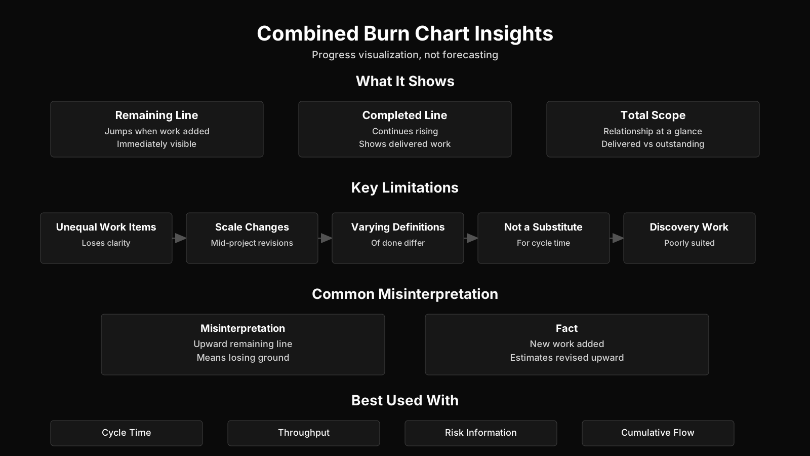
Summary of Key Topics for Combined Burn Chart
| Key Concept | Summary |
|---|---|
| Definition | A combined burn chart is a hybrid progress visualization that overlays cumulative completed work and remaining work as paired trend lines to reveal delivery trajectory at a glance. |
| Fixed-Scope Dynamics | Under a fixed scope, the completed work line rises symmetrically as the remaining work line declines, with the intersection typically occurring near the midpoint of planned effort. |
| Primary Benefit | By rendering completed and remaining effort in the same view, the chart removes the need for manual reconciliation and supports faster, more accurate decisions in sprint reviews and release planning. |
| Scope Growth Signal | New requirements added by the product owner appear as an upward jump in the remaining work line while the completed work line continues unchanged, immediately signaling an increase in total scope. |
| Diagnosing Upward Moves | An upward movement in the remaining work line calls for a structured diagnosis: scope additions, revised estimates, and work returned from review each require a different response. |
| Origins | The combined burn chart emerged as an extension developed by practitioners of the burndown chart, gaining traction in the Agile software development community during the early 2000s. |
| Historical Influences | Lean and manufacturing visual controls, especially cumulative flow diagrams and visual management boards, shaped the broader family of progress charts from which the combined burn chart evolved. |
| Practical Value | A standalone remaining work line can conceal overwork, perfectionism, or repeated rejection of acceptable output, whereas the combined chart exposes these forms of waste as visible gaps between the two trend lines. |
What Is a Combined Burn Chart?
The combined burn chart definition is best described as a hybrid progress chart that shows two trend lines together: one for cumulative completed work and one for remaining work. At any point in time, the sum of those two values represents the current total scope or effort baseline. When both lines use the same percentage or effort scale, a fixed-scope project produces a completed line that rises as the remaining line falls, and the two lines cross at roughly the halfway point of the work.
The core meaning is fairly straightforward. A combined burn chart answers two questions simultaneously: how much has been done and how much is still left to do. A burndown chart only tracks remaining work, so an upward movement can be ambiguous. A burnup chart tracks completed work and sometimes total scope, but remaining work is inferred rather than directly shown. The combined form makes the relationship between done and remaining explicit, which reduces the need for mental arithmetic during sprint reviews and release planning.
Imagine a simple pile of work sitting in front of the team. The completed line shows how much of the pile has been moved to the done side. The remaining line shows how much of the pile has not yet been touched. If nobody adds or removes items, the two piles always add up to the same total. If someone drops more cards onto the remaining side, that side grows even though the completed pile has not shrunk. That visible imbalance is exactly what the combined burn chart is designed to expose.
Core Meaning and Basic Logic
At the center of the chart is the relationship between the completed and remaining lines. In a typical iteration, the completed line starts at zero and moves upward as user stories, features, or tasks are accepted. The remaining line starts at the initial scope estimate and moves downward as work finishes. When total scope stays constant, the two lines are complementary. The higher one is, the lower the other should be.
Scope changes break that complementary pattern. If a product owner adds new requirements, the remaining line jumps upward while the completed line continues along its existing path. The sum of the two values increases, which is the direct visual fingerprint of scope growth. If requirements are removed or de-scoped, the remaining line drops downward even without new delivery. This is not a sign of progress. It is a sign that the size of the job has changed.
How It Differs from Traditional Burndown and Burnup Charts
A traditional burndown chart has one main line showing remaining effort. It may include a second line showing an ideal or planned rate of consumption. A burnup chart has one line for cumulative completed work and often a flat or stepped line for total scope. The combined burn chart takes the remaining-work perspective of the burndown and the completed-work perspective of the burnup and puts them into the same visual frame.
This difference is not cosmetic. When a burndown line moves upward, the team must decide whether the change came from scope growth, re-estimation, or work being returned to the backlog. A burnup chart can show total scope growth, but remaining work has to be calculated. The combined chart removes much of that guesswork by showing both signals together: what has been completed, what remains, and how much total work the team now believes exists.
Origin and Context
The combined burn chart has no single widely recognized origin in project management literature. It emerged as a practitioner extension of burndown charts, which became popular in the Agile software development community in the early 2000s. Lean and manufacturing visual controls, including cumulative flow diagrams and visual boards, influenced the broader family of progress charts. The combined chart is less standardized than a burndown or burnup chart, but the term is used in practice when teams want to retain both remaining-effort and completed-scope visibility.
Outside software, visual progress tracking has deep roots in manufacturing, control rooms, and logistics. A production team might track units completed against units remaining. A clinical trial program might track patients enrolled against patients still required. The specific term combined burn chart is most common in Agile project management, but the visual logic belongs to a much older tradition of making progress visible at the point of decision.
Key Takeaways on Combined Burn Charts
- Dual trend line display
- A combined burn chart plots cumulative completed work and remaining work on a single scale, allowing stakeholders to assess progress and outstanding effort simultaneously without toggling between separate views.
- Total scope representation
- At any point in time, the sum of the completed and remaining values equals the current total scope or effort baseline, which makes any change in project size immediately visible.
- Crossing at halfway point
- On a fixed-scope project with aligned axes, the rising completed line and the falling remaining line intersect near the midpoint of the work, offering a quick visual cue that execution is tracking as planned.
- Advantage over single charts
- By showing completed and remaining work together, the combined format removes the need to mentally reconcile separate burndown and burnup charts, which strengthens communication during sprint reviews and release planning.
Key Components of a Combined Burn Chart
The key components of a combined burn chart are the time axis, the effort scale, the completed work line, the remaining work line, and the implied total scope relationship. Each component has a specific role in helping the team read the chart correctly. When any one of these components is poorly defined or inconsistently updated, the chart loses much of its diagnostic value.
Time Axis and Effort Scale
The horizontal axis represents time. In Scrum this is usually sprints or calendar days. In release-level views it may show iterations, weeks, or dates. The vertical axis represents effort. Teams may use story points, ideal hours, task counts, or another estimation unit. The same unit should be used consistently across the completed and remaining lines.
Effort scale consistency matters because the relationship between the two lines only has meaning when both lines are measured in the same unit. If the team estimates remaining work in hours but tracks completed work in points, the chart cannot reliably show scope. Some teams solve this by normalizing both lines to a percentage of the original baseline, but percentages can hide absolute changes in scope.
The Completed Work Line
The completed work line is cumulative. It starts at zero, or near zero, and rises as backlog items are accepted according to the team’s definition of done. The line should move only when work is genuinely complete and usable, not when it is nearly done or merely coded. In Agile practice, this aligns with the discipline of not counting partially finished work as progress.
Because the completed line is cumulative, it never declines in a healthy process. If it does decline, the team may have reclassified work as incomplete, lowered the definition of done, or corrected a data entry error. A flat completed line while the remaining line continues to fall may indicate that the team is reducing scope rather than delivering new value.
The Remaining Work Line
The remaining work line starts at the total estimated effort and decreases as work is completed. It can also increase when scope is added, when estimates become larger, or when previously accepted work is rejected and returned to the backlog. This line is more volatile than the completed line because it absorbs every change to the backlog.
In a combined burn chart, the remaining line is not simply an inverse of completed work. Completed work plus remaining work equals current total scope. If the remaining line shifts upward while the completed line stays flat, total scope has increased. If the remaining line drops without a corresponding rise in completed work, scope has been removed. If both lines move in opposite directions by the same amount, the team is making steady progress against a stable baseline.
Ideal Trend or Forecast Reference
Some combined burn charts include a third, dashed line showing an ideal or expected rate of completion. This reference line helps stakeholders see whether actual progress is faster or slower than the initial plan. It is not a commitment. It is a projection based on average throughput or the original scope estimate.
When the ideal line is included, the chart becomes a forecast rather than just a historical record. The distance between the actual remaining line and the ideal line can highlight likely finish dates or release risks. But the ideal line can also become a source of unhelpful pressure if teams and executives treat it as a fixed promise rather than a reference point.
Combined Burn Chart in Project Management Frameworks
When discussing a combined burn chart in project management, it is more accurate to describe it as an informal visual control than a formal artifact named in widely used standards. The PMBOK Guide, PRINCE2, and the Scrum Guide do not mandate a combined burn chart. However, the chart aligns closely with the monitoring and controlling responsibilities described in PMBOK, the progress theme in PRINCE2, and the transparency expectations in Agile frameworks.
Agile and Scrum Context
In Scrum, progress is empirical. Teams inspect a product increment and adapt the Sprint Backlog based on what is known. Burndown charts, burnup charts, and cumulative flow diagrams are common ways to visualize progress. A combined burn chart adds value when a Scrum Team or its stakeholders need to see remaining work and completed work in one view, especially during Sprint Review or release planning.
Product Owners often find the combined chart helpful because it separates delivery progress from scope changes. If the completed line is rising steadily but the remaining line is not falling, the product owner can see that new backlog items are entering faster than work is being finished. That conversation is much harder with a simple burndown chart.
Predictive and Hybrid Environments
In predictive projects, work is often tracked through earned value management, Gantt charts, and milestone reports. A combined burn chart is less common but still usable when a phase or work package has a finite list of deliverables. A contractor might track completed drawings against remaining drawings over the life of a design package. A hybrid project might combine an overall predictive baseline for construction with Agile delivery for software components and use the combined chart for the software portion.
Hybrid teams should be cautious about forcing a burn chart into a phase that has no stable unit of effort. If deliverables vary widely in size, counting them as equal units can distort the chart. In such cases the chart can still be useful as a high-level visual, but it should be paired with more detailed schedule and risk information.
PMBOK and PRINCE2 Alignment
Within the PMBOK framework, a combined burn chart is an example of a visual representation of work performance information. It takes raw work performance data, such as completed story points and remaining story points, and turns it into a view that supports monitoring and controlling. The chart does not replace formal change control, variance analysis, or schedule performance measurement, but it can sit alongside those practices as a team-level transparency tool.
PRINCE2 focuses on management by exception and tolerance-based control. Project boards rely on highlight reports, checkpoint reports, and end-stage reports rather than daily burn charts. A combined burn chart can supplement these reports by giving the project board or change authority a quick view of progress inside a stage. It is not a PRINCE2 management product, but it can support the progress theme when a project board wants more frequent visual indicators.
Key Insights on Combined Burn Charts
- Informal visual control tool
- The combined burn chart functions best as an informal visual control, offering continuous progress visibility rather than acting as a formal performance artifact required by project management standards.
- Aligns with major frameworks
- The chart directly supports PMBOK monitoring and controlling processes, reinforces the PRINCE2 progress theme, and meets the transparency expectations common to Agile delivery frameworks.
- One view of both workloads
- The chart provides Scrum Teams and stakeholders with a single, consolidated view of remaining and completed work, which is especially valuable during Sprint Reviews and release planning sessions.
- Reveals scope versus delivery
- Product Owners can assess whether newly added backlog items are outpacing completed work by comparing the completed work line with the remaining work line.
- Complements formal measurement
- The chart works alongside formal change control, variance analysis, and schedule performance measurement, adding a team-level transparency layer without replacing these established controls.
Purpose and Importance of a Combined Burn Chart
The primary purpose of a combined burn chart is to make both delivery progress and scope volatility visible in one place. That dual visibility changes the quality of project conversations. Instead of asking whether the team is behind schedule, stakeholders can see whether the remaining work is shrinking because of delivery or because of scope cuts.
This is important because project status is rarely a single number. A team can be delivering quickly and still falling behind because the backlog is growing faster than output. A team can also appear to be burning down nicely while actually completing almost nothing because someone removed scope. The combined chart exposes those situations instead of hiding them under a single downward line.
Transparency and Alignment
Transparency is a core Agile value. A combined burn chart helps the team and its stakeholders develop a shared understanding of what is happening. When the chart is displayed on a wall or in a digital dashboard, anyone can see the current state of the release without asking the project manager for a status report. This reduces information asymmetry and keeps discussion focused on the actual pattern rather than on secondhand descriptions.
Alignment improves because the chart distinguishes between execution pace and scope decisions. A product owner can explain why the total scope increased. A delivery manager can explain why the completed line is flat. Both lines sit in the same frame, so the conversation no longer starts from a misleading one-line summary.
Scope Change Detection
Scope changes are a normal part of complex projects. The combined burn chart makes them visible without requiring a separate scope report. When the remaining line jumps upward, the team immediately sees that the size of the work has changed. When the remaining line drops without a matching rise in completed work, the team sees that scope has been removed or re-estimated downward.
This does not replace formal change control. In predictive projects, scope changes must still flow through integrated change control. But the chart gives the project manager an early warning signal. A pattern of frequent upward jumps can reveal a product owner who is adding work informally or a discovery process that keeps expanding the solution.
Forecasting and Risk Signals
Forecasting with a combined burn chart is probabilistic, not deterministic. The chart shows a trend based on recent performance. If the remaining line intersects the horizontal axis beyond the planned end date, the team may need to adjust scope, increase capacity, or change the plan. If the completed line is rising faster than expected, the team may have underestimated capacity or overestimated task size.
Risk signals often appear early in the chart. A flattening completed line combined with a rising remaining line suggests blocked work or frequent rework. A narrowing total scope caused by repeated scope removal may indicate that the project is being hollowed out rather than genuinely progressed. These patterns deserve investigation even if the remaining line looks healthy in isolation.
BVOP Perspective on Monitoring with a Combined Burn Chart
From a Business Value-Oriented Project Management perspective, monitoring with a combined burn chart is valuable when the chart is connected to more than task completion. BVOPM emphasizes business value points, waste reduction, and the detection of process damage that is not always visible in traditional progress metrics. A chart that shows only a falling remaining line can hide overwork, perfectionism, or repeated rejection of acceptable work; adding the completed line and total scope relationship gives those forms of waste a clearer visual signature.
Business Value and Process Damage
BVOPM regards persistent decline in business value points as a possible signal that a project should be closed or restructured. A combined burn chart can support that assessment when completed work rises without a corresponding improvement in value outcomes. The chart itself does not measure value. It shows throughput and scope movement, which must be interpreted alongside separate business value tracking.
Process damage in BVOPM refers to invisible organizational harm created by unstable scope, unrealistic expectations, and continuous rework. A combined burn chart can reveal one form of that damage: a completed line that rises slowly while the remaining line repeatedly jumps upward. The visual separation between progress and newly added work helps teams articulate the cost of churn.
Waste Categories and Interpretation
BVOPM categorizes waste as overwork, perfectionism, and rejected acceptable work. Each of these can distort a combined burn chart. Overwork may temporarily accelerate the completed line, followed by a sharp decline in velocity. Perfectionism may keep the completed line flat because work is rarely accepted. Rejected acceptable work may cause the remaining line to rise even though the team believed the item was finished. Practitioners can use these categories to diagnose unusual chart patterns rather than simply blaming team performance.
Key Insights on Value-Based Monitoring
- Business value focus
- BVOPM links burn chart monitoring directly to business value points, waste reduction, and process damage detection instead of treating task completion alone as the measure of progress.
- Hidden waste patterns
- A falling remaining line can hide overwork, perfectionism, and repeated rejection of acceptable work, but adding the completed line makes those issues visible.
- Value decline signal
- When business value points decline persistently while completed work continues to rise, the project is producing effort without value and may need closure or restructuring.
- Process damage definition
- BVOPM defines process damage as organizational harm that standard metrics cannot see, caused by unstable scope, unrealistic expectations, and continuous rework.
- Chart pattern diagnosis
- A slowly rising completed line combined with a repeatedly jumping remaining line reveals scope churn and helps teams explain the cost of added work instead of blaming performance.
Practical Application and Use
Using a combined burn chart in real project work is most natural when the team has a defined backlog, a steady cadence, and a shared estimation unit. It appears most often in release planning and sprint tracking. A Scrum Master or agile project manager may maintain the chart after each daily standup or at the end of each sprint, depending on whether the chart is sprint-level or release-level.
At the sprint level, the chart tracks one iteration. At the release level, it tracks many iterations. The release-level chart is often the more valuable use because that is where scope changes and uneven velocity become visible. Sprint-level charts can simply show normal variation, while release-level charts show whether the total product is actually coming together.
Release and Sprint Tracking
Release-level combined burn charts are commonly updated after each sprint review. The team adds completed story points to the completed line and recalculates the remaining line based on the current backlog. If the product owner has added or removed items, the remaining line moves accordingly. This makes the release chart a running history of both delivery and product decisions.
Sprint-level combined burn charts are less common than sprint burndowns, but some teams prefer them because they show completed work as a positive upward line. This can be motivating and can also prevent the misleading impression that a team is making progress simply because the remaining line is falling. A sprint that starts with 40 points, completes 15, and removes 20 will show a dangerous pattern that a simple burndown might disguise.
Reporting and Stakeholder Communication
Stakeholders outside the team often prefer a burnup or combined chart because it does not require them to interpret a downward line as good news. A combined chart also gives the project manager a way to explain schedule pressure without hiding scope change in a footnote. In steering committee updates, the chart can be accompanied by a brief note about the main drivers of any total scope change.
Project managers should avoid using the chart as the only source of status. It does not show cost, quality, risk, or business value. It shows work volume and movement. When used alongside a risk register, issue log, and value metrics, the combined chart becomes a useful part of a broader project dashboard rather than a stand-alone judgment tool.
Reading a Scope Change in Real Time
Suppose a team starts a release with 120 story points. After three sprints, it has completed 45 points and has 75 points remaining, so total scope is still 120. During the fourth sprint, the product owner adds 25 points of new work. The completed line remains at 45 until the new work is accepted, but the remaining line jumps from 75 to 100. The summed total increases from 120 to 145, immediately showing that the release has grown by 25 points.
In that same scenario, a burndown chart would show a line moving upward, which a stakeholder might misread as the team losing completed work. A burnup chart would show the total scope line rising, but a reader would need to subtract completed work from total scope to understand the remaining situation. The combined chart presents the full picture without requiring that calculation. This is why practitioners find it especially useful in emotionally charged release discussions.
Common Challenges, Pitfalls, and Misconceptions
One of the most damaging combined burn chart pitfalls is treating the ideal line or the initial remaining line as a fixed promise. A chart is a historical view of a changing system. It cannot tell a team what to do, and it cannot enforce scope discipline by itself. The chart makes changes visible, but humans still have to act on that visibility.
Another common issue is that teams update the chart irregularly. If remaining work is only recalculated once a month while completed work is updated weekly, the relationship between the lines becomes a measure of reporting inconsistency rather than actual project scope. Consistent data hygiene is more important than the specific tool used to produce the chart.
Misreading Scope Changes as Slow Progress
A flat or rising remaining line is often interpreted as poor team performance. In many cases, the driving force is scope growth or re-estimation. The combined chart helps distinguish these causes because the completed line continues to rise even as the remaining line climbs. If only the remaining line were shown, the same data would look like a failure of execution.
Project managers should train stakeholders to read the chart as two signals. The completed line tells a story about delivery throughput. The remaining line tells a story about total outstanding work, which is influenced by both delivery and scope decisions. Confusing these two signals is the most common misreading.
Overemphasis on the Ideal Line
The ideal line is an average, a projection, or a simple reference. It does not know about technical discoveries, personnel changes, or shifting priorities. Teams sometimes become fixated on crossing the ideal line and start cutting corners to make the chart look good. That is a dangerous distortion of the tool’s purpose. The chart should help the team inspect reality, not create an incentive to game a metric.
When the ideal line is used, experienced practitioners label it clearly as a forecast reference. They also review it periodically. If the original assumption no longer holds, the ideal line should be recomputed or removed. A stale ideal line invites misleading comparisons.
Data Quality Issues
Story points are relative, not absolute. They are not interchangeable with hours across teams. A combined burn chart using story points is useful for the team that estimated them, but it is not a reliable benchmark for comparing teams or projects. This limitation is often ignored in portfolio-level reporting. Aggregating story points across teams can create a false sense of comparability.
Incomplete definitions of done also corrupt the chart. If a developer marks a story complete when code is written but before testing, the completed line rises prematurely. When testing finds defects, the work returns to the backlog and the remaining line jumps upward. The chart then shows volatility that came from a weak definition of done, not from real scope change.
When the Chart Is Not Appropriate
A combined burn chart is not ideal for operational work with no bounded backlog. If incoming tasks are continuous and unrelated to a fixed release or project, a cumulative flow diagram or Kanban board provides better insight into flow. The combined chart assumes a meaningful remaining work total. When that total is arbitrary or unknowable, the chart loses its diagnostic power.
It is also less useful in small, very short efforts. A one-week enhancement with five tasks does not need a two-line burn chart. The overhead of maintaining the chart can exceed the value it provides. Teams should choose the simplest visual that answers the question they actually have.
Key Burn Chart Misconceptions
- Ideal line is not a promise
- Treating the ideal line or the initial remaining work line as a fixed commitment undermines the chart's value, since it tracks evolving reality rather than serving as a binding forecast.
- Data hygiene matters most
- When remaining work and completed work are updated on different schedules, the chart captures reporting inconsistency instead of actual scope movement, so consistent data updates have a greater impact than the choice of tool.
- Scope changes versus slow progress
- A flat or rising remaining work line is often misread as weak team performance, but it usually signals scope expansion or re-estimation, which the combined chart reveals when the completed work line continues to climb.
- Avoid gaming the metric
- Teams that focus narrowly on crossing the ideal line may cut corners to make the chart appear favorable, but the chart is intended to encourage honest inspection of reality rather than reward metric manipulation.
Combined Burn Chart vs Other Progress Charts
The combined burn chart vs burndown distinction is not a matter of preference alone. Each chart answers a different question. A burndown answers: how much work remains? A combined burn chart answers: how much work is done, how much remains, and has the total changed? The extra question matters in projects with frequent backlog changes.
The burnup chart is closer to the combined chart because it includes cumulative completed work and often includes total scope. The difference is that a burnup chart does not always show remaining work as its own explicit line. When it does not, the reader must mentally subtract completed work from total scope. The combined chart makes that subtraction visible.
Burndown and Burnup
A burndown chart is simple and widely understood. It is well suited to a stable sprint where scope changes are rare. A burnup chart is better for release views because it shows completed work clearly and can show scope growth with a separate total line. The combined chart merges the strengths of both, but it is also slightly more visually dense. That density is a reasonable trade-off when the team needs full context.
Some teams alternate between these charts depending on the audience. A sprint review for the team may use a burndown. A steering committee update may use a burnup. A release retrospective may use a combined chart to examine how much of the delivery burden was created by new scope. There is no universal rule that one chart is always better.
Cumulative Flow Diagram
A cumulative flow diagram is a different kind of visualization. It shows the number of work items in each state over time, such as waiting, in progress, and done. It is excellent for spotting bottlenecks and understanding cycle time. A combined burn chart, by contrast, focuses on total effort and the relationship between done and remaining work. It does not show how work flows through intermediate stages.
In Kanban-style environments, a cumulative flow diagram is usually the stronger choice because the system has no fixed iteration and the main concern is flow. In a release-oriented Scrum environment, a combined burn chart offers a simpler view of whether the release scope is being consumed faster or slower than new work is being added.
Earned Value Management Charts
Earned value management uses planned value, earned value, and actual cost to assess schedule and cost performance. It is a formal, quantitative approach often required in large government or infrastructure projects. A combined burn chart is not a substitute for earned value. It does not include cost, and it does not directly compute schedule variance or cost performance index.
However, the mental model is related. Earned value asks how much value has been earned relative to plan. A combined burn chart asks how much work has been completed relative to remaining scope. Project managers in hybrid environments sometimes use earned value for the contractual baseline and a combined burn chart for delivery-level visibility. The two tools can coexist, but they serve different levels of decision-making.
Evolution and Current Thinking
Current combined burn chart best practices emphasize simplicity, frequent updates, and honest conversation around the data. The tool has evolved from a basic reporting chart into an information radiator that supports team-level inspection. In modern Agile practice, the chart is less about micromanaging a team and more about making the consequences of product and scope decisions visible to everyone.
Digital tools now generate combined burn charts automatically from backlog systems. This has reduced the effort required to maintain the chart, but it has also created a new risk: a generated chart can be mistaken for objective truth. Project managers still need to know what the data represents and what it omits.
From Basic Reporting to Visual Control
Early burn charts were often static documents printed for status meetings. They became historical records rather than working tools. The current view treats the combined burn chart as a visual control that should be available continuously, either on a wall or in a dashboard. When the chart is visible, the team can react to unfavorable trends before they become severe.
Visual control depends on legibility. A good combined burn chart should require no more than a few seconds to interpret. If the chart contains too many lines, annotations, and overlaid metrics, it becomes a report rather than a signal. Keeping the chart clean is a discipline in itself.
Debates and Limitations
Some practitioners question whether a combined burn chart adds enough value to justify the extra visual complexity. They argue that a burnup chart with a clear total scope line already communicates the essential information. Others find that the explicit remaining line helps product owners and business stakeholders understand the impact of scope changes more directly. Both positions have merit.
The chart is also limited by the quality of estimation. If a team does not estimate reliably, the lines will move in ways that reflect guesswork rather than progress. In that context, no chart can rescue the underlying uncertainty. A combined burn chart is best understood as a mirror. It reflects the planning and delivery system. If the system is unstable, the chart will look unstable, and that in itself is useful information for a retrospective.
Current thinking continues to lean toward minimal sufficient reporting. Use a combined burn chart when the team or its stakeholders need the dual perspective on completed and remaining work. When a simpler chart answers the core question, use the simpler chart. The tool is not a badge of Agile maturity. It is a means of making project reality harder to ignore.
Key Takeaways on Burn Chart Evolution
- Modern best practices focus
- Effective teams now use the combined burn chart as a lightweight prompt for regular, transparent discussion, favoring clarity and continuous updates over formal status reporting.
- Shift to visual control
- What was once a static report prepared for periodic status meetings has become a continuously visible information radiator on a team wall or dashboard, inviting regular inspection and self-correction.
- Automation creates false certainty
- Automated generation from the backlog eliminates manual upkeep, yet it can lend an unwarranted sense of objective accuracy that masks missing or poorly estimated work.
- Debate over complexity and value
- Opinions remain divided: some practitioners believe the chart's visual density outweighs its usefulness, while others defend the separate remaining scope line as essential for showing product owners the real consequences of scope adjustments.