A burnup chart is a graphical tool used in project management, particularly within Agile and iterative development environments, to visualize the progress of work completed against a defined total scope over time. Unlike its more commonly referenced counterpart the burndown chart, a burnup chart explicitly tracks both the amount of work completed and any changes to the total amount of work that needs to be done, making it exceptionally useful for projects where scope is expected to evolve. The vertical axis typically represents a unit of work like story points, tasks, or hours, while the horizontal axis shows time, usually in days, sprints, or iterations, and two distinct lines are plotted: one for the cumulative completed work and one for the total scope.
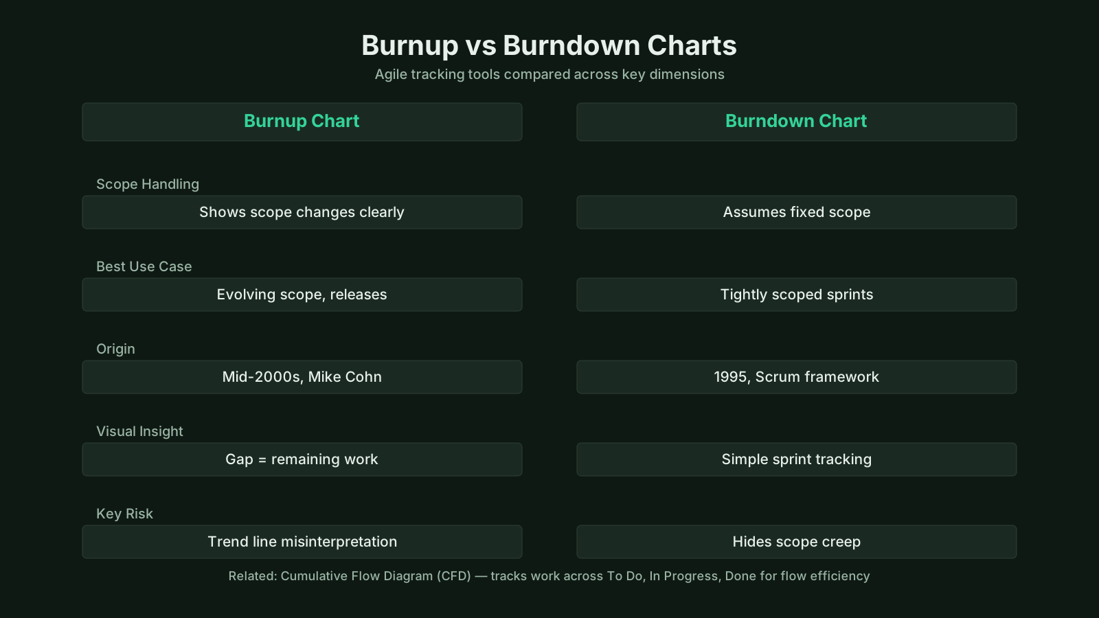
Burnup Chart: Key Points Summary
| Definition | Summary |
|---|---|
| Burnup Chart | A burnup chart is an Agile project visualization that plots cumulative completed work against the total scope, clearly showing both progress and scope evolution over time. |
| Burndown vs. Burnup | Unlike a burndown chart, a burnup chart tracks completed work and total scope as independent trajectories, making it essential for projects where requirements frequently change. |
| Chart Axes | The vertical axis measures work effort in units such as story points, hours, or ideal days; the horizontal axis marks time in sequence of sprints, iterations, or calendar weeks. |
| Core Lines | Two key lines are drawn: the completed work line rises incrementally as items finish, while the total scope line moves up or down each time scope is added or removed. |
| Scope Visibility | This chart offers instant visual clarity on work done and effort remaining, honestly reflecting that scope is seldom static and often adapts during delivery. |
| Forecasting | Extending the slope of the completed work line enables stakeholders to gauge whether the team will meet the target date or if scope or timeline adjustments are prudent. |
| Simple Analogy | A burnup chart resembles tracking the construction of a custom home where owners continually add rooms: it displays both finished work and the expanding total scope in one view. |
| Trend Line | Most burnup charts include a forward projection from the completed work line that estimates a completion date based on the team's current velocity and remaining scope. |
What Is a Burnup Chart?
A burnup chart definition in project management describes it as an information radiator that displays work progress toward a variable target. Unlike static tracking tools, it acknowledges that project scope is rarely fixed, and it provides immediate visual feedback on how much work has been accomplished and how much remains. The core visual structure consists of the completed work line, which rises as the team finishes items, and the total scope line, which can move upward when new requirements are added or move downward if scope is cut. Where these two lines meet, the project is complete. This creates a projection into the future; stakeholders can quickly see whether the team is on track to finish the total scope by a desired end date, or if adjustments are needed.
Practitioners often observe that the real power of a burnup chart lies in what it reveals about decisions that affect the project's outcome. The gap between the completed work line and the total scope line represents the remaining work, and the steady progression of the completed line, compared against any sudden jumps in the total line, exposes the impact of scope creep in a way that few other charts can. A burnup chart explained in simple terms is like tracking the construction of a custom house where the owner keeps adding rooms. The chart would show the builder’s progress on the original plan while also showing how many more rooms have been added to the contract, and whether the finish date is still realistic. It doesn’t just track speed; it tracks the size of the challenge as it changes.
Core Insights on Burnup Charts
- Dynamic tracking of variable scope
- Burnup charts track progress against a flexible target, offering an immediate, at-a-glance view of both completed and outstanding work, unlike static tools that lock scope early.
- Two core data lines
- As tasks are finished, the completed work line rises, while the total scope line moves upward to accommodate new requirements or downward to reflect scope reductions; the project is complete at the exact point where these two lines meet.
- Reveals the impact of scope creep
- The distance between the completed work line and the total scope line indicates remaining work, and any abrupt upward shift in the total line while progress remains constant immediately reveals how scope creep threatens the project timeline.
Key Components of a Burnup Chart
The burnup chart's structure consists of several essential elements that work together to provide a clear picture of project health. The horizontal axis is always time, marked in consistent intervals relevant to the team’s cadence, such as days for a daily stand-up view or sprints for a release-level overview. The vertical axis represents the unit of measurement for work: story points, ideal days, number of tasks, or even feature count. Two lines form the core of the visualization. The completed work line starts at zero and climbs incrementally as the team finishes work, while the total scope line represents the current sum of all known work items in the project backlog or release plan. The total scope line is step-shaped; it remains flat when scope is stable, jumps up when new items are introduced, and steps down when items are removed.
In addition to these two primary lines, many burnup charts include a guideline or a trend line projecting forward from the completed work line’s slope to show an estimated completion date. This projection uses velocity, calculated as the average rate of work completion over recent intervals. When the projection intersects the total scope line, that point in time gives a forecasted finish date. Because the total scope line can move, the forecast adjusts dynamically. Some burnup charts also include an ideal line representing a perfect linear progression from start to finish based on the initial scope and timeline. The distance below the ideal line indicates delays, while the shifting total line exposes re-planning events. The visual separation between the completed line and the total line is the remaining work, often the single most discussed metric during daily stand-ups and sprint reviews.
Burnup Chart vs Burndown Chart
A burnup chart vs burndown chart comparison reveals fundamental differences in how they treat scope and what insights they provide. A burndown chart starts with the initial total work and charts the decline toward zero as tasks are completed. It offers a single line descending over time, and if new work is added, the line jumps upward, making it look as though progress has been erased. This can be psychologically discouraging and makes it harder to distinguish between genuine progress and scope changes. In contrast, a burnup chart separates these two stories: the completed work line consistently rises to show forward movement, and the total scope line adjusts independently to reflect updated requirements. The team’s hard work is always visible, and the impact of additional requests is never hidden.
Because a burndown chart conflates scope change with a lack of progress, managers sometimes misinterpret a rising burndown line as a team underperforming when in reality the project simply got larger. A burnup chart removes this ambiguity. It also surfaces a critical question that burndown charts cannot answer directly: are we adding more work than we are finishing over time? This is immediately obvious when the gap between the completed line and the total scope line widens rather than narrows. For projects in which the scope is intentionally emergent, such as those following a product backlog approach where stakeholders continuously refine requirements, the burnup chart provides a more honest and less demoralizing picture. It is not that burndown charts are obsolete; they work well in tightly controlled sprints with fixed scope, but for multi-sprint releases and roadmap tracking, the burnup chart becomes the superior option.
Core Insights on Scope Tracking
- Burndown chart mechanics
- A burndown chart visualizes the remaining effort over time, starting from the initial workload and trending downward to zero as tasks are finished.
- Scope changes disrupt burndown
- When new work is added mid-sprint, the burndown line spikes upward, creating the false impression of lost progress that can demotivate the team.
- Burnup separates two lines
- A burnup chart displays a steadily rising line for actual completion alongside a separate, adjustable scope line that expands to accommodate new requirements.
- Avoiding misread performance
- Because burndown charts merge scope increases into the same downward trend, they often mislead stakeholders into perceiving scope growth as underperformance, unfairly attributing blame to the team.
- Better for emergent scope
- Projects with dynamic backlogs and multi-sprint releases benefit from the burnup chart's transparent separation of scope changes, providing a truthful and motivating picture, whereas burndown remains effective for tightly scoped, single-sprint efforts.
Burnup Chart in Project Management Frameworks
Agile and Scrum Context
Within Agile methodologies, the burnup chart is widely adopted as a release-level tracking instrument, even though it is not mandated by the Scrum Guide itself. Scrum teams often use it during sprint reviews to show stakeholders how the product increment is growing toward a release goal. The product owner typically maintains the total scope line by updating the product backlog’s estimated size, while the development team contributes the completed work line based on finished backlog items each sprint. In the Scaled Agile Framework (SAFe), burnup charts appear in program-level reporting to visualize feature completion against program increment objectives. Kanban teams may also use burnup charts to track cumulative flow of work items through the system, with the total line representing the total number of items requested and the completed line measuring those that have reached the “done” state.
Because Agile embraces change, the burnup chart’s ability to show scope adjustments as visible, non-punitive events aligns perfectly with the Agile principle of welcoming changing requirements. It transforms a scope increase from an emergency to a plain engineering trade-off conversation. A team can say, “Based on our velocity, adding this feature pushes the projected completion from sprint 8 to sprint 10. Is that acceptable?” The conversation shifts from blame to prioritization, which is exactly what Agile intends.
Predictive and Hybrid Environments
While burnup charts are less common in predictive project management, the concept translates to earned value management and milestone tracking when adapted. A project manager in a hybrid environment might replace story points with physical deliverables or work packages and plot the cumulative number of completed deliverables against the total number in the work breakdown structure. This provides a similar forward-looking forecast. In the PMBOK Guide, the idea of tracking work completed versus total work is closely tied to the Control Schedule and Monitor and Control Project Work processes. Although the PMBOK Guide does not explicitly name “burnup chart,” the principles behind trend analysis, forecasting, and variance analysis are consistent with its use. In PRINCE2, where stage boundaries and tolerance management are central, a burnup chart can serve as a visual aid during checkpoint reports, showing the Project Board how much of the current stage’s products have been completed and whether the stage scope is stable or drifting.
BVOP Perspective
Business Value-Oriented Project Management (BVOPM) approaches scope change not as a failure but as user feedback, which aligns directly with what a burnup chart visualizes. BVOPM introduces a five-level scope scale ranging from Definite to Unlikely, where only items rated as Definite are included in the baseline, while lower-confidence items are tracked separately. When such items are later confirmed and added to scope, the burnup chart’s total line steps upward, making that feedback loop entirely transparent. This integration honors the BVOPM principle that scope adjustments are expected and valuable rather than signs of poor planning. Within this context, the burnup chart becomes a boardroom-friendly tool to demonstrate that the team is responding to validated business needs without obscuring their progress.
Purpose and Importance of Burnup Charts
The primary purpose of a burnup chart is to provide an honest, at-a-glance view of project progress that fosters trust and informed decision-making. When posted on team walls or included in dashboards, it acts as an information radiator that reduces the need for lengthy status meetings. Stakeholders can walk by on any given day, see that the completed line is climbing steadily, notice if the total line has jumped, and immediately understand whether the project’s trajectory is problematic. Because it separates scope changes from productivity, it lowers the emotional resistance to discussing late additions; teams feel safe reporting progress because even a small amount of work completed looks like forward movement rather than a drop in a burndown that goes unnoticed against a rising total.
In multi-team programs, burnup charts aggregated at the release or program level offer portfolio managers a single view of how multiple backlogs are converging toward a common roadmap date. They can compare the slopes of completed lines across teams to detect velocity imbalances early. If one team’s total scope is growing disproportionately while its velocity remains flat, the program manager knows a conversation about capacity and prioritization is required. This aligns well with the predictive capability required in hybrid governance, where hard deadlines often exist. The visual projection line becomes a negotiation tool, grounding scope discussions in empirical data rather than gut feelings.
Key Takeaways on Burnup Chart Value
- Transparency builds stakeholder trust
- The burnup chart delivers an unfiltered, real-time snapshot of project progress, replacing ambiguity with transparent evidence that strengthens stakeholder confidence and supports data-driven decisions.
- Information radiator reduces meetings
- Acting as a live information radiator on walls and dashboards, the burnup chart curtails repetitive status meetings by keeping everyone aligned on progress automatically.
- Scope separated from productivity
- By visually decoupling scope changes from actual throughput, the chart fosters a psychologically safe space for honest progress reporting and defuses defensiveness that often accompanies late-stage scope discussions.
- Program-level portfolio oversight
- When aggregated across multiple teams or backlogs, burnup charts provide portfolio managers with a unified view of delivery convergence, highlighting diverging completion slopes that signal velocity imbalances long before deadlines are at risk.
- Projection line grounds scope talks
- The extrapolated projection line transforms subjective scope debates into fact-based negotiations, anchoring hybrid governance discussions in the team's actual delivery track record rather than intuition.
Common Challenges and Misconceptions
Common pitfalls with burnup charts often arise from misinterpreting the data rather than from flaws in the chart itself. One frequent mistake is treating the projected completion date as a guarantee. The forecast is based on historical velocity, and if velocity is volatile or the team composition changes, the projection can mislead. Another misconception is that the total scope line should only move upward; scope can also be removed when features are deprioritized, and the chart should reflect those cuts by dropping the line. If a team fails to update the total line to reflect de-scoping, the remaining work appears larger than it truly is, inflating anxiety unnecessarily. There is also the temptation to add scope without adjusting the total line in small increments because “it’s just a minor change,” but doing so erodes the chart’s integrity and destroys the very transparency it was built to provide.
Teams sometimes confuse a burnup chart with a cumulative flow diagram, though they serve different purposes. A cumulative flow diagram tracks work in different states (to-do, in-progress, done) and can expose bottlenecks, while a burnup chart focuses solely on done versus total. Using a burnup chart for sprint-level tracking, where scope is ideally fixed, can be over-engineered; burndown charts are simpler and more appropriate in that constrained context. Additionally, the unit of measurement must remain consistent; mixing story points and task hours on the same vertical axis produces nonsense. Finally, stakeholders who are accustomed to traditional Gantt charts may initially struggle with the idea that the finish line can move. The burnup chart forces a conversation about trade-offs that some organizations would rather avoid, which is both its greatest strength and its greatest challenge.
Relationship to Other Agile Metrics
Related Agile tracking metrics intersect with the burnup chart in ways that deepen its analytical power. Velocity is the engine behind the trend line; without a reliable velocity measurement, the projection from the completed work line is little more than a guess. As such, the burnup chart is rarely used in isolation. Teams typically monitor their velocity stability and use that confidence level to determine how frequently they should update the forecast. Cumulative flow diagrams complement the burnup chart by showing not just what is done, but where work is piling up in the process. If a burnup chart shows a strong completed line but a cumulative flow diagram reveals enormous amounts of work in testing, that gap signals that the completion rate may soon plateau despite appearing healthy.
The burnup chart also connects closely with the product backlog. The total scope line is a direct reflection of the backlog’s estimated size. When the product owner splits epics into smaller stories and re-estimates them, the total line can jump even without new feature requests, reflecting a more accurate understanding of existing work. This kind of refinement is healthy, but it must be communicated clearly to avoid the appearance of uncontrolled scope growth. In this sense, the burnup chart serves as a sprint-over-sprint narrative of how the team’s understanding of the work evolves. It ties together estimation accuracy, scope management, and stakeholder communication in a single visual artifact.
Core Takeaways on Metric Interplay
- Velocity drives forecast accuracy
- A burnup chart’s forecast trend relies on consistent velocity, so teams track variability in their velocity to determine the optimal frequency for revising predictions.
- CFD reveals bottleneck risks
- Cumulative flow diagrams complement burnup charts by revealing bottlenecks where work accumulates, such as a testing pile-up that may stall overall throughput and flatten the completion curve.
- Scope line signals estimation health
- The total scope line mirrors backlog size estimates; when product owners decompose and refine epics, the resulting upward shift reflects better definition, not uncontrolled growth, so clear stakeholder communication is essential to prevent misinterpretation.
Evolution and Current Thinking
Current trends in burnup chart usage show a shift toward automation and integration with digital project management tools rather than manual whiteboard drawings. Most modern Agile life cycle management platforms can generate burnup charts automatically from ticket data, often layered with additional analytics like confidence intervals for the projected end date. This statistical approach uses Monte Carlo simulations to generate a range of possible finish dates rather than a single line, acknowledging the uncertainty inherent in knowledge work. Such probabilistic burnup charts are gaining traction because they manage stakeholder expectations more responsibly, presenting a forecast as “by sprint 10 we have an 85% chance of completion” instead of a deterministic promise.
Another evolving practice is the use of burnup charts in outcome-based planning, where the vertical axis represents value points or business outcomes rather than effort units. In this variant, the completed line rises as the team delivers increments known to generate user value, and the total line represents the desired value threshold for a release. This aligns with lean startup thinking, where the goal is not to complete a fixed set of features but to achieve a measurable impact. It also echoes the BVOPM concept of Business Value Points, where persistent decline in value points can signal the need for project closure. As organizations move beyond simplistic velocity tracking, the burnup chart is becoming less of a productivity report and more of a strategic conversation starter, quantifying not just how much was built, but how close the team is to creating something that actually matters.