A Cycle Time Chart is defined as a graphical representation that plots the elapsed time from the moment active work begins on a work item until that item reaches a completed state. In project management, particularly in Agile and Lean contexts, the chart displays individual cycle time values as data points across a timeline, allowing teams to visualize delivery speed, variability, and trends. The chart serves as both a diagnostic artifact and a communication tool for stakeholders who need to understand how work actually flows through a team or system.
The value of a Cycle Time Chart rests in its capacity to expose flow dynamics that remain invisible in traditional schedule reports. A Gantt chart shows planned durations and dependencies. A burndown chart tracks remaining scope. A Cycle Time Chart, by contrast, captures observed elapsed time for completed items, revealing the real distribution of delivery durations rather than estimates or commitments. This distinction matters because teams frequently know what they planned and what they delivered, but lose track of how long delivery actually took after work commenced.
Practitioners often observe that schedule slippage rarely results from a single dramatic failure. More commonly it emerges from many small delays accumulating across individual work items. The Cycle Time Chart makes those small delays visible in aggregate, one completed data point at a time.
Cycle Time Chart: Key Topics at a Glance
| Key Concept | Summary |
|---|---|
| Cycle Time Chart | A Cycle Time Chart presents individual cycle time values as data points along a timeline, allowing teams to monitor delivery speed, detect variability, and track trends in Agile and Lean delivery environments. |
| Purpose | It functions as a diagnostic instrument and a communication aid, helping stakeholders see how work actually moves through a team or system instead of relying on planned timelines or static status reports. |
| Flow Dynamics | The chart reveals flow dynamics that traditional schedule reports tend to hide, exposing the actual distribution of delivery durations rather than the estimated dates or commitments recorded elsewhere. |
| Data Points | Each completed work item generates a single data point that measures the elapsed time from the item entering an active work state to its completion as done. |
| Usage | Project managers, Scrum Masters, and delivery leads read these patterns to diagnose delivery bottlenecks and estimate likely completion ranges for new or incoming work. |
| Bottleneck Diagnosis | Stable execution durations combined with prolonged total lead times typically indicate an upstream bottleneck in intake queues, prioritization decisions, or resource availability. |
| Sprint Boundary Effect | Scrum teams operating on two-week sprints commonly show cycle times clustering near the sprint boundary because work starts late and is completed only just before the sprint review. |
| Agile Context | The practice has gained momentum as organizations shift away from predictive scheduling toward empirical flow measurement and delivery decisions grounded in observed performance. |
What Is a Cycle Time Chart?
In Agile project management, what is a cycle time chart often gets answered by comparing it to more familiar scheduling visuals. A Cycle Time Chart is not a plan. It is an empirical record. Each completed work item, whether a user story, defect fix, task, or feature, contributes one data point representing the elapsed time between entering an active state and exiting as done. The x-axis typically orders work items by completion date, while the y-axis represents elapsed duration in hours, days, or weeks.
The resulting plot forms a scatter diagram that reveals patterns absent from aggregated summaries. A cluster of points low on the y-axis indicates fast delivery. A wide vertical spread signals variability. A rising trend line suggests deteriorating flow, while a compression toward lower durations indicates improvement. Project managers, Scrum Masters, and delivery leads read these patterns to diagnose bottlenecks and forecast likely completion ranges for new work.
The chart's simplicity can be misleading. It does not prescribe actions. It surfaces evidence. A team that sees several cycle times stretching far above its median on a Cycle Time Chart knows something blocked those items. Whether the cause was external dependency, unclear requirements, or resource contention requires separate investigation. This distinction between signal and diagnosis is central to proper use of the tool.
The term cycle time chart in project management has grown increasingly prominent as organizations shifted from purely predictive scheduling toward empirical flow measurement. The chart represents a departure from asking "are we on schedule?" toward asking "how long does our work actually take, and how consistently?" This reframing carries significant implications for how teams communicate with stakeholders and how they forecast future delivery.
Core Insights on Cycle Time Charts
- Not a scheduling plan
- Each completed work item contributes one data point that records elapsed time from active state to done, turning the chart into an empirical snapshot of delivery performance rather than a prescribed schedule.
- Patterns reveal flow health
- Tight clusters near the lower y-axis indicate fast delivery, wide vertical spread exposes inconsistency, an upward trend signals deteriorating flow, and compression toward shorter durations marks improvement.
- Drives empirical flow decisions
- Project managers, Scrum Masters, and delivery leads interpret these patterns to isolate bottlenecks and forecast probable completion ranges, reinforcing a shift from predictive scheduling to evidence-based flow measurement.
Cycle Time Chart Definition and Core Meaning in Flow-Based Delivery
The cycle time chart definition in management literature centers on the elapsed duration from workflow start to workflow finish for a single work item. In Kanban terms this corresponds to the time an item spends in progress, excluding time spent queued before work began. That exclusion matters. Lead time includes the wait from request to start. Cycle time excludes it. A stakeholder might perceive a two-week delay as slow delivery, but the Cycle Time Chart may show that actual work took only three days. The remaining eleven days were queue time, a separate problem with separate causes.
This distinction between cycle time and lead time forms the conceptual backbone of flow metrics. Queue time is waste in Lean thinking. Cycle time is execution duration, which can also contain waste if work is blocked mid-process. When a Cycle Time Chart shows stable execution durations but long lead times, the bottleneck sits upstream, likely in intake, prioritization, or resource availability. When cycle times themselves are long and erratic, the bottleneck exists within the active workflow itself.
Little's Law provides the mathematical relationship that connects these concepts. The law states that the average number of items in a system equals the average arrival rate multiplied by the average time an item spends in the system. Translated to project work, work in progress equals throughput multiplied by cycle time. If a team holds twelve items in progress and completes three per week, average cycle time will be approximately four weeks. This relationship is not a prediction tool. It is a structural constraint. A Cycle Time Chart makes the time component of this equation visible at the individual item level, which aggregated averages hide.
What this means in practice is straightforward. A team that wants shorter cycle times has two levers: reduce work in progress or increase throughput. Most teams find reducing work in progress more immediately controllable. When a Cycle Time Chart shows durations drifting upward, the first question should be whether the team started too many items simultaneously. The chart itself will not answer that question, but it will quantify the consequence.
Key Components of Cycle Time Charts
Several key components of a cycle time chart define its structure and interpretive value. The horizontal axis represents the sequence or chronology of completed work items. Some charts plot completion date directly, producing a time-series view. Others plot item order, which emphasizes distribution rather than temporal trends. The choice depends on whether the team wants to examine change over calendar time or consistency across work items.
The vertical axis represents elapsed duration, typically measured in days for knowledge work. The scale must accommodate outliers without compressing the majority of data points into an unreadable band. Teams often use a log scale or manually truncate extreme values while noting them separately. A Cycle Time Chart that shows ninety percent of points clustered between one and five days with three points at forty days carries a different message when the y-axis reflects that full range.
Data Points and Percentile Lines
Each completed work item contributes one data point. Percentile lines, usually at the 50th, 85th, and 95th percentiles, create reference bands that help teams interpret the scatter. The 50th percentile marks the median cycle time: half of all items completed faster, half slower. The 85th percentile indicates the duration within which most work finishes. The 95th percentile captures the tail of slow items. A Cycle Time Chart with these lines reveals whether long durations are rare outliers or a regular feature of the distribution.
For a team new to cycle time analysis, percentile lines can feel abstract. Imagine a delivery record where most packages arrive in three to five days, but occasionally one takes three weeks. The median tells the team what to expect under normal conditions. The 95th percentile acknowledges the painful exceptions. Forecasting future delivery based on the median alone would disappoint stakeholders roughly half the time. Forecasting with the 85th percentile provides a more honest commitment range.
Trend Lines and Control Limits
A rolling average or trend line smooths the scatter to expose directional shifts. Control limits, borrowed from statistical process control, can mark the boundaries of expected variation. Points outside these limits signal special cause variation: something unusual happened to that specific work item. A Cycle Time Chart used in this way becomes a control chart variant, distinguishing common cause variation inherent in the system from exceptional events requiring investigation.
The interpretive power of these components comes from their interaction. A trend line that remains flat while the 95th percentile rises indicates that typical work is stable but extreme cases are becoming more frequent. A trend line that rises while the percentile spread remains tight suggests a systemic slowdown affecting all work equally. Reading these combinations requires experience and a willingness to look beyond any single summary number.
Core Takeaways on Chart Components
- Two plotting approaches
- Cycle time charts typically use one of two plotting methods, where completion dates produce a calendar-based time series and item sequence highlights variation across individual work items.
- Axis choice depends on goal
- The choice between these methods depends on whether the team needs to monitor trends over calendar time or evaluate how cycle time varies across individual work items, with each approach revealing a different analytical dimension.
- Vertical axis measures duration
- The vertical axis encodes elapsed time, most often expressed in days for knowledge work, and its scaling must be chosen to keep extreme values visible without flattening the cluster where most data points fall.
- Handling extreme values
- Because a full-range axis can compress the main distribution into an unreadable band, practitioners commonly apply a logarithmic scale or cap extreme values and annotate the excluded points separately.
- Percentile reference bands
- Reference lines at the 50th, 85th, and 95th percentiles divide the distribution into interpretable bands, where the 50th percentile marks the median cycle time and splits items into equal faster and slower halves.
Cycle Time Chart in Project Management Frameworks
The use of a cycle time chart in project management spans predictive, Agile, and hybrid approaches, though the depth and formality of application differ. In predictive environments, cycle time functions as a secondary metric within schedule control. In Agile environments, it often serves as a primary health indicator for team flow. The common thread is that all frameworks concerned with delivery speed and predictability can derive value from seeing actual elapsed durations at item level.
Framework context shapes how the chart is interpreted. A predictive project manager might view cycle time as one input among many in schedule variance analysis. An Agile coach might treat it as the central diagnostic tool for team flow. A hybrid program manager might use it selectively across workstreams where flow-based delivery applies. The metric itself does not change. The weight given to it does.
Cycle Time Chart in PMBOK and Predictive Environments
Within the PMBOK framework, a Cycle Time Chart does not appear as a named artifact in the traditional process groups. It aligns most closely with the Control Schedule process in the Monitoring and Controlling process group, where schedule variance analysis and performance reviews occur. In the Seventh Edition of the PMBOK, which organizes work around principles and performance domains rather than process groups, cycle time fits within the Delivery Performance Domain. The focus on delivering value frequently and measuring actual outcomes gives cycle time metrics a natural home in the PMBOK framework.
A predictive project manager might use a Cycle Time Chart alongside earned value management to understand why schedule performance index values are declining. Earned value shows that planned work is lagging. The Cycle Time Chart can reveal whether completed work packages themselves are taking longer than expected once execution begins. This distinction helps separate planning inaccuracies from execution inefficiencies, two very different problems requiring different corrective actions.
Predictive environments often impose fixed milestones and contractual dates. In these settings, cycle time data can inform the realism of future estimates, but it does not override binding commitments. A cycle time chart PMBOK context serves primarily as a feedback mechanism for improving estimating practices and identifying execution bottlenecks that formal schedule reports might obscure.
Cycle Time Chart in Agile and Scrum
Scrum does not mandate a Cycle Time Chart, but many Scrum teams adopt it as a complement to velocity and burndown charts. Velocity measures output in story points per sprint. Burndown charts track remaining work against time within a sprint. Neither captures the elapsed duration of individual product backlog items from the moment a developer starts working until the increment is done. A Cycle Time Chart fills that gap, exposing delivery speed and consistency at the granularity that matters for forecasting release windows.
Scrum teams operating with two-week sprints sometimes produce cycle times that cluster near the sprint boundary, a phenomenon caused by work starting late and finishing just before the sprint review. The Cycle Time Chart makes this clustering visible. If most stories complete on day eight or nine of the sprint regardless of size, the pattern suggests batch processing rather than continuous flow. Recognizing this pattern allows the team to consider whether its definition of done, sprint planning practices, or work breakdown habits create artificial delays.
Cycle Time Chart in Kanban and Lean
Kanban systems treat the Cycle Time Chart as a core analytical tool, often displayed directly on the board or in a connected analytics dashboard. The chart pairs with the cumulative flow diagram to provide a complete picture of system health. The cumulative flow diagram shows how many items sit in each workflow state over time. The Cycle Time Chart shows how long completed items took to traverse those states. Together they connect work in progress, throughput, and duration in a way that supports evidence-based workflow policy decisions.
Lean practitioners use cycle time as a key measure of flow efficiency. If an item spends ten days in progress but only two hours of active work, flow efficiency is extremely low. The Cycle Time Chart exposes the elapsed duration, but calculating flow efficiency requires additional data on active work time. This distinction matters because managers sometimes mistake low cycle time for high efficiency. A team can deliver quickly while wasting enormous effort through context switching, rework, or waiting that the elapsed duration metric alone does not capture.
Cycle Time Chart and the BVOP Perspective
Business Value-Oriented Project Management, or BVOPM, treats prolonged or erratic cycle times as potential indicators of process damage and waste. The methodology categorizes waste into forms including overwork, perfectionism, and rejected acceptable work. A Cycle Time Chart in a BVOPM context serves as a monitoring artifact that links these waste categories to observable delivery duration patterns. An upward drift in cycle time might signal perfectionism creating rework loops, while sudden spikes may indicate overwork reducing cognitive capacity and slowing decision-making.
BVOPM also tracks Business Value Points to determine whether a project remains viable. Persistent cycle time increases can depress value delivery rates, which in turn affects those points. The chart thus functions not as an isolated schedule metric but as one input into broader value-oriented monitoring. BVOPM's emphasis on waste reduction rather than speed maximization aligns with a balanced reading of cycle time data, where the goal is sustainable, predictable flow rather than aggressive duration compression at any cost.
Purpose and Importance of Cycle Time Charts
The purpose of cycle time charts extends beyond simple performance measurement. They enable probabilistic forecasting, expose systemic impediments, support continuous improvement efforts, and provide stakeholders with an honest view of delivery reality. Traditional schedule tools communicate plan versus actual at a macro level. A Cycle Time Chart communicates the empirical distribution of delivery durations, which is precisely the information needed to make credible commitments about future work.
Forecasting based on historical cycle time distributions produces statements like "we have an eighty-five percent chance of delivering this item within six days." This type of probabilistic language replaces deterministic promises that ignore variability. Stakeholders accustomed to fixed deadlines may initially find such forecasts less satisfying, but they are demonstrably more accurate over time. The chart supplies the data that makes this forecasting approach possible.
The importance of cycle time charts also lies in their diagnostic power. Changes in the chart's shape often precede stakeholder complaints. A team that sees its 95th percentile rising week after week can intervene before delivery delays become visible to customers. This forward-looking capability distinguishes the Cycle Time Chart from lagging indicators that only confirm a problem after it has fully materialized.
Additionally, the chart supports organizational learning in ways that many other metrics do not. Because it records actual performance rather than planned intention, it accumulates a historical record that remains useful across projects. A team that has tracked cycle time for six months can reference that data when estimating an unfamiliar type of work, negotiating scope with stakeholders, or explaining to leadership why a requested deadline is unrealistic. The chart becomes a memory system for delivery capability.
Core Insights on Probabilistic Forecasting
- Beyond simple performance measurement
- By making the distribution of delivery times visible, cycle time charts support probabilistic forecasting, expose systemic bottlenecks, strengthen continuous improvement efforts, and provide stakeholders with a transparent view of delivery reality.
- Empirical distribution of durations
- Traditional schedule tools report plan versus actual at a macro level, whereas a cycle time chart reveals the empirical distribution of delivery durations required to make credible commitments about future work.
- Probabilistic over deterministic promises
- Historical cycle time data yields forecasts such as an 85 percent chance of delivery within six days, replacing deterministic promises that ignore variability with defensible, probability-based language that stakeholders can trust over time.
- Forward-looking early warning signal
- A rising 95th percentile trend provides an early warning that allows teams to intervene before delays reach customers, giving cycle time charts a forward-looking advantage over lagging indicators that confirm problems only after they have fully materialized.
- Foundation for negotiation and estimation
- A six-month history of cycle time data provides the empirical foundation teams need to estimate unfamiliar work, negotiate scope with stakeholders, and explain to leadership why a requested deadline is unrealistic.
Practical Applications and Use of Cycle Time Charts
Common cycle time chart applications appear throughout the delivery lifecycle, from backlog refinement to retrospective analysis. Product owners use cycle time distributions to set expectations with stakeholders about likely delivery windows. Delivery managers use trend lines to detect deteriorating flow before it affects release commitments. Teams use the chart during retrospectives to ground discussions in data rather than anecdote. A retrospective observation that "stories took longer this sprint" carries more weight when the Cycle Time Chart shows a cluster of points above the 85th percentile.
Release planning benefits particularly from cycle time analysis. When a team knows its historical cycle time distribution for different work types, it can estimate the probable duration of future items with defensible confidence intervals. This does not eliminate uncertainty, but it bounds it. A product owner planning a release can say with statistical backing that a set of ten similar stories will likely complete within a range derived from the chart's percentile bands.
Cross-team comparison represents a more contested application. Comparing cycle times between teams working on different products, with different definitions of done, or with different work item granularity produces misleading conclusions. Cycle time comparison is most valid when teams share comparable workflows and work definitions. Some organizations establish normalized cycle time benchmarks for similar work types across teams, but even these require careful contextualization. A team working on well-defined small tasks will naturally show shorter cycle times than a team handling complex, novel feature work.
During active project execution, the chart supports daily or weekly standup conversations. When a work item has been in progress for longer than the team's 95th percentile cycle time, that item is statistically unusual and likely blocked. Team members can focus attention on such outliers without waiting for formal status reviews. This real-time application transforms the Cycle Time Chart from a retrospective reporting tool into an active management instrument.
Common Challenges, Pitfalls, and Misconceptions about Cycle Time Charts
Several cycle time chart misconceptions undermine effective use. The most frequent is treating cycle time as synonymous with lead time. The two metrics answer different questions. Lead time answers "How long did the customer wait from request to delivery?" Cycle time answers "How long did active work take?" A team can have excellent cycle times and terrible lead times if work sits in a backlog queue for weeks before anyone starts it. Fixing that queue requires different actions than fixing slow execution.
Another pitfall involves averaging. Stakeholders sometimes ask for "the average cycle time" and use it as a commitment target. Averages mask the distribution. A team with a four-day average and a 95th percentile of fifteen days will frequently miss four-day commitments. Reporting the median alongside the 85th and 95th percentiles provides a more complete picture. Sophisticated practitioners avoid single-number cycle time reporting entirely in favor of percentile-based bands.
The chart also cannot measure quality or value. A team can achieve impressively short cycle times by shipping low-quality work, cutting corners, or avoiding complex features. Cycle time optimization without quality safeguards produces a faster path to defects and technical debt. Organizations that tie performance bonuses exclusively to cycle time reduction often discover this dynamic the hard way, after quality metrics have already deteriorated.
Data quality presents another common challenge. Inconsistent work item granularity distorts cycle time comparisons. A team that logs a large epic as a single work item and a small bug fix as another work item will see enormous variance in its Cycle Time Chart that reflects definitional inconsistency rather than real flow problems. Establishing clear criteria for what counts as a trackable work item, and applying those criteria consistently, is a prerequisite for meaningful analysis.
Another misconception is that the chart predicts individual work item durations. It does not. It describes the historical distribution of completed items. Future items may fall inside or outside that distribution depending on changing conditions, new team members, altered scope, or external disruptions. The chart informs probabilistic forecasting, but it cannot anticipate a specific requirement's hidden complexity or a vendor's unexpected failure.
Key Takeaways on Cycle Time Misconceptions
- Cycle time differs from lead time
- Lead time measures the total elapsed time from customer request to delivery, so a team can show excellent cycle times while lead times remain poor because work sits idle in the backlog for weeks before development begins.
- Averages hide critical variation
- A team whose average cycle time is four days but whose 95th percentile is fifteen days will routinely miss four-day delivery commitments, which is why experienced practitioners track the median and the 85th and 95th percentiles instead of a single summary figure.
- Short cycle times may indicate gaming
- Teams can post impressively short cycle times by shipping low-quality work, cutting corners, or avoiding complex features, and organizations that tie bonuses solely to cycle time reduction often discover that quality metrics have already declined.
- Work item definitions distort charts
- When a large epic is logged as one work item and a small bug fix is logged as another, the Cycle Time Chart shows inflated variance that stems from inconsistent work item definitions rather than actual flow problems.
- Historical distribution is not fixed
- Future work can fall outside the historical distribution because shifting conditions, new team members, changed scope, or external disruptions can move cycle times, which means past performance is not a reliable predictor of future results.
Cycle Time Chart vs Lead Time Chart and Other Flow Metrics
A cycle time chart vs lead time chart comparison clarifies the boundaries of each metric. A lead time chart plots elapsed duration from the moment a request enters the system, including queue time, until final delivery. A cycle time chart plots only the active work portion. The gap between the two charts on any given item represents queue time, often the dominant source of delay in knowledge work. Teams that plot both metrics on a single chart gain immediate visibility into where their delays concentrate.
Throughput charts present another related but distinct view. A throughput chart counts completed items per unit time, typically per week. Throughput and cycle time share an inverse relationship governed by Little's Law. When cycle time rises, throughput falls, assuming work in progress remains constant. The Cycle Time Chart shows individual item durations, while the throughput chart shows delivery volume. Both are necessary for complete flow analysis, and neither substitutes for the other.
Cumulative flow diagrams differ from cycle time charts in their focus on system state rather than item completion. A cumulative flow diagram shows how many items are in each workflow state at any given moment, revealing bottlenecks through band widening. A Cycle Time Chart shows the historical durations of completed items, revealing delivery speed and consistency. The cumulative flow diagram diagnoses where work piles up. The Cycle Time Chart quantifies the resulting delay. Practitioners often use them in tandem during workflow reviews.
Control charts in traditional quality management bear a family resemblance to cycle time charts when control limits are applied. The distinction lies in the metric being tracked. A control chart can track any process variable with a defined mean and standard deviation. A Cycle Time Chart specifically tracks elapsed work duration. When a Cycle Time Chart incorporates control limits, it becomes a specialized control chart for flow-based delivery, subject to the same interpretive rules about common and special cause variation.
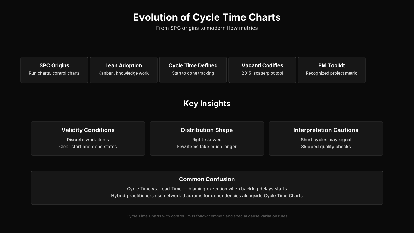
Evolution and Current Thinking on Cycle Time Charts
The evolution of cycle time charts reflects broader shifts from deterministic planning toward empirical, flow-based management. Early manufacturing applications of cycle time measurement focused on production line efficiency and takt time alignment. The translation to knowledge work required adapting the concept, because software development and project deliverables lack the repetitive, standardized characteristics of physical manufacturing. The chart had to accommodate heterogeneous work items, variable definitions of done, and cognitive work that resists precise timing.
Current best practice emphasizes distribution over point estimates, percentile-based forecasting over averages, and integration of cycle time data into probabilistic planning tools. Simulation techniques, particularly Monte Carlo methods, draw on historical cycle time distributions to generate range forecasts for future work. These approaches treat uncertainty as a feature of the data rather than a flaw to be eliminated. A Cycle Time Chart that feeds a Monte Carlo simulation becomes part of a forecasting system rather than a static report.
Debate continues about the appropriate granularity of cycle time tracking. Some practitioners advocate for tracking at the level of individual workflow states, arguing that total cycle time hides transitions where delay concentrates. Others maintain that item-level cycle time is sufficient for most teams and that finer granularity introduces measurement overhead without proportional insight. Both positions have merit depending on team maturity and workflow complexity. The disagreement itself signals a healthy maturation of the practice, moving beyond simple metric adoption toward thoughtful measurement design.
Another current development involves connecting cycle time data to organizational outcomes beyond delivery speed. Researchers and practitioners have begun examining relationships between cycle time patterns and developer burnout, defect rates, and customer satisfaction. While causal claims remain difficult to establish, the correlations observed in practice suggest that sustained cycle time deterioration often accompanies broader team health problems. This connection reinforces the value of monitoring the chart as a leading indicator rather than a retrospective scorecard.
As hybrid project management models gain traction, cycle time charts increasingly appear alongside traditional work breakdown structures and critical path analyses. The hybrid practitioner may use a network diagram to sequence dependencies while also maintaining a Cycle Time Chart to track how quickly work packages move once they enter execution. This blending of deterministic and empirical approaches represents a pragmatic acknowledgment that both planned logic and observed reality carry information. The Cycle Time Chart, once confined to Kanban boards and Lean manufacturing floors, now occupies a recognized place in the broader project management toolkit.
Cycle Time Chart Evolution Insights
- Shift to empirical management
- Cycle time charts have shifted from deterministic scheduling artifacts to empirical, flow-based instruments that reflect the inherent variability of knowledge work.
- Percentile forecasting over averages
- Leading practitioners now favor percentile-based forecasts and Monte Carlo simulations built from historical cycle time distributions, because averages and single point estimates conceal the true spread of delivery outcomes.
- Granular workflow state tracking
- Tracking cycle time at the level of individual workflow states is increasingly recommended, as aggregate cycle time obscures the specific handoffs and queues where delay accumulates.
- Cycle time signals team health
- A sustained rise in cycle time often coincides with broader team health issues, including developer burnout, elevated defect rates, and declining customer satisfaction, even though causal links are difficult to establish.