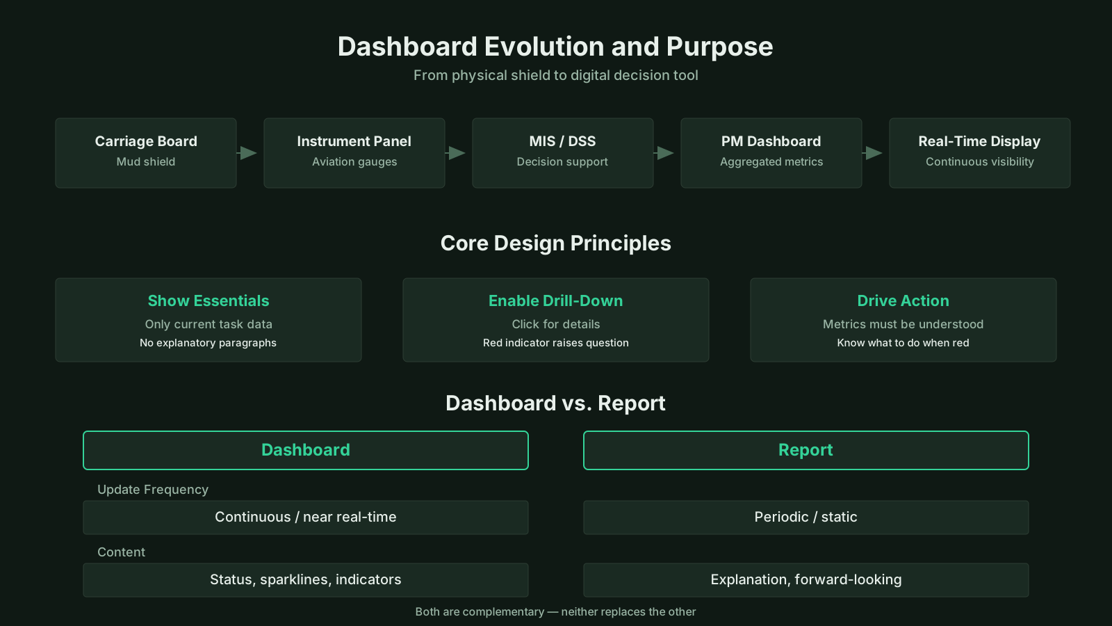
A dashboard in project management is defined as a visual display of the most critical project information, consolidated on a single screen or interface so that project stakeholders can monitor performance, progress, and health at a glance. The term is borrowed from automotive and aviation control panels, where a driver or pilot needs immediate access to essential indicators without searching through pages of data.
Dashboard Key Topics at a Glance
| Key Concept | Summary |
|---|---|
| Definition | A project management dashboard is a consolidated visual interface that displays critical project performance indicators on a single screen, enabling immediate situational awareness and faster decision making. |
| Origin | The term originates from automotive and aviation instrument panels, where operators rely on instantly readable gauges to monitor complex systems without distraction. |
| Integrated Data | It consolidates schedule progress, budget performance, resource workload, risk exposure, and quality metrics into a single coherent real-time view, eliminating the need to cross-reference separate systems. |
| Live Refresh | Unlike a static report, a live dashboard refreshes automatically and is optimized for rapid scanning, allowing stakeholders to detect shifts and anomalies before they escalate. |
| Status Monitoring | It directly answers "How are we performing right now?" without requiring project managers to open multiple spreadsheets, chase status updates, or reconcile conflicting data sources. |
| Visual Elements | Effective dashboards use progress bars, traffic light indicators, trend lines, Gantt timelines, burndown charts, heat maps, and key figures such as earned value and schedule variance. |
| Target Audiences | Dashboards can be tailored to team, program, portfolio, and executive audiences, with views that range from sprint velocity and open defect counts to return on investment and strategic alignment. |
| Data Reliability | Manually populating a dashboard from disconnected spreadsheets rapidly erodes its value, as data entry errors accumulate and maintenance overhead grows, undermining confidence in the metrics. |
What Is a Project Management Dashboard?
The project management dashboard definition centers on a real-time or near-real-time visual interface that aggregates schedule status, budget data, resource utilization, risk levels, and quality metrics into one coherent view. Unlike a static report that captures a snapshot at a specific moment, a dashboard is typically refreshed automatically and designed for rapid scanning rather than deep reading. It answers the immediate question "how are we doing right now?" without forcing a project manager to open multiple spreadsheets or ask several team members for updates.
In practice, a project dashboard may display progress bars, traffic light indicators, trend lines, and key numbers such as earned value, milestone completion percentage, or number of open issues. The central idea is that the most important data for decision-making is always visible and current. This distinguishes a dashboard from a traditional status report, which is often narrative-heavy and produced on a weekly or monthly cycle.
Dashboards are not limited to a single project. They can serve a program manager overseeing several related projects, a portfolio manager tracking investment performance across an entire organization, or an executive who needs a high-level view of strategic alignment. The same underlying concept applies at each level, but the metrics and granularity change based on the audience. A team-level dashboard might show sprint velocity and open defects, while an executive dashboard focuses on return on investment, strategic milestone achievement, and aggregate risk exposure.
Key Insights on Project Dashboards
- Real-time visual aggregation
- A project management dashboard consolidates schedule, budget, resource, risk, and quality data into a single visual interface that updates in real time or near real time.
- Built for rapid scanning
- Unlike static narrative reports, dashboards refresh automatically and are structured for rapid visual scanning, allowing stakeholders to absorb project status at a glance.
- Immediate status awareness
- The dashboard answers the immediate question of how the project is performing right now, eliminating the need to open multiple spreadsheets or chase team members for updates.
- Audience-driven metric selection
- Dashboards serve team leads, program managers, portfolio managers, and executives, with the metrics and level of detail automatically adjusting to match each audience's specific decision-making needs.
- Current data for decisions
- The core principle is that essential decision-making data remains continuously visible and current, providing a clear advantage over traditional weekly or monthly status reports.
Key Components of an Effective Dashboard
A well-designed dashboard includes several key components that work together to make project information accessible and actionable. The key components of a project dashboard generally fall into three categories: data integration, visual design, and user interaction. Without any one of these, the dashboard either becomes a static picture or a confusing jumble of numbers.
Data Sources and Integration
A project dashboard is only as good as the data behind it. Data typically comes from schedule management tools, financial systems, timesheet applications, risk registers, and issue trackers. The dashboard must pull from these sources automatically or through scheduled imports to avoid the lag that comes from manual compilation. When data is entered manually into a separate spreadsheet just to feed the dashboard, the value drops quickly because errors creep in and maintenance becomes burdensome.
Integration also means mapping data to consistent fields. For example, "budget variance" must be calculated the same way across all projects in a portfolio, or the dashboard becomes misleading. This is a common pain point in organizations that use multiple project management tools. The dashboard designer has to decide which single source of truth each metric comes from and document that decision clearly.
Visual Design Elements
Visual design is not about making the dashboard look pretty; it is about reducing cognitive load. Typical visual elements include Gantt charts compressed into a high-level timeline, burnup or burndown charts for agile projects, heat maps for resource contention, and traffic light icons for overall health. Color coding should follow a consistent logic: green for on track, yellow for at risk, red for off track. The moment these colors are used inconsistently, the dashboard loses its instant readability.
An effective dashboard also limits the number of visible metrics. A common mistake is the "Christmas tree" effect, where every possible KPI is crammed onto the screen. Practitioners often observe that a dashboard with ten well-chosen indicators is far more valuable than one with fifty. The person using the dashboard should be able to identify a problem within five seconds and know where to click for deeper detail.
Types of Project Management Dashboards
Project management dashboards can be categorized by their audience and their time horizon. The three most common types are operational dashboards, tactical dashboards, and strategic dashboards, though the boundaries between them are not always rigid. Each type addresses a different set of questions and requires different data granularity.
Operational, Tactical, and Strategic Dashboards
An operational dashboard is used by team members and immediate project managers to track day-to-day activities. It shows sprint progress, open tasks, current blockers, and short-term deadlines. These dashboards are often refreshed continuously and may be displayed on a large monitor in a team room. In agile environments, a physical or digital Kanban board serves a similar purpose.
A tactical dashboard supports project managers and mid-level stakeholders who need to track schedule, budget, scope, and risk over weeks or months. The classic earned value management dashboard falls into this category, showing planned value, earned value, actual cost, and variance trends. Tactical dashboards are usually reviewed weekly or at status meetings.
A strategic dashboard targets executives and portfolio governance bodies. It aggregates data from multiple projects into portfolio-level health indicators, such as alignment with business objectives, aggregate ROI, major milestone attainment, and top risks across all initiatives. These dashboards are often reviewed monthly or quarterly and deliberately exclude operational noise. The key challenge is avoiding information overload while still providing enough context for strategic decisions.
Status Dashboards and Portfolio Dashboards
Another useful distinction is between a single-project status dashboard and a portfolio dashboard. A status dashboard for one project may include detailed task lists, issue counts, and resource assignments. A portfolio dashboard, by contrast, compares projects against one another using normalized metrics like schedule performance index, cost performance index, and risk score. Portfolio dashboards help executives make trade-off decisions, such as reallocating funds from a delayed project to a high-performing one.
In many organizations, these dashboard types are layered. A team member might drill down from an executive portfolio view into a specific program, then into a project, and finally into a task board. This drill-down capability is a defining feature of modern dashboard platforms, though it requires careful data architecture to maintain consistency across layers.
Key Insights on Dashboard Types
- Categorized by audience and horizon
- Project management dashboards are typically grouped by the audience they serve and the planning horizon they cover, although the boundaries between categories often blur in practice.
- Operational dashboards for daily work
- Operational dashboards give team members and frontline managers a real-time view of sprint progress, open tasks, blockers, and short-term deadlines, with data refreshed frequently or continuously.
- Kanban boards as operational tools
- In agile environments, physical or digital Kanban boards serve as operational dashboards by making workflow stages and task status visible in real time, helping teams spot bottlenecks early.
- Tactical dashboards for mid-level oversight
- Tactical dashboards provide project managers and mid-level stakeholders with a forward-looking view of schedule, budget, scope, and risk over weekly or monthly cycles.
- Earned value and portfolio indicators
- The earned value management dashboard is a classic tactical tool, and broader tactical dashboards typically aggregate project data into portfolio health metrics such as ROI, milestone attainment, and top risks.
Dashboards in PMBOK, PRINCE2, and Agile Frameworks
Within the PMBOK framework, a dashboard is not a formal artifact but functions as a project dashboard in PMBOK reporting and monitoring processes, particularly in the Monitor and Control Project Work process and the Control Procurements process. It acts as an information radiator that supports data-driven decision-making by the project manager and the project management office. The dashboard itself is a presentation tool, not a separate knowledge area, but it integrates with performance data from earned value management, quality control, and risk monitoring.
PRINCE2 treats dashboards primarily as a mechanism for management by exception. A PRINCE2 project board receives regular highlight reports, but a dashboard can supplement these with real-time visual status for the board's review. Since PRINCE2 emphasizes defined tolerances for time, cost, quality, scope, risk, and benefits, a well-configured dashboard can indicate tolerance breaches immediately rather than waiting for the next reporting cycle. The dashboard is not prescribed in PRINCE2's seven themes, but it is fully compatible with its principle of continued business justification and its focus on information for decision-makers.
In agile frameworks, dashboards take on a more prominent and continuous role. The concept of an information radiator, introduced in agile and lean thinking, is closely related. A burndown chart, a cumulative flow diagram, and a sprint health board are all forms of dashboards specifically tailored to iterative delivery. Agile dashboards emphasize team-level transparency, work in progress limits, and flow efficiency. They are typically displayed publicly in the team area or accessible online for all stakeholders. The daily stand-up meeting often revolves around the information shown on the agile dashboard.
BVOPM Perspective on Dashboards
Business Value-Oriented Project Management (BVOPM) brings a specific focus to dashboards through its monitoring and controlling principles. A BVOPM-informed dashboard tracks Business Value Points over time, and a persistent decline in those points may signal that a project is a candidate for closure. It also surfaces process damage as a form of invisible organizational harm, and categories of waste such as overwork, perfectionism, and rejected acceptable work. A dashboard used in a BVOPM context does not merely report schedule or cost; it attempts to make value deterioration and wasteful practices visible to stakeholders who might otherwise overlook them.
Purpose and Importance of Dashboards in Project Management
The primary purpose of a project dashboard is to provide dashboards for project visibility and enable timely corrective action. Without a consolidated view, a project manager might spend hours each week collecting status updates from team members, reconciling spreadsheets, and preparing slides for a steering committee. The dashboard automates much of that effort and shortens the feedback loop between performance deviation and management response.
Another important purpose is stakeholder alignment. A dashboard creates a shared reference point that reduces interpretive arguments. When the dashboard shows a schedule variance of minus ten percent, the conversation shifts from "I think we are behind" to "what should we do about the ten percent variance?" This shared factual basis is especially valuable in politically charged environments where different stakeholders have different incentives to spin the project's status.
Dashboards also support proactive risk management. A well-designed dashboard includes leading indicators, not just lagging ones. For example, a trend of increasing defect rates or declining team velocity may signal future quality or schedule problems before they become critical. When these leading indicators are visually prominent, the project team can investigate root causes earlier, which is far cheaper than fixing a fully realized problem.
Core Insights on Dashboard Value
- Visibility and rapid corrective action
- By automating the collection of status updates, dashboards compress the time between a performance deviation and the corrective response, enabling management to act while issues are still manageable.
- Shared reference for stakeholder alignment
- A dashboard establishes a shared factual baseline, so discussions shift from subjective assessments of progress to objective decisions about the next interventions.
- Leading indicators for early warnings
- Well-designed dashboards surface leading indicators such as rising defect densities or slowing delivery velocity, giving teams early visibility into quality and schedule risks before they become critical.
- Cheaper intervention through early detection
- Addressing root causes while issues are still contained is significantly less expensive than correcting fully developed failures, because remediation scope, rework, and customer impact all grow with time.
Common Challenges and Misconceptions About Dashboards
One of the most persistent misconceptions about dashboards is that more KPI cards and widgets automatically create more insight. This is a dangerous fallacy. A common dashboard pitfall is the "dashboard theater" effect, where the visual looks impressive but the underlying data is stale, incomplete, or inconsistently defined. A dashboard that no one trusts is worse than no dashboard at all because it creates a false sense of control while decisions are still being made on the basis of informal conversations and hunches.
Another challenge is metric selection. Teams often choose metrics that are easy to collect rather than metrics that actually matter. For instance, a dashboard might prominently display the number of documents completed, which is a vanity metric that does not reflect progress toward the project's objectives. The absence of a clear link between a KPI and a project or business outcome is a classic reason dashboards fail. Practitioners often observe that people will game any metric that is used for performance evaluation, so the dashboard designer must anticipate unintended consequences.
Data latency and manual updates are also common problems. A dashboard that requires a project coordinator to manually enter data every Friday can become out of date by Monday morning. In fast-moving agile projects, a dashboard that is even a day old may no longer represent reality. The solution is automated data integration, but that requires investment in integration layers and data governance. Many organizations underestimate the effort required to keep dashboard data accurate and consistent across projects.
Finally, dashboards are sometimes mistaken for governance. A dashboard can highlight a problem, but it cannot solve it. The project manager still has to investigate root causes, make trade-offs, and communicate with stakeholders. When dashboards are introduced as a substitute for management judgment, they fail quickly. The tool supports decisions; it does not make them.
Dashboards vs. Reports and Other Visual Tools
A dashboard is often confused with a traditional project report, but the two serve different purposes. A dashboard versus report comparison reveals that a dashboard is designed for continuous monitoring and rapid at-a-glance review, while a report is a periodic, structured document that provides detailed analysis, narrative explanation, and historical context. A report might be ten pages long and issued monthly; a dashboard is one screen and refreshed daily or hourly. Both have value, but they sit at different points on the information consumption spectrum.
Dashboards are also related to but distinct from information radiators, status walls, and Kanban boards. An information radiator is any display that communicates information to passersby without requiring them to ask questions. A dashboard can function as an information radiator, but not all information radiators are dashboards. A simple whiteboard with a burnup chart is an information radiator but may lack the data integration and interactivity of a dashboard.
Within the broader PM ecosystem, dashboards connect to earned value management charts, risk matrices, and Gantt charts. A dashboard frequently embeds miniaturized versions of these artifacts, but the dashboard's role is synthesis rather than deep analysis. The Gantt chart answers detailed sequencing questions; the dashboard answers whether the project is broadly on track. When someone needs to understand a specific variance, they typically leave the dashboard and open the underlying report or project schedule.
Key Takeaways on Dashboard Distinctions
- Dashboards prioritize at-a-glance monitoring
- Dashboards deliver continuous, real-time visibility across key metrics in a consolidated view, whereas reports provide periodic, in-depth analysis enriched with historical context.
- Dashboards differ from information radiators
- Information radiators simply broadcast data to anyone nearby, but they rarely offer the integrated data sources or interactive controls that make dashboards far more actionable and responsive.
- Dashboards synthesize, not deeply analyze
- Dashboards condense tools like Gantt charts and risk matrices into compact overviews for rapid synthesis; however, examining specific variances requires reviewing the underlying reports.
Evolution and Current Thinking on Dashboards
The concept of dashboards in project management has evolved significantly since the early 2000s. Early project management software produced static reports that were essentially exported charts. The rise of business intelligence platforms and cloud-based project management tools made real-time, interactive dashboards widely accessible. Modern project dashboard trends now emphasize self-service configuration, mobile accessibility, and predictive analytics. A project manager can often build a custom dashboard by dragging widgets onto a canvas and connecting them to live data sources without writing code.
Current thinking also recognizes the limits of purely visual monitoring. There is a growing emphasis on "actionable dashboards," which not only display a KPI but also recommend or trigger specific actions when a threshold is crossed. For example, if a risk indicator turns red, the dashboard might automatically notify the risk owner or open a predefined response procedure. This moves the dashboard from passive reporting toward active decision support.
Debates exist around standardization versus customization. Some organizations push for a single enterprise-wide dashboard template to ensure comparability, while project managers argue that each project has unique metrics that require tailored views. A balanced approach is a tiered dashboard architecture: standardized top-level health metrics for the portfolio and flexible lower-level dashboards for individual projects. This allows comparability without stifling team autonomy. The future direction appears to be toward embedding dashboards into collaborative work management platforms, where the visual display and the underlying work items are part of the same system, reducing data reconciliation overhead.
Practical Application Across the Project Lifecycle
In the initiating and planning phases, dashboards are less prominent because baseline data is still being established. However, a planning dashboard can track milestone definition, resource allocation forecasts, and risk identification counts. Once the project baseline is approved, the dashboard becomes a central monitoring tool. During execution, the project manager and team use the dashboard to track actual performance against the baseline, identify emerging issues, and adjust work in real time. In monitoring and controlling, the dashboard is arguably the most frequently used artifact, as it provides the continuous feedback loop that earned value management, quality control, and risk monitoring all require.
In closing, dashboards shift from tracking performance to tracking completion criteria. A closing dashboard might show open issues, pending deliverables, transition activities, and benefits handover status. Even after the project closes, a portfolio dashboard may continue to track benefits realization for months or years, which connects project management to program and portfolio governance. The dashboard thus spans the entire lifecycle but changes its content and emphasis as the project moves through phases.
The practical value of a dashboard ultimately depends on the discipline of the people who configure and use it. A project manager who treats the dashboard as a conversation starter rather than a replacement for analysis will get far more from it. The best dashboards create a natural pull for more information: a red indicator raises a question, a click drills into the data, and a discussion leads to a decision. That sequence is what separates a useful project management dashboard from a decorative screen.
Dashboard Use Across Project Phases
- Early phase dashboard role
- In the initiation and planning phases, dashboards play a supporting role by tracking milestones, resource forecasts, and emerging risk counts before the project baseline is established.
- Execution tracking against baseline
- After the baseline is approved, the dashboard becomes the primary control instrument, enabling teams to compare actual performance against planned targets and make timely corrective adjustments.
- Monitoring and controlling primary artifact
- During monitoring and controlling, the dashboard serves as the most heavily used artifact because it provides the continuous feedback loop required to manage earned value, quality, and risk in near real time.
- Closing and post-project tracking
- During project closing, dashboards track completion criteria such as outstanding issues, deliverable acceptance, and the handover of benefits, while portfolio dashboards often continue monitoring benefits realization for years after project completion.