When you’ve spent weeks tracking tasks, costs, and milestones, the real test is whether anyone outside the project team actually understands what those numbers mean. Sharing performance reports with project stakeholders isn’t a mechanical step to check off; it’s the moment where raw data gets translated into decisions, confidence, or corrective action. Too many project managers treat report distribution as a simple forwarding of spreadsheets, only to discover later that a critical sponsor missed a trend buried in the tenth row of a cost variance column. The source material on this topic points directly to what works: using status review meetings as dialogue, employing push communication for report distribution, and building a reporting system that captures cost, schedule, and progress consistently. Yet beneath those straightforward recommendations lie a dozen finer points about software consolidation, visual representation, and stakeholder psychology that determine whether your performance reports actually land.
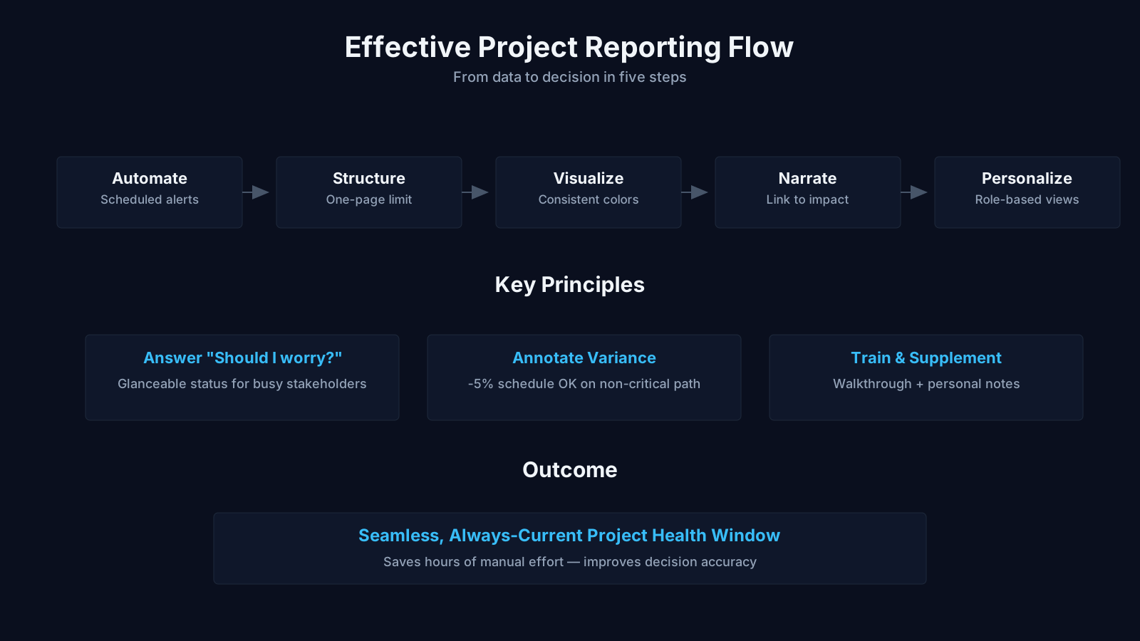
Sharing Performance Reports: Summary of Key Steps
| Key Concept | Summary |
|---|---|
| Reporting Purpose | Performance reports transform raw data into actionable decisions, stakeholder confidence, and targeted corrective measures, moving beyond mere information distribution. |
| Common Pitfall | Reducing report distribution to forwarding spreadsheets often obscures critical trends, causing sponsors to overlook early warning signals embedded in the data. |
| Best Practices | Effective reporting integrates interactive status review meetings, push-based distribution for time-sensitive updates, and the consistent tracking of cost, schedule, and progress metrics. |
| Change Control | As essential inputs to Perform Integrated Change Control, performance reports must flag schedule variances promptly so the change control board can assess impact without delay. |
| Stakeholder Analysis | Stakeholders scrutinize reports by benchmarking against predefined thresholds, investigating variances, and tracing cost overruns to quality slippages to diagnose root causes. |
| Layered Push | A layered push strategy begins with a concise executive summary of three key points and a link, followed by a detailed PDF attachment, enabling recipients to engage at their preferred depth. |
| Push vs Pull | Highly engaged stakeholders often benefit from a pull model granting real-time dashboard access, whereas regulated environments mandate push communication with formal delivery and acknowledgment receipts to ensure compliance. |
| Communication Failure | A steering committee meeting collapsed into confusion when critical schedule variance details, sent days earlier, remained unopened by key sponsors, underscoring the failure of passive communication. |
Understanding the core purpose of performance report sharing
The act of distributing a report is rarely the end goal. You are trying to arm decision-makers with enough clarity that they can approve a change request, reallocate funds, or simply sleep better knowing the project remains on track. The source notes highlight that status review meetings are used to exchange and analyze information about project progress and performance. That word "exchange" matters because it signals that reporting is not a one-way broadcast. In a well-run meeting, the project manager presents the report, but stakeholders ask questions, challenge assumptions, and sometimes reveal constraints the data never captured. This is why simply emailing a PDF can fall short when the topic is sensitive or complex.
When you look at this through the PMBOK lens, sharing performance reports sits squarely within the Monitoring and Controlling Process Group, specifically tied to the Monitor Communications and Control Communications processes. The whole point is to ensure that information flows in a way that meets stakeholder needs, and that flow is measured and adjusted when gaps appear. That same framework emphasizes that performance reports serve as a key input to the Perform Integrated Change Control process—if the report shows a schedule slip, the change control board needs that data immediately. So the sharing mechanism directly influences governance.
In practical terms, this might mean that before you even craft the report, you list the three or four decisions that depend on the numbers. A project I recall involved a manufacturing line upgrade where the operations director only cared about whether the weekly burn rate exceeded the contingency threshold. The report she received was stripped down to a single page: burn rate, a red/yellow/green indicator, and a two-sentence narrative. That simplicity came from understanding that her real need was for a fast trigger, not a full earned value analysis. The exchange that followed in a brief status call confirmed the next steps. So the purpose isn't to show everything; it's to show what will provoke the right conversation.
The role of status review meetings in performance sharing
Status review meetings transform a static report into a living artifact. The source note says these meetings are used to exchange and analyze information. Analysis is the operative word—stakeholders don't just receive figures; they compare them to thresholds, question variances, and connect the dots between cost overruns and missed quality targets. A project manager who simply projects a slide deck and reads bullet points wastes the opportunity. Instead, you structure the meeting so that each major variance is presented with a root cause hypothesis and an ask: do we accept this delay, invest more, or descope?
One pitfall many newcomers stumble into is treating the status review meeting as a performance review of the project manager. That dynamic kills honest reporting. If the project manager feels defensive, the data becomes sanitized. The better approach is to frame it as a joint problem-solving session. For example, when a software development project shows a feature backlog growing, the conversation shifts from "why didn't you code faster?" to "do we have the right prioritization, and should we bring in a specialist for the next sprint?" That shift happens because the meeting format expects analysis, not just presentation.
There’s a practical nuance here about frequency. A status review that happens every week for a year-long construction project might make sense, but for a fast-moving agile initiative, the sprint review already covers performance. The key is not to layer redundant meetings. If the sprint review includes a burndown chart and stakeholder demo, that is the status review meeting in many respects. The source material doesn't prescribe a rigid format; it simply identifies the meeting as a vehicle for exchange. Use it when the report content needs interpretation, not just acknowledgment.
Core Takeaways on Report Sharing
- Arming decision-makers with clarity
- Performance report sharing equips decision-makers with the clarity required to approve change requests, reallocate funds, and sustain confidence that the project remains on track.
- Meetings enable deeper analysis
- Status review meetings move beyond static data delivery by creating space for stakeholders to ask probing questions, challenge underlying assumptions, and surface constraints that a written report alone cannot capture.
- Rooted in PMBOK monitoring processes
- Within the PMBOK framework, sharing performance reports resides in the Monitoring and Controlling Process Group and connects directly to Monitor Communications, Control Communications, and Perform Integrated Change Control.
- Analysis drives stakeholder value
- Stakeholders extract genuine value by comparing actual figures against predefined thresholds and rigorously examining variances, as illustrated by a manufacturing director who relied on a single-page burn rate report featuring a red, yellow, or green indicator alongside a concise narrative.
Communication techniques for distributing performance reports
The source material explicitly states that the project manager generally uses a push communication technique to distribute performance reports. Push communication means the sender originates the message and sends it to recipients without them requesting it. That could be an email with an attached report, a broadcast through a project management information system, or even a printed handout at a steering committee meeting. The advantage is speed and control—you ensure that everyone who needs to see the numbers sees them at the same time, with no dependency on someone remembering to look at a dashboard.
But push communication carries a hidden risk: information overload. When stakeholders receive a weekly report that spans twenty pages, most will scan the first summary table and ignore the rest. Over time, they may even start ignoring the summary because they assume nothing new will appear. The distribution method needs to account for attention economics. One technique that works in practice is the layered push: send a brief email with three bullet points and a link to the full report, then attach the report as a PDF for those who want to dive deeper. This respects that different recipients have different appetites for detail, but it still fulfills the push obligation.
There’s also an important interplay with pull communication. While the source concentrates on push for report distribution, many project information systems allow dashboards where stakeholders can pull reports on demand. For stakeholders who are deeply involved, a pull model often suffices—the VP of Engineering might have real-time access to sprint velocity charts and doesn't need a weekly email. The blend of push and pull depends on organizational culture. In high-trust environments, pull predominates; in heavily regulated or contractual settings, push with formal acknowledgment receipts becomes necessary for audit trails. So when you decide how to share performance reports, you're also deciding on the level of formality and auditability.
Choosing between push, pull, and interactive methods
An interactive communication method, though not named in the source, often emerges during status review meetings themselves. When a project manager walks through a cost performance index chart in a meeting and answers questions on the spot, that’s interactive. It bridges the gap between the dry report and stakeholder understanding. In fact, the push technique only gets the report into hands; the interactive session is where the real analysis happens, as the source notes for status review meetings. So effective distribution is not a singular act but a sequence: push the report beforehand, then discuss it in the meeting, then perhaps follow up with adjusted data.
A practical mistake is to rely solely on email pushes without any check that stakeholders actually read the material. I’ve seen a project steering committee descend into chaos when a critical schedule variance was emailed three days before the meeting, yet two key sponsors hadn’t opened the attachment. The project manager assumed the push was sufficient; the sponsors assumed nothing urgent would be sent without a phone call. The fix was simple: send a one-line text message confirming receipt of the performance report and asking for any pre-meeting questions. That tiny extra step transformed the meeting effectiveness. So the push technique's success depends less on the sending mechanism and more on the confirmation loop you build around it.
Building a reporting system that supports reliable distribution
The source notes describe a reporting system as a standard tool for capturing, storing, and distributing information about project cost, schedule progress, and performance. When you hear "reporting system," don't immediately think of a multimillion-dollar enterprise software suite. It can be as modest as a well-structured SharePoint folder with templated spreadsheets and automated email distribution lists. The essential quality is standardization—every cost report uses the same format, the same fields, and the same definitions so that stakeholders can compare this month to last month without recalibrating their brains.
Standardization reduces cognitive load in a way that's rarely appreciated. Imagine a portfolio review where each project manager presents a status report in a different format: one uses a Dashboard with RAG status, another shows a detailed Gantt chart, a third narrates tasks in a memo. The steering committee spends half its time just unpacking the presentation logic. A reporting system eliminates that overhead because the template forces consistency. The source material explicitly calls out that software packages allow the project manager to consolidate reports from several systems. In a large program, you might have financial data in SAP, schedule data in Microsoft Project, and risk data in a separate register. The reporting system stitches these into a single coherent output. That consolidation is what makes the final report usable; without it, stakeholders would need to cross-reference multiple sources, which few will do.
Another advantage of a reporting system is historical archiving. When a project encounters a claim or a post-project audit, having a time-stamped record of performance reports demonstrates that the project manager communicated issues in a timely manner. In that sense, the system doubles as a defense against "I was never told" assertions. The source notes the ability to capture, store, and distribute—but the storage aspect is the one most often overlooked during implementation. If your reporting system doesn't maintain an immutable archive, you lose the chain of evidence that performance was actively managed.
Consolidating data from multiple sources
Real-world projects rarely have the luxury of feeding a single database. You'll have actual costs from the finance module, percent complete from the field team's mobile app, and resource availability from an HR system. The source mentions that software packages facilitate report consolidation. In practice, this often means a weekly ritual: the project controller exports from each source, runs a reconciliation macro, and produces a master spreadsheet. The "reporting system" in that scenario is partly a set of Excel templates with embedded pivot tables and partly a disciplined process. What matters is that the consolidation step includes checks for internal consistency—if the schedule says 80% complete but costs are at 95%, there's a data integrity issue that must be flagged before the report goes out.
One overlooked capability is the use of lightweight integration tools like Power Query or built-in connectors to pull data automatically. When the reporting system can refresh with minimal manual intervention, the project manager gains back hours each week. More importantly, the freshness of the data improves because there’s no hesitation to update it; a push-button refresh lowers the effort barrier. For stakeholders, this might translate to receiving a performance report every Friday morning without fail, which builds a rhythm of expectation and trust. If the system is too labor-intensive, reports become sporadic, and stakeholders learn not to depend on them—exactly the opposite of what good communication should achieve.
Key Insights on Reporting Systems
- Cost-effective tools often suffice
- A practical reporting system can rely on a well-organized SharePoint folder with templated spreadsheets and automated email distribution, eliminating the need for costly enterprise software while still delivering timely and structured updates.
- Standardization enables straightforward comparisons
- Maintaining consistent report layouts, data fields, and terminology across all reporting periods enables stakeholders to instantly compare current metrics with historical trends, eliminating the cognitive load of reinterpreting data each time.
- Consolidation drives report usability
- Integrating financial, field, and HR data into a single consolidated report is vital because stakeholders rarely cross-reference separate systems independently; a unified view ensures critical insights are readily accessible and actionable.
- Consistency checks and records safeguard projects
- Conducting internal consistency checks before distribution uncovers data integrity problems like schedule and cost mismatches, and retaining time-stamped report versions provides an audit trail of timely communication during claims or audits.
Selecting distribution formats that match stakeholder consumption habits
The source gives concrete examples: distribution formats include table reporting, spreadsheet analysis, and presentations. These three formats cover most needs, but they serve very different purposes. Table reporting is dense, perhaps a tabular summary of key performance indicators with rows for planned value, earned value, actual cost, and variances. That format works well for financially savvy stakeholders who can scan numeric patterns quickly. But it can overwhelm a sponsor who just wants the story behind the numbers. That’s where the spreadsheet and presentation formats come in, providing analysis and narrative respectively.
Spreadsheet analysis goes a step beyond tables by including calculations, what-if scenarios, and drill-down capability. A stakeholder receiving a spreadsheet can filter tasks by late status, pivot by cost center, or model the impact of delaying a milestone. This format is ideal for technical leads or the PMO, people who need to interrogate the data themselves. The source material’s mention of spreadsheet analysis acknowledges that performance reporting is not just about delivering conclusions—sometimes you need to give stakeholders the raw material so they can perform their own analysis and surface questions you hadn't considered.
Presentations, by contrast, are designed for high-level consumption. A deck with charts, trend arrows, and a few summary sentences delivers the essential narrative in a format suitable for executive briefings. Here the project manager becomes a storyteller, sequencing the performance data to lead the audience from status through risks to recommended actions. The source’s inclusion of presentations underscores a truth: sharing performance reports is often a persuasive act, not just an informational one. You are making a case that the project is under control—or that it needs intervention. The format shapes how that case is received. A sixty-slide deck with dense tables will lose most executive audiences within five minutes; a five-slide deck with clear visuals and talking points can change a decision in ten minutes.
Table reporting for metric-heavy audiences
If your primary audience is a cost controller or a program manager overseeing multiple workstreams, a well-structured table is worth a thousand charts. The key is to organize it with an intuitive logic: top-down summary, then by work breakdown structure element, then by time period. Conditional formatting—like shading cells red when the cost performance index drops below 0.9—can add a visual layer without transforming the table into a chart. The source didn't limit table reporting to static documents; modern tools allow interactive tables that sort and filter in a shared browser. When you distribute such a table through a reporting system, you give stakeholders the freedom to explore the data on their terms, which often increases engagement.
But here’s a trap: tables that are too wide make it impossible to view on a tablet during a meeting. I’ve watched a sponsor squint at a tiny font on her iPad, scrolling left and right, and finally give up entirely. Distribution format must account for device constraints. If your stakeholder typically reviews reports on a mobile phone, a long table might need to be repackaged as a series of smaller sections. That’s not a trivial formatting task, but it directly affects the report’s readability and therefore its impact. The medium is often the message; if the format fails the device test, the performance data goes unseen.
Using presentations to drive decision-making
A presentation deck does not have to be a one-way lecture. When you structure the slides to surface three specific decision points, you transform the meeting from report-reading into problem-solving. For instance, slide one shows the schedule health; slide two highlights the top risk that might derail it; slide three proposes a mitigation plan with a resource ask. This format leverages the performance report as evidence, not as the centerpiece. The source’s mention of presentations ties back to the status review meeting concept—the presentation becomes the shared reference point for discussion. The best practice is to send the presentation as a pre-read and then use the meeting for dialogue, not for reciting.
A practical refinement is to embed small multiples within a presentation: tiny charts that show cost trends alongside milestone completion rates, all on one slide. The human eye can compare small multiples almost instantly, whereas flipping between slides breaks cognitive continuity. With today’s presentation software, you can animate the appearance of data points to build the story step by step. That controlled reveal can be powerful in a live setting, though it’s lost if you just email the file. So when distributing presentations, ask yourself: is this meant to be experienced with a narrator, or should it stand alone? If standalone, prioritize self-explanatory annotations on every chart.
Enhancing performance reports with graphic capabilities
The source states plainly that graphic capabilities can be used to create visual representations of project performance information. That’s not a cosmetic suggestion; it’s a recognition that most people process spatial patterns faster than numeric tables. A simple S-curve comparing planned value to earned value can reveal in one glance whether the project is tracking, while a table of ten weeks of cumulative data requires mental effort to synthesize. The visual representation offloads that synthesis onto the report designer, which is exactly where it should be.
One challenge is that graphic capabilities are often underused because project managers feel they lack design skills. But the goal is clarity, not artistry. A line chart with clear axis labels, a legend, and a reference line for the baseline is within anyone’s reach. The source’s mention of this capability reminds us that reporting systems often come with built-in charting functions—use them, don’t reinvent the wheel. A pilot I know uses a stacked bar chart to show feature completion by sprint, coloring each bar segment by team. The visual immediately shows which team is carrying the load and where bottlenecks form. That kind of insight would be invisible in a narrative report.
Graphic representations also serve as a universal language when stakeholders come from different functional backgrounds. A financial controller and a marketing director might interpret a variance column differently, but both can see that a red trend line dipping below a green one spells trouble. The source’s inclusion of this capability aligns with a broader project management principle: tailoring communication to stakeholder needs. If your stakeholder pool includes non-technical executives, invest in visuals; if your audience is exclusively analytical, tables might suffice. But rarely is an audience that homogeneous.
Building effective dashboards for ongoing visibility
Dashboards are the natural evolution of static visuals. A well-designed dashboard pulls live data from the reporting system and displays performance indicators in a panel of gauges, charts, and heatmaps. When you share such a dashboard with stakeholders—perhaps via a web link—you shift from periodic push to continuous pull communication. The source didn’t explicitly mention dashboards, but they are a direct application of the reporting system and graphic capabilities combined. The caution is that dashboards can create an illusion of control. Stakeholders might assume that because the dashboard is available, they don’t need to attend meetings or read commentary. In reality, dashboards rarely explain why a metric has changed, just that it has. So they work best paired with a brief narrative, which circles back to the push technique for highlights.
Designing dashboards requires discipline. Choose no more than seven to ten metrics, else the visual becomes a cluttered cockpit. Align each metric with a strategic driver: cost variance matters to the sponsor, schedule variance matters to the customer, defect density matters to quality assurance. If a metric can’t be tied to a stakeholder’s decision authority, remove it. For sharing via screens, use large touch-friendly elements if the dashboard is accessed on tablets during walk-throughs. The graphic capability here isn’t about decoration; it’s about letting the data tell the story without verbal explanation—a discipline that sharpens the project manager’s own understanding of the performance story.
Key Insights on Visual Reporting
- Graphics accelerate comprehension
- Stakeholders interpret project trends more quickly from charts than from raw numbers because the human brain processes spatial patterns faster than tabular data.
- Simple charts are sufficient
- A basic line chart with clear axis labels, a legend, and a baseline reference is straightforward to produce and communicates trends effectively without specialized design expertise.
- Leverage built-in charting functions
- Most reporting platforms include native charting modules that generate consistent visuals automatically, allowing project managers to focus on analysis rather than manual graphic creation.
- Visuals bridge stakeholder differences
- Tabular reports often lead to inconsistent interpretations, but a universal visual cue such as a red trend line crossing below a green one communicates a problem instantly and unambiguously.
Tailoring performance reports to stakeholder expectations
No single report fits all. The source material doesn’t dive into tailoring explicitly, but the variety of distribution formats implies it. A construction project’s client representative may want weekly cost-to-complete forecasts delivered as a spreadsheet, while the internal steering committee wants a monthly presentation with heatmaps. The act of sharing performance reports involves segmenting your stakeholder list and mapping each segment to a format, frequency, and level of detail. This tailoring is what turns generic data into stakeholder-specific performance insights—a phrase that captures the essence of effective report sharing.
It helps to document these preferences in a communications management plan. List each stakeholder or group, note whether they prefer push or pull, table or graphic, weekly or monthly, and which metrics they care about. Then audit this plan periodically; stakeholder roles change, and a new executive may hate the red/green color scheme that the previous one loved. I once watched a project manager fail to notice that the new department head was color-blind, rendering the entire status report’s traffic-light scheme useless for him. That’s a small but telling example of how tailoring includes accessibility considerations. The sharing mechanism is only as effective as the recipient’s ability to interpret it.
Another layer of tailoring involves the timing of report distribution. If your steering committee meets on the second Tuesday of the month, sending reports at 5 p.m. the night before guarantees that no one will read them in depth. The push technique’s timing matters as much as the content. Some stakeholders prefer a brief preview call before the report is officially released, especially if it contains bad news. That’s not about soft-pedaling the truth; it’s about giving them a heads-up so they can prepare their response and avoid a defensive reaction during the meeting. This nuanced social dimension is often absent from textbook descriptions of push communication, but it’s fundamental to building trust through report sharing.
Adapting report content for different roles
A sponsor cares about return on investment and strategic alignment; a functional manager cares about resource allocation within the department. The same project can produce two different cuts of the same performance data. The reporting system should support this with role-based filters or, more practically, with separate report templates. For example, the sponsor’s report might include a cumulative cost S-curve and a milestone trend chart, while the functional manager’s version might list the upcoming tasks requiring her team’s hours, along with a variance note if they’re over-allocated. Both derive from the same underlying data, but the presentation serves their decision-making scope.
There’s a temptation to blast everyone with the most comprehensive version, thinking that more is better. It isn’t. When stakeholders receive information irrelevant to their decisions, they learn to ignore the whole communication. The push technique becomes counterproductive if it habituates them to irrelevance. A focused, role-specific report builds a reputation for utility, and stakeholders will open it eagerly. So the design of the report—not just its distribution—is a stakeholder management act. You are literally engineering attention.
Common pitfalls when sharing performance reports
Even experienced project managers fall into a few predictable traps. The first is confusing activity with progress. A report that lists dozens of tasks completed can mask the fact that the critical path is slipping. Performance reports must connect outputs to outcomes. The source mentions cost, schedule, and performance—that “performance” isn’t a euphemism for busywork; it’s about whether the project is achieving its objectives. So avoiding superficial performance reporting pitfalls means making the report performance-relevant, not activity-relevant. If the stakeholder can’t answer “are we on track?” after reading, the report fails.
Another pitfall is the “green shift” bias, where project managers unconsciously soften negative data to avoid difficult conversations. The cost report might show a 5% overrun but it’s labeled “manageable,” when in reality the contingency budget is nearly exhausted. This bias creeps in during the push stage because the project manager controls the narrative. To counter it, some organizations mandate that reports include independent validation—perhaps a finance or PMO review before distribution. That doesn’t slow things down much and preserves objectivity. Sharing performance reports honestly, even when it stings, builds long-term credibility.
Over-automation is another risk. When a reporting system churns out auto-generated PDFs with no human commentary, stakeholders might miss the significance of a blip. A one-sentence note saying “this spike is due to a one-time vendor expedite fee and does not indicate a trend” can prevent unnecessary panic. I’ve seen a project sponsor escalate after seeing a cost spike, only to learn it was an accounting accrual that would reverse the following week. A human touch on the report—a brief annotation—would have averted that escalation. So while the source champions reporting systems and software packages, it doesn’t remove the project manager’s judgment from the loop; you still need to add context.
Neglecting data validation before distribution
Distributing a performance report with incorrect data is worse than sending none. Stakeholders make funding decisions based on those figures; if the actual cost field accidentally included a double-counted invoice, you could trigger a premature cancellation scare. The reporting system’s consolidation capability is a strength, but it also means errors at the source propagate quickly. Therefore, a crucial step before push distribution is a lightweight validation sequence: check that actuals align with the general ledger, that percent complete matches the team lead’s latest update, that the schedule’s status date is correct. The source mentions software packages that facilitate report distribution, but they don’t eliminate the need for a human sanity check. Often, a fifteen-minute review with the project controller catches anomalies that automation cannot.
This validation also extends to graphic representations. If a chart’s axis scaling inadvertently exaggerates a minor variance, stakeholders might overreact. For instance, truncating the y-axis to make a 2% cost variance look like a 20% variance is misleading. While not exactly a data error, it’s a representation error that undermines the report’s integrity. So the distribution step must include a quality check on both the numbers and the visuals. After all, sharing performance reports is a trust exercise, and trust fractures quickly when distorted charts are discovered.
Key Takeaways on Report Pitfalls
- Activity masks performance gaps
- When a report lists numerous completed tasks, it can conceal critical path slippage; emphasize milestone achievement over activity volume to reveal genuine progress.
- Green shift bias warning
- Project managers often downplay adverse data, for instance by calling a 5 percent cost overrun manageable when contingency reserves are nearly exhausted, which obscures the true financial exposure.
- Independent validation requirement
- To counteract reporting bias, leading organizations mandate an independent review by finance or the PMO before any status update is shared with stakeholders.
- Context prevents stakeholder panic
- A concise explanation of anomalies, such as a one-time vendor expedite fee, prevents stakeholders from misinterpreting a single data spike as a persistent trend.
- Pre-distribution validation sequence
- Prior to distribution, validate actual costs against the general ledger, confirm completion percentages with team leads, and verify the schedule status date to avoid triggering false alarms.
Linking performance reporting to broader project control processes
Performance reports don’t exist in isolation. They feed into change control, risk management, and quality assurance. The source’s focus on cost, schedule, and performance aligns with triple constraint thinking, but modern methodologies tie it all together. For instance, when a report reveals a rising cost variance, that triggers a risk review to see if the risk log has a corresponding threat entry. If not, the report surfaces a new risk. This symbiosis means that integrating performance reporting with other control processes multiplies its value beyond simple status updates. The report becomes an early warning system, not a rearview mirror.
In PMBOK terms, performance reports are outputs of the Monitor Communications process, but they are also inputs to Monitor Risks and Perform Integrated Change Control. That’s why sharing them broadly matters—if the report goes only to the sponsor, the risk owner might miss cues. The distribution list should include anyone whose response to a variance would involve a risk response or change request. Practically, this means the report might need to go to the change control board members, not just the project steering committee. The reporting system’s ability to distribute to multiple stakeholders simultaneously turns the report into a coordination mechanism across disciplines.
Consider a scenario where the schedule performance index drops due to a key engineer’s illness. The performance report doesn’t just note the delay; it can include a recommendation to pull in a backup resource, which then becomes a change request at the next meeting. If the report hadn’t been shared with the resource manager, that option would be delayed. So the sharing mechanism activates other processes. This real-world interplay is why the source material isn’t merely a laundry list of formats—it’s a chain of dependencies that, when managed well, creates a responsive project environment.
Modern value-focused perspectives on performance sharing
While traditional performance reports center on cost and schedule, some contemporary frameworks encourage a shift toward business value and waste detection. The BVOP methodology, for example, introduces the concept of process damage as invisible organizational harm that can be monitored alongside traditional metrics. When sharing performance reports, a project manager attuned to this might include indicators of overwork, perfectionism, or rejected acceptable work—forms of waste that eat away at value even when the schedule looks fine. This doesn’t replace the cost and schedule data the source emphasizes, but supplements it. A performance report that shows “on schedule, on budget, but team burnout score rising” gives a richer picture to stakeholders who care about sustainability.
Similarly, BVOP tracks Business Value Points as a measure of delivered outcomes. If those points start to decline across multiple reports, it’s a signal that maybe the project should be closed, even if the traditional metrics appear healthy. This kind of forward-looking sharing can be uncomfortable because it challenges the assumption that finishing on time validates the effort. Yet stakeholders increasingly ask about value realization, so incorporating such a dimension into performance reports—perhaps as a short commentary—aligns reporting with strategic objectives. It doesn’t require a complete overhaul; a simple bullet in the presentation might say “Value Points delivered this period: 45 (target 50). Reason: unresolved dependency with data platform team.” That makes the performance report about outcomes, not just outputs.
This perspective also influences the format choice. If you’re sharing a report that includes qualitative waste indicators, a presentation with narrative works better than a pure table, because the concept of waste needs explanation. The source’s distribution formats accommodate this—presentations are the natural home for narrative and context. So a project manager borrowing from BVOP ideas would lean more heavily on that format for governance meetings, while still providing spreadsheet details for those who want to dig into the numbers. The fundamental process remains the same: capture, consolidate, distribute. But the content expands to reflect a broader definition of performance.
Key Insights on Value-Focused Reporting
- Value supplements traditional metrics
- Value-focused reporting augments conventional cost and schedule metrics with insights into business value delivered and waste eliminated, rather than discarding established financial data.
- BVOP process damage concept
- The BVOP methodology treats process damage as hidden organizational harm, such as overwork, excessive perfectionism, and rejected acceptable work, that erodes long-term performance and morale.
- Richer stakeholder picture
- A report that pairs on-schedule, on-budget delivery with increasing burnout scores offers sustainability-oriented stakeholders a richer, more actionable view of overall project health.
- Declining value signals closure
- A downward trend in value points over consecutive reports serves as a predictive signal that the project's diminishing returns may warrant closure, even when traditional metrics remain favorable.
- Simple value point format
- Project managers can embed a succinct entry such as “Value Points delivered this period: 45 (target 50)” without reworking existing reporting formats, lowering the barrier to value-driven transparency.
Practical steps to improve your current report sharing approach
If you’re reading this and thinking about your own project’s reporting rhythm, start by auditing the last three performance reports you shared. Check how many stakeholders actually responded or acted on the data. If the answer is “none,” your push technique might be pushing into a void. That’s a sign to shorten the report, change the format, or convert that push into an interactive meeting where stakeholder questions naturally surface. The source’s tools are a starting point, but you must close the feedback loop. So try a simple experiment: next time, send a one-page graphic summary with three discussion questions for the status review meeting, and see if engagement ticks up. The continuous improvement of performance report sharing relies on measuring stakeholder response, not just report throughput.
Another quick win is to standardize definitions across your reporting system. If “percent complete” means one thing to engineering and another to finance, your consolidated report will confuse everyone. Spend an hour aligning definitions with key stakeholders. That upfront investment makes every future distribution more coherent. Also, test your graphic representations with a non-project stakeholder—someone from HR or legal—and ask them to interpret the chart. If they get the right message in under ten seconds, your visual is working. Iterate based on that feedback. Sharing performance reports effectively is a skill refined through small, deliberate adjustments, not a formula you master once.